Once you see the name of Wes Anderson on any movie poster, you can expect to see a good story, soundtrack, and above all, great design. It’s been widely celebrated to the point that people have even started a Reddit thread to share the “Accidental Wes Anderson” sights they happen to come upon as they live their daily lives.
Color, space, type—those are the key ingredients of great style. Today we are going to talk about how the director uses the latter to create an impact that is uniquely his own.
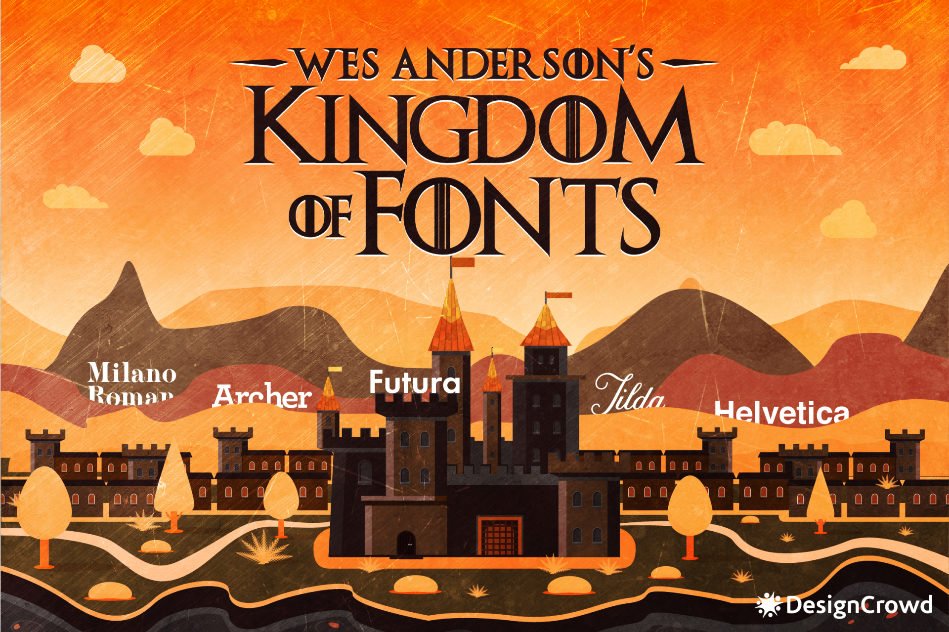
So much of this artful expression is backed up by smart use of fonts. Take a look at the following fonts Anderson has used frequently, distinctly and more.
Examining these fonts and the way he uses them gives us a better understanding of his style. You’ll learn that these fonts serve as a telltale sign of his fun, classy, and quirky work.
But why fonts?
What do these characters matter to the overall design of something? Like colors, there is a psychological aspect at play when it comes to typography. Various font types depict an array of emotions. Take the two common font styles for example, which are serif and sans serif.
Serif fonts are often used in designs by traditional companies. The ends of serif characters have a “tail” or extra elements to emphasize the end of each stroke. Luxury brands like Prade, Gucci, Rolex, and Versace use this in their brand logos. Audiences perceive these fonts as classy and authoritative. Some examples of serif fonts include Georgia, Garamond, and Times New Roman.
On the other side of the coin are sans serif fonts or fonts that do not have that extra detail on each character. Recognizable fonts that make use of this font include Facebook, FedEx, Google, Nike, and more. Laidback brands that want to appear approachable and friendly. Bebas Neue, Proxima Nova, and Brandon Grotesque are great examples of sans serif fonts.
Of course, art is subjective and it may mean different things to people coming from different cultures. The traits above are just some of the commonly associated ones in general.
Now, let’s look at Wes Anderson’s collection of astounding fonts.
Tilda
Director Wes Anderson has tailored himself his own distinct visual style. Fans of his consider warm color grading and outstanding symmetry as an integral part of his filmography. Needless to say, the director is particular about how he styles every scene and character.
The same story played out for the Moonrise Kingdom.
It is a coming-of-age movie that was released in 2012 and its poster featured a never before seen font. At the time of Moonrise Kingdom’s release, Tilda’s obscurity was due to the fact that the font was custom made by lettering artist Jessica Hische.
It was only in 2014 that the font became available for the public having been published by the Font Bureau. Tilda appears to be a feminine font with influences from old French films. Its soft and slender appearance paired amazingly with the story that explored the delicate pains of adolescence.
Milano Roman

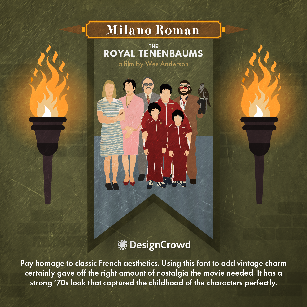
The Royal Tenenbaums is a 2001 tragic comedy that centered on a dysfunctional family that fell apart. It was the director’s most popular movie until 2014.
Each member was extremely proficient at the tasks they took up. This prompted the mother, Etheline Tenenbaum, to commemorate their genius by writing a book titled, “Family of Geniuses”. The book cover was in a remarkable font called Milano Roman in soft pink shade.
This style of typography prevailed in the era for its bold and eccentric design. Using this font for that prop certainly gave off the right amount of nostalgia the movie needed. It has a strong ‘70s look that captured the childhood of the characters perfectly. Chunky serif fonts like Milano Roman are good for headlines and logo text. Just look at the logos of Versace and Gucci.
This film is the director’s third feature and certainly took the chance to keep building his vision. It was still in the early stages of his career and treated this as no time to slack off especially in terms of design.
Archer

In 2014, one of the best films that took advantage of typography was rolled out in cinemas. Artists even raved about its brilliance. The Grand Budapest Hotel is set in 1968 for the most part. It is about war and love and you guessed it, a hotel where the story unfolds.
The movie has showcased the charm of varying fonts from subtitles, signages, and other props. Its poster, however, really stands out. It portrays the said hotel with the mountain scenery. The names of the cast are written in a font called Archer that gives it a feel of vintage Eastern Europe.
Archer is a square or slab serif font created in 2001. Slab serif font means that the characters of this font have thick tails that resemble blocks. The squareness of the logo gives it a classy yet fun appearance.
Originally, it was designed to be used in the lifestyle magazine of Martha Stewart.
Does it look familiar to you? It must be for good reason. Archer was also used in the 2017 Netflix movie, Okja.
Helvetica

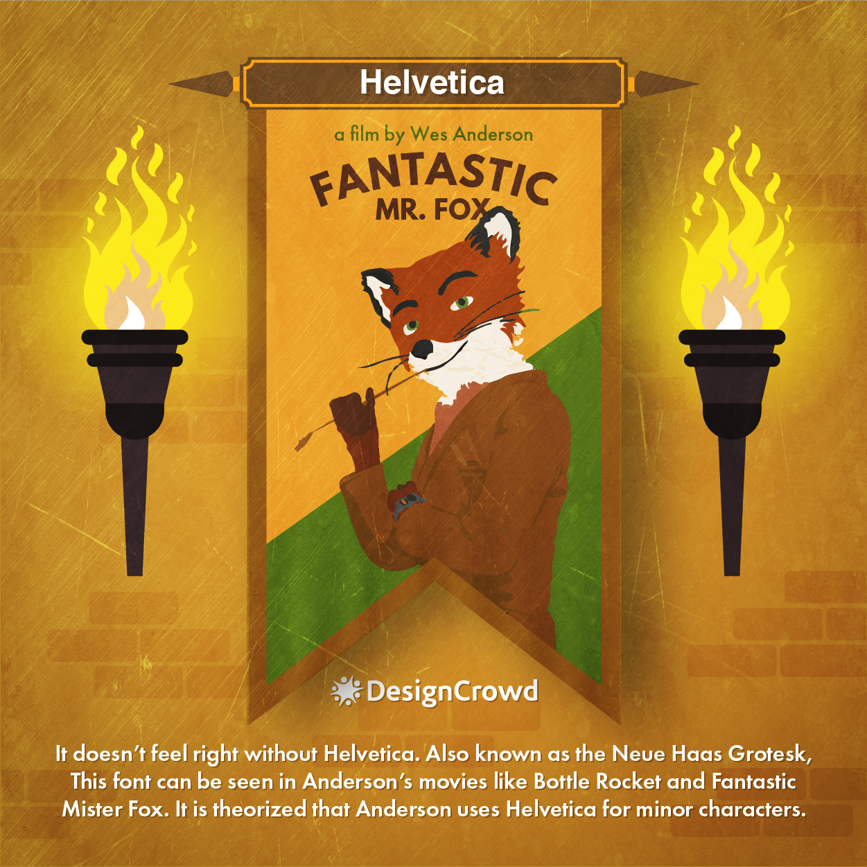
Also known as the Neue Haas Grotesk, Helvetica can be seen in Anderson’s movies like Bottle Rocket and Fantastic Mister Fox. It is theorized that Anderson uses Helvetica for minor characters.
This sans serif font is a poster child of modern design. It was made by Swiss designer Max Miedinger in 1957 to represent the innovations of his country. To this day, people describe this font as neutral and consistent.
Love it or hate it, Helvetica has made a serious impact in the design world. It even has a dedicated indie documentary that studied how it became such a huge deal in typography. Helvetica is not just for art films. It can be seen in shop signs, subways, flyers, and more.
Brands like Target, Energizer, 3M, and Jeep are just three of the long list of other companies that use this font in their logos.
Futura

No trustworthy Wes Anderson font roundup will leave Futura behind. It is The Wes Anderson mark.
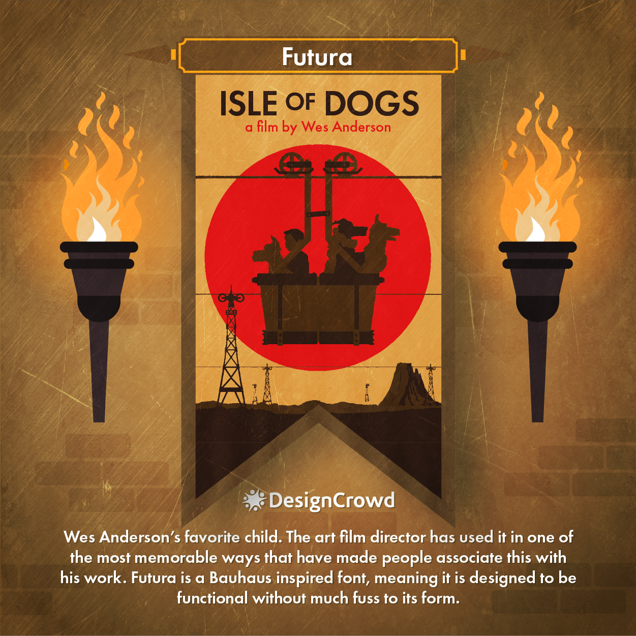
The director uses Futura in title cards for his work including but not limited to Rushmore, The Life Aquatic of Steve Zissou, The Darjeeling Unlimited, Isle of Dogs, and more. He makes sure to use the bold and italicized version of the font as well.
While of course, the font is not exclusive to his use alone. But the art film director has used it in one of the most memorable ways that have made people associate this with his work. That’s good branding.
Futura is a Bauhaus inspired font, meaning it is designed to be functional without much fuss to its form. Designer Paul Renner created the geometric type in 1927.
If Helvetica has a film, Futura has a book. It is a font often discussed in the art community as well. From art to politics, the font has been used for numerous graphic works. The book by Douglas Thomas and Ellen Lupton titled, Never Use Futura tackles this.
When you take a look at its history, you’ll be surprised just how many big brands have used Futura such as Absolut Vodka, Dominos, and Nike. If you want to see more font-centered logos head over to this gallery.

Creating your own kingdom
It doesn’t matter if you’re a filmmaker or a businessman or maybe even both. Art plays a huge role in our lives and every endeavor. That much we’ve established.
We can learn another thing from Wes Anderson. And that’s the importance of brand consistency. Instilling this in everything you do helps relay messages effectively, making your audience trust you better. This improves brand visibility, too.
Before settling with any design, make sure you’re working with people who understand your brand. It is essential to make every project reflect your brand identity in a consistent fashion. Ensure this even if you’re hiring a full-time team or working with online freelance graphic designers to create a custom design.
Find yourself wanting to explore more?
Written by DesignCrowd on Friday, April 24, 2020
DesignCrowd is an online marketplace providing logo, website, print and graphic design services by providing access to freelance graphic designers and design studios around the world.

