You have probably been there.
At least once in your life, you’ve downloaded an app from the store that you think will be your next favorite app, but soon became disappointed once you’ve finally opened the app. It was probably because the app was too complicated to use or it just straight up had an outdated look. Either way, you found yourself pressing the uninstall button why you just spent time and data for nothing.
According to a study by Statista, smartphone users have downloaded a total of 204 billion mobile applications in 2019. However, those apps don’t automatically become favorites. AppsFlyer found that every 3 out of 10 mobile applications get uninstalled within a month.
Effective mobile application design will lessen the odds of your precious app from being uninstalled. Developing an application takes a lot of work. That’s why you shouldn’t let all that hard work go to waste with bad design.
Create an app people will enjoy using by reading this effective guide. We will cover everything you need to know about how apps are presented:
Principles
There are hundreds of great apps that you can install from the store of your device’s operating system. It can range from social media to fitness, but they follow a similar set of principles in order to achieve a usable and remarkable design.
Sure, it’s easy to yap about “good design”, but people rarely define what that concept means. For this section, we are going to discuss what guide app designers use as a foundation for their mobile app projects. What should your app aim to look like? What purpose does it have to serve? These fundamental principles will help you approach the process in a better way.
Visual hierarchy
Bombarding audiences with concept and graphics can lead to clutter and take attention away from things with higher priority. This leads to losing the opportunity to emphasize your content and call-to-action button, among others.
The human attention span lasts for a brief amount of time. You want to avoid spending those fleeting seconds with nonessential information.
To make your content prioritization airtight, the best plan of action is to put the essential content on top where users can instantly read it. This is correct, but there are other ways you can creatively achieve this, too. You can use color contrasts and other graphic design elements to create an emphasis on essential content.
Legibility
Typography is different for mobile devices. Mobile devices have limited space when compared to desktop users. This is why designers put a lot of effort into ensuring that bodies of text are presented in a distinguishable way even in small spaces.
Legibility is a measure of how recognizable a letter is when typed with a certain font. Ever mistake the lowercase “c” for an “o”? If your answer is yes, you probably encountered a typeface that needed improvement.
In order to call a design legible, you should be able to tell one glyph from another. You can play around with typeface elements to achieve legible text. This includes character width, stroke contrast, weight, and design traits.
Touchscreen friendliness
Let’s face it. The human finger isn’t the most precise tool out there. Not everyone uses a mobile cursor.
When it comes to function buttons and CTA buttons, you want to design it big enough ranging from seven to 100 millimeters for accessibility. At the same time, these tap targets should be small enough to look presentable and make room for other parts of your design.
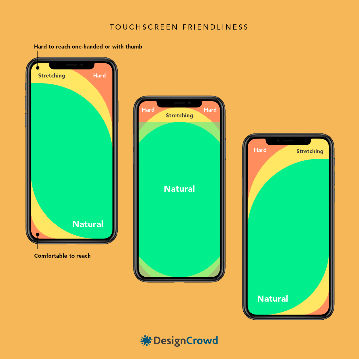
Your design should also consider the hand positions to increase accessibility. Over half of mobile phone users make use of one thumb when navigating an app. And the average length of the human thumb is 2.74 inches.
These hand positioning regions will help you decide where to place certain features. The upper left and right regions are considered the hardest to reach, making these spots ideal for action buttons that are not used often.
Subsequently, the lower and middle regions are for design components that your users are going to be using the most. It depends on what type of app you are making, but this is a good space for displaying product listings, posts, and other appropriate actions
Minimizing data input
Handheld devices are handy because of their compact design. But this is a double-edged sword. As discussed in the previous principles, a lot of people have difficulty with using their fingers for navigating small screens.
Mobile app designers are pushing for less typing by applying functions like autocomplete, search suggestions, and dropdown fields, among other things.
2020 Mobile App Design Trends

Applying the latest trends in iOS and Android mobile application design makes your brand look modern and up to date. Learning the current movements is another way for you to forecast what your users are expecting to see. Plus, it’s never a bad idea to get inspiration from emerging trends.
Dark mode
A study by The Vision Council found that 59% of American adults experience eye strain due to extensive exposure to blue light. The introduction of dark mode helps address this issue. The shift to a darker interface also paved the way for efficient battery saving.
Famous apps like Facebook Messenger, Skype, Whatsapp, Twitter, Trello, and more give users the option to make eye staring a thing of the past.
Swiping first
This motion comes as an instinct for humans. Even infants as early as 17 days old have been recorded doing this hand gesture towards an object they find appealing according to the Developmental Psychology: A Student’s Handbook (2002). Designers are leaning towards this instinct to make applications more functional.
Animation
Animations are growing more common as brands make use of its eye-catching design element. It is also a good source of distraction and entertainment as your app loads from one page to another.
Round corners
Handheld devices are taking on a softer shape. This isn’t just for aesthetics, but also for reducing the risk of screen breakage from impact. Naturally, designers are going to adapt to this change. The rounded shape improves the way users process information, too. This explains the number of apps with borders, content containers, and message bubbles that are taking on curvier figures.
Bottom navigation
Allowing users to access important features is a top priority of mobile app designers for 2020. Placing these buttons on the lower region makes it easier for people to reach because the lower region is a natural zone that thumbs can reach.
5 Must-Have Features
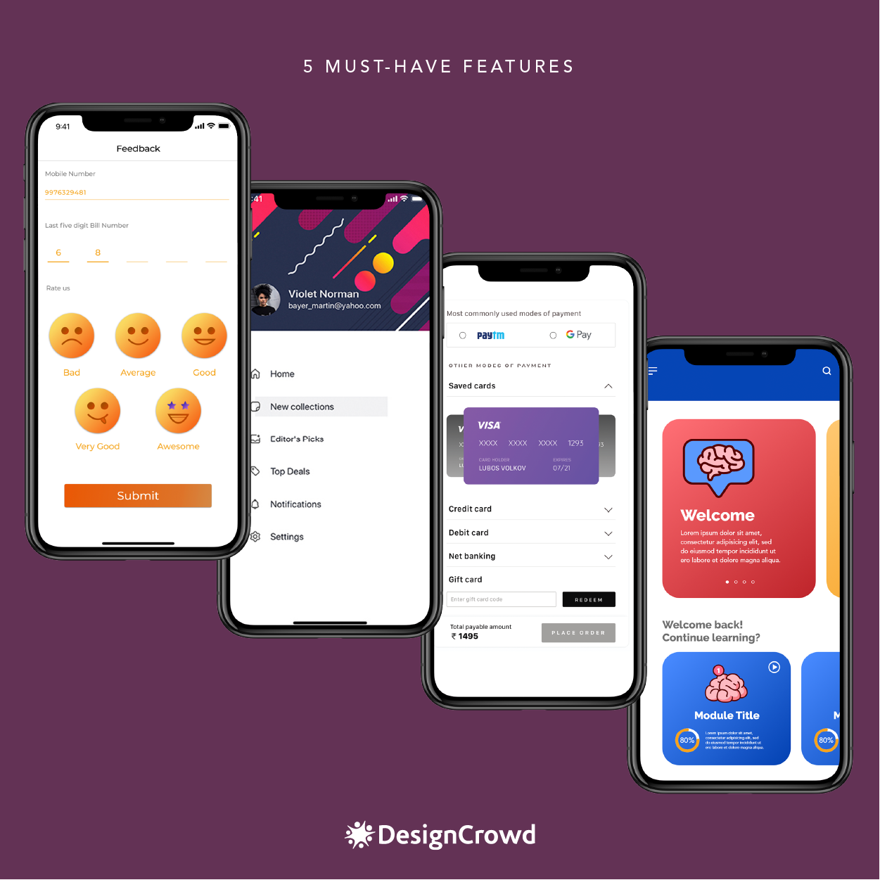
Most entrepreneurs think that asking their software development company to add more features to their app is the key to a good design. The more the merrier, right? Well, not exactly.
Avoid adding unnecessary components that can confuse users and add to your expenses. Always remember to KISS or Keep It Short and Simple. In order to keep yourself from being off track, think about the main objective of your app and the problem you aim to solve. From there, you can evaluate the relevance of the features you plan on integrating. Knowing all of these can also help you consider crucial factors such as the cost of app development. The common features to get you started.
Feedback
Audiences love being heard. Apart from that, your app benefits from user comments and suggestions. Their first-hand experience is a helpful source of information about your software’s performance.
You can use this to respond to issues, learn more about your audiences, and improve customer support experiences. Leaders see this feature as a driving factor for customer loyalty and retention as well. That’s why you have to make your feedback button recognizable.
Easy navigation
Cluttered design can easily overwhelm users, especially ones that aren’t exactly tech-savvy. This can lead to excessive cognitive load and give your users an unpleasant experience. Overly complex design and excessive options hinder your design from being easy-to-navigate.
This can be prevented by improving the organization of graphic elements. Give your images and text proper spacing to display information comprehensively.
Additionally, incorporating universal or self-explanatory symbols will lessen misunderstandings and uncertainty. For example, your app’s back button can be represented by a left-facing arrow. This symbol is used by different apps and browsers for the same purpose as well. Besides simplified design, content can also take your navigation up a notch.
Streamlined checkout
Ecommerce apps will obviously need a checkout feature to complete purchasing transactions. The ideal checkout process needs to display the payment process, integrations, and a concise order summary.
What you can do to achieve this is to simplify the layout. Less visual clutter and defined call-to-action buttons will give your customers a better idea of the steps they need to accomplish in order to complete the transaction.
Personalization
Greater optimized apps lean on personalization. This is because it provides more relevant content that results in a higher conversion rate.
Not to be mistaken for customization, personalization is achieved by learning the behavior of your audience and using that information to suggest what they like. One of the well-known examples of this feature is Spotify’s algorithm. The feature creates playlists for subscribers based on the music they listen to.
You can apply this feature to other aspects such as user location, demographic, and more.
Optimized display
Not everyone uses the same device model. You have to consider the varying screen sizes that will display your app. Otherwise, your app may appear distorted and pixelated on the device of your audience.
For starters, it is best to be mindful of how your app is going to appear when opened using a phone, tablet, smartwatch, TV, and other devices. Designers recommend beginning the design process with small devices. This is done to comply with the current rise of the mobile-first approach as a best practice.
Tools You Can Use
The internet provides designers, developers, and entrepreneurs a wide selection of tools to refine projects. All of these can help streamline your design process and possibly lessen the total app design cost.. Take a look at these 5 handy materials you can use to achieve your ideal app:
InVision
All inventions start with a prototype.
InVision is a tool to help you create an interactive prototype of your own app. You can design your wireframe in Photoshop, Sketch, and Pencil Project. Designers can also use their very own software InVision Studio and InVision Freehand. Wireframes made in Photoshop and Sketch can be easily synced into this tool.
You can choose hotspots within your design that can be clicked or hovered and InVision demonstrates user flow. Hotspots can be linked to other screens, anchor points, external URLs, and many more.
Mockups for mobile can include gestures such as double taps and swiping. The mockups can simulate how the app will function in real life. It can stand as a clear blueprint for your development team.
You make collaboration easier and organized. InVision allows clients or teammates to leave comments on specific parts of the mockup. Synchronous editing is also possible with this tool along with Liveshare.
InVision can be used for apps designed for mobile, desktop, and even watch devices. If your app is available on different platforms, it is critical to have the same ease and experience for a user with a mobile device and a desktop.
Appium
Creating an app doesn’t stop at wireframes, mockups, and prototypes. Test-runs are conducted to make sure your app runs smoothly. Appium is a free open-source tool for automating test cases in native, mobile web, and hybrid apps on Android, iOS, and Windows platforms.
It supports multiple programming languages such as Java, Python, Ruby, and more. Appium is also supported by various automation testing tools that can streamline the migration of projects.
Automation tools are important in running tests because they are far cheaper and faster than manual testing. They make testing multilingual sites easier. They are also less prone to errors since it can be operated without human intervention.
Marvel App
Like InVision, Marvel App is one of the most popular prototyping tools. It is a simple and easy-to-use tool that can help you create mockups from static designs made in Sketch, Photoshop, and other programs without having to code. With a wireframe ready, you can select hotspots and their designated action.
After creating your mockup, you can let others, your client or target audience, test your prototype. In a remote usability test or in-person interview, you can record and view each comment, tap or click on your prototype. An event tracker shows which designs challenged users. You can use this information to reduce friction and create a user-friendly app.
MonkeyTalk
Another open-source automation tool is MonkeyTalk. It can be used for regression and functional testing of native, and hybrid software products for iOS, Android, and even simulators. It gives you the option to playback and modifies the tests to drive the efficiency of the testing process.
Zeplin
Zeplin is a collaborative tool used by UI designers and developers to be able to create projects as fast and accurately as possible. The designs can be turned into specs and guidelines, making it easier for developers to access.
This functionality reduces the back-and-forth between designers and developers. The tool is also integrated with multiple apps such as Photoshop, Sketch, Adobe XD, and Figma for design projects. While Slack, Trello, and Jira are made available for collaboration.
Testing Strategies
We will add a paragraph containing your keyword that will look like this “A/B Testing – This type of test is crucial in determining which feature, page, or version of your app is better. You can use this to test anything — from knowing if your users prefer square or rounded buttons, if they prefer hamburger menus or expandable menus, or if your marketing and app store optimization strategies are working. One of the biggest mistakes an app can make is taking testing and your user experience for granted. This is how you can gauge the effectiveness of your app in solving the problems of your consumers. Here are other methods for you to check on your app’s performance:
Automated Testing – Many mobile app development companies will forego automated tests due to cost constraints. However, an automated testing tool can run end-to-end tests across your mobile app to discover unknown bugs and issues. Best in class tools such as TestProject.io offer features such as real-time recording, cross-platform testing, and a comprehensive open-source scripting SDK (for those more customized tests). It’s recommended to always run automated tests across all environments prior to any release to production.
Focus Group Discussions – Acquiring the right participants that match your target buyer persona is the key to any successful FGDs. Most brands gather six to nine individuals for a few hours to try their apps and collect user insight before the actual release of their software. This method is used to gauge the preferences of customers.
Beta testing – Think of beta tests as your product’s soft launch. Conducting one will strengthen your app, especially when you pair it with thorough in-house testing. The average testing process lasts for about six to 10 weeks, depending on your objectives.
You can source testers on different platforms such as Erli Bird, BetaList, BetaTesters, Reddit, and more.
While you’re already in the presence of participants, you can maximize the opportunity by asking them about your marketing strategy, too.
Get their thoughts on your brand by presenting your logo and visual identity assets. One way you can impress your users by completing your branding kit with a spectacular symbol from this app logo gallery.
Great Examples
The applications we’ve come to know and love excel at finding the design that works for their brand and for their users. These apps demonstrate the best practices of mobile app development.
By taking a look at how they do it, you can pick up a thing or two about how to design your own app.
Spotify
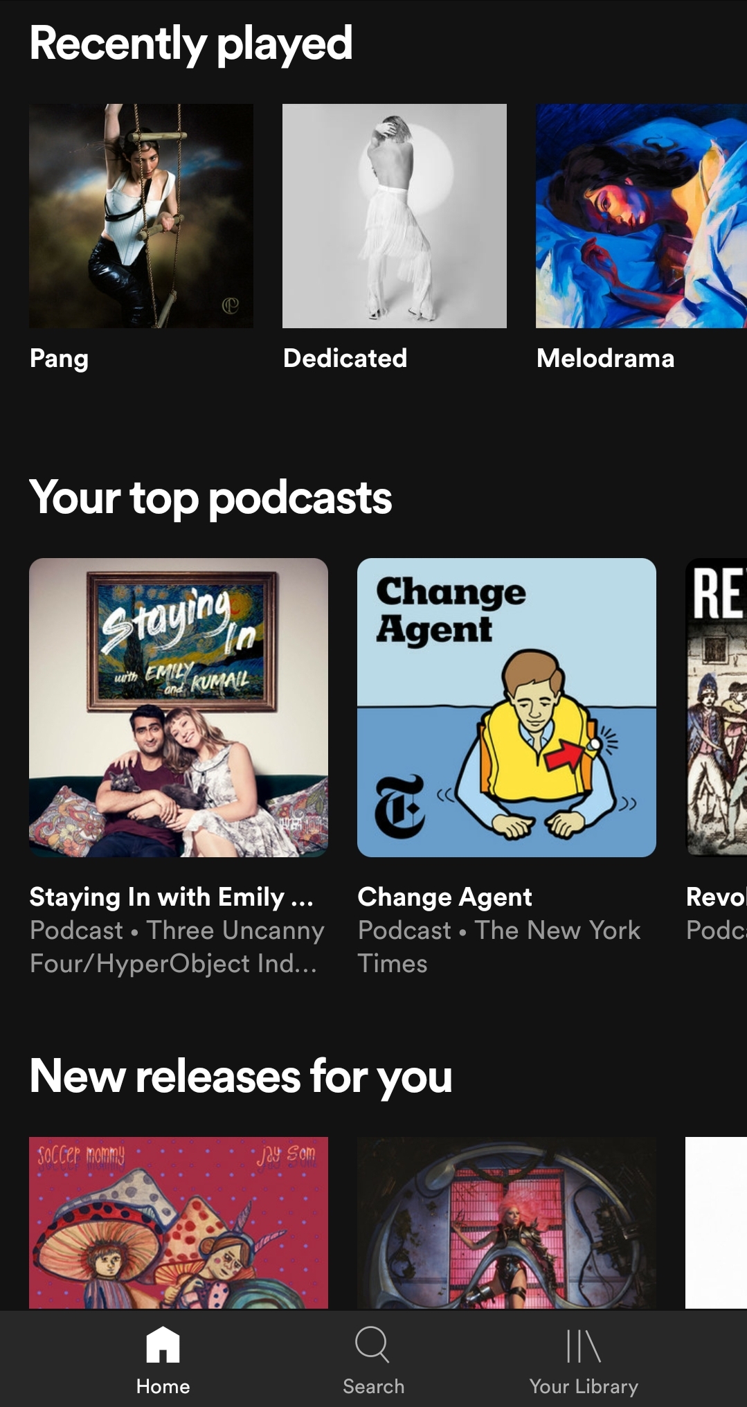
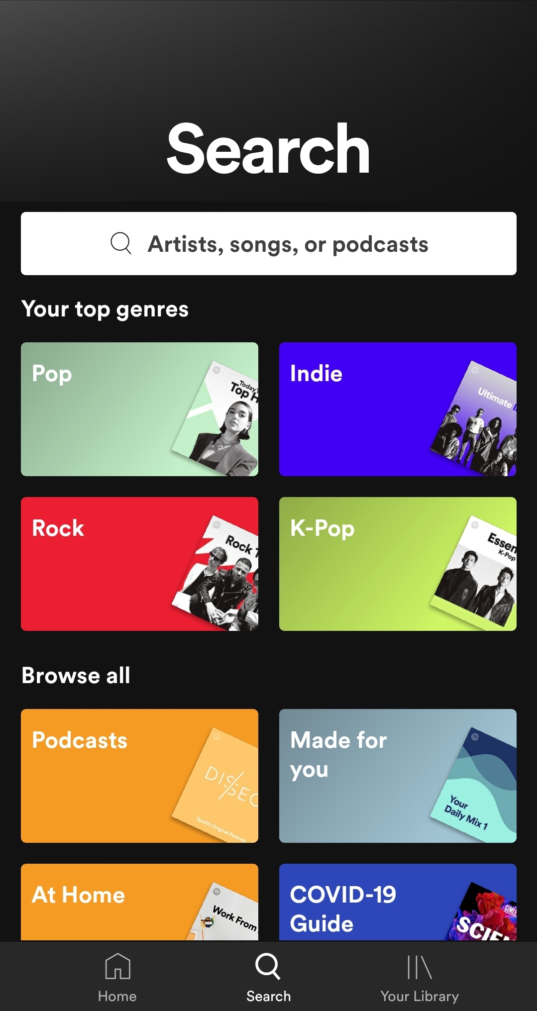
Any music lover has Spotify on their phone and for good reason. It is a music streaming service that allows users to consume audio content the way they want. Spotify offers songs and podcasts, playlist creation, and a music discovery feature.
You might think that an app with so much content would have an oversaturated look but Spotify has an efficient and clean design.
They optimize their use of space by providing what listeners want and are interested in. Their curated playlists also have covers that sum up the artists or vibe of each mix. Users can easily find what they are looking for because Spotify instantly provides relevant suggestions and visual cues that lessen the need for typing.
Trello
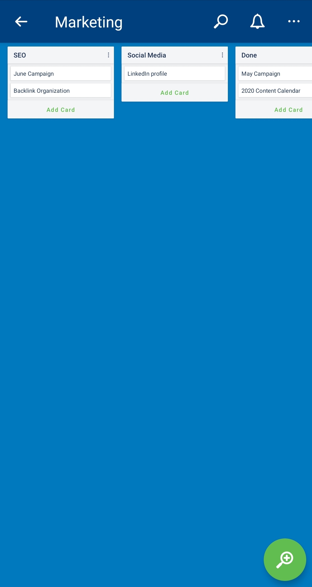
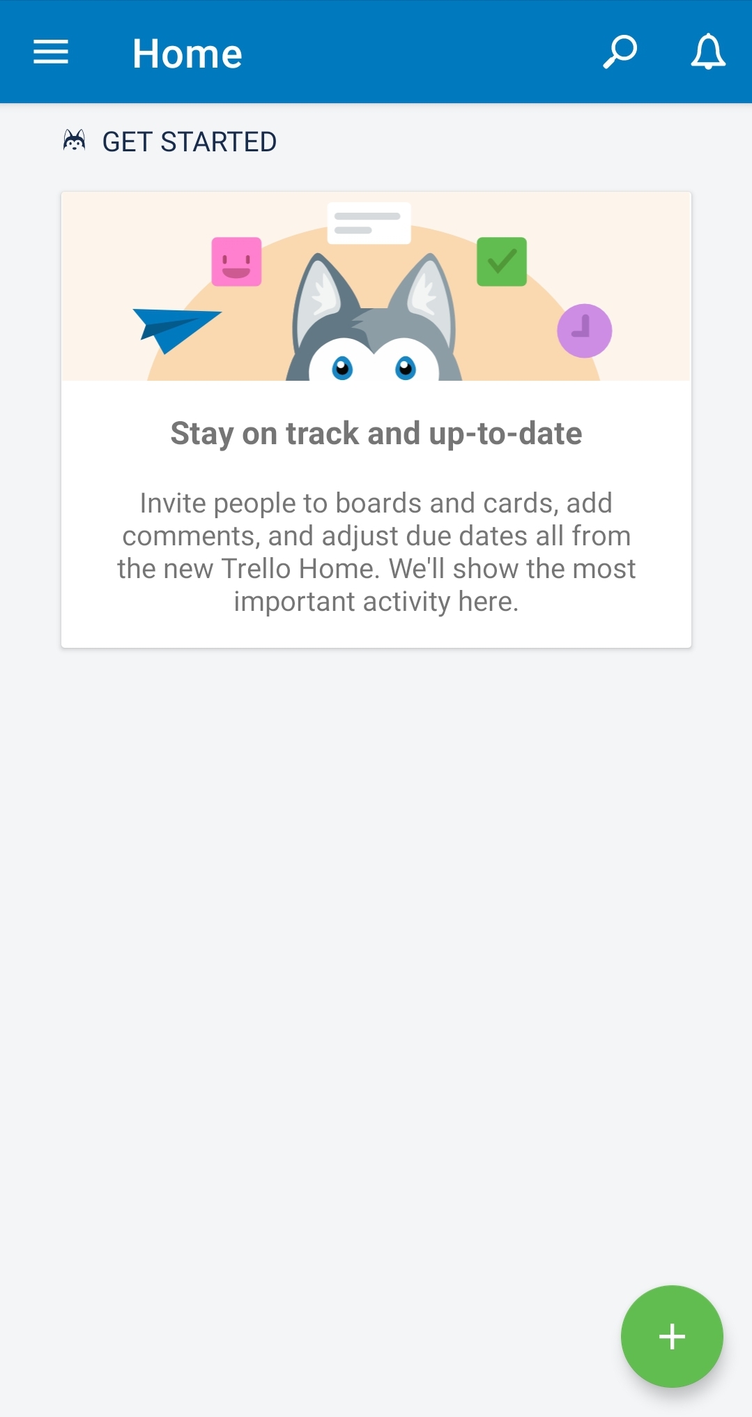
Trello is a list-making application that feels like a corkboard within your phone. Cards are sorted according to their purpose and additional labels can be added to differentiate tasks. Attaching images to the cards is also possible. Additional boards can also be added and viewed by others. This makes Trello a great app for planning between two or more people.
For a list-making app, it’s important to have features that allow users to organize different tasks through color-coding and other sorting methods. Having a clean layout also helps users organize their thoughts properly and lighten the cognitive load.
Google Translate
Google Translate is an app you can use to translate words, sentences, and paragraphs into another language.
The mobile app can also translate handwriting, images, and even spoken words. Under the translation window, past searches are listed and can be bookmarked. Its design is simple and straightforward, making learning more approachable.
Having a spacious layout that presents the words clearly helps the reader make the most out of the app. It also uses symbols that are easily picked up by users regardless of their native language.


Ready to create your own app?
There are a lot of ways for you to source a competitive design that will give you an edge from other apps in the market. Brands can opt to work with design agencies and contact freelancers. Another good option is to launch a create a contrast that will allow you to have multiple design options to choose from.
Mobile application design contest on DesignCrowd gives you the chance to receive and evaluate different proposals from talented professionals who will pay close attention to your project brief.
For a fraction of the price, you can get up to 25 design submissions featuring original concepts from experienced mobile app designers. This way, you’ll get more chances to find the perfect mobile app design you’ve been looking for.
To give you an idea of what you should expect from the community, take a look at the apps that found the perfect design by running a contest.

Telecommunication app design by pb
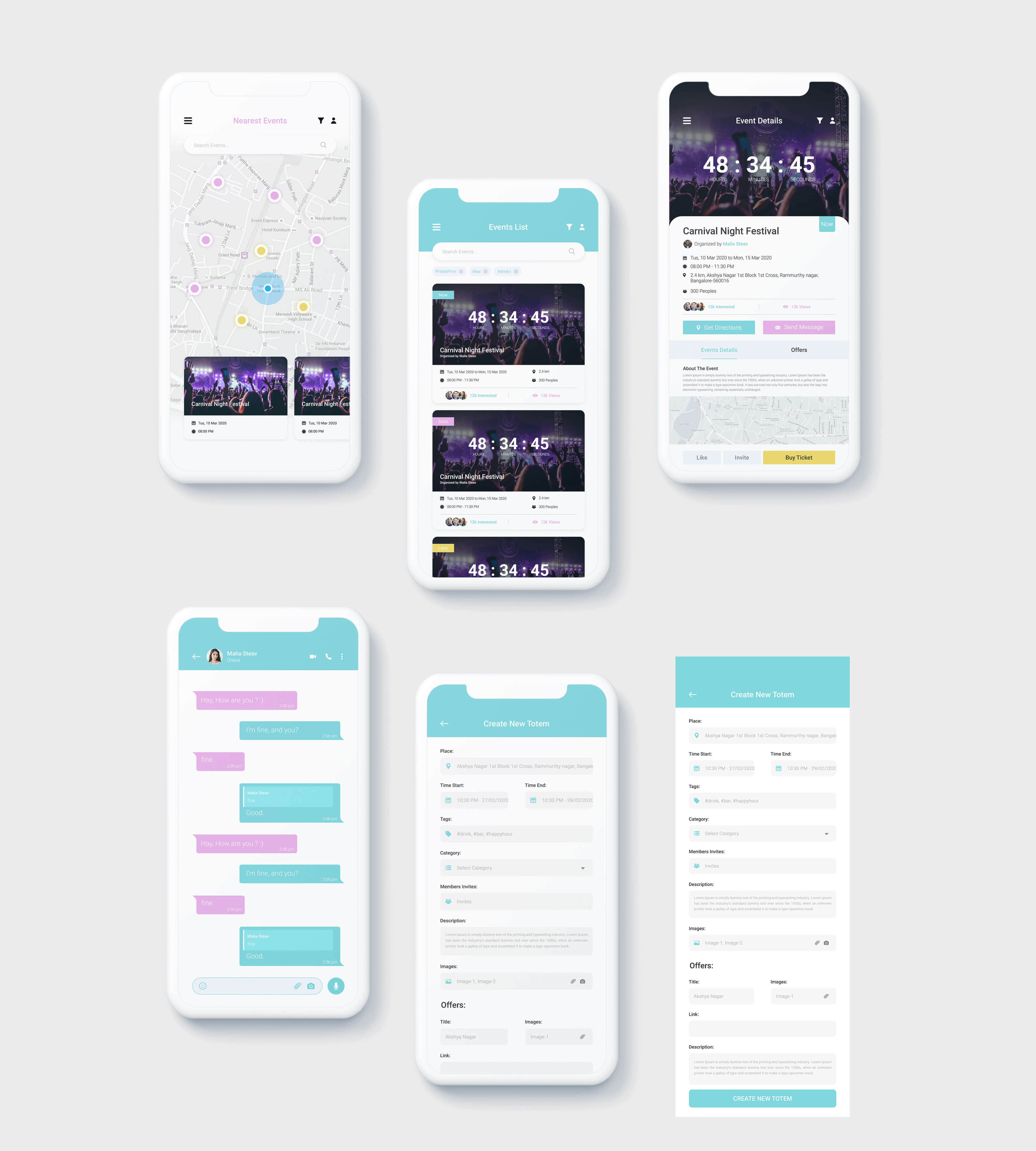
Live Events Stream app by Amir Iqbal
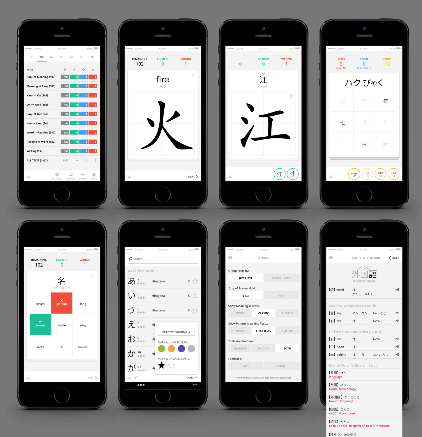
Redesign iOS App Kanji Teacher by MIND
Interested in learning more? We have more for you:
Written by DesignCrowd on Friday, May 29, 2020
DesignCrowd is an online marketplace providing logo, website, print and graphic design services by providing access to freelance graphic designers and design studios around the world.

