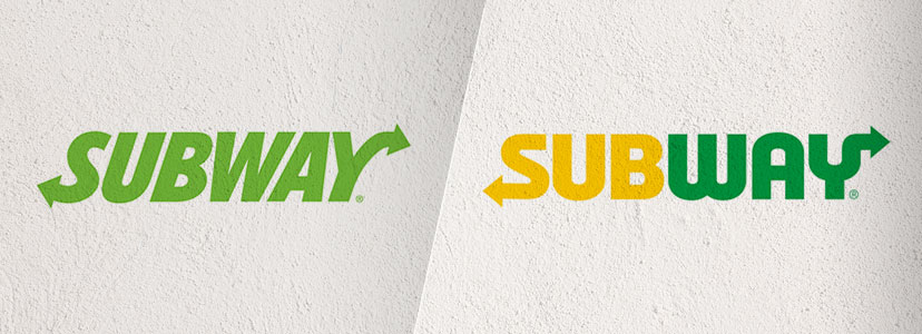
True to their word, the people at Subway recently released a new logo to help support “the evolution of the brand”.
A year after first announcing they planned to redefine their identity following a series of less than favorable headlines, bosses this month launched a “powerful new symbol” for the fast-food service.
The new design replaces the short-lived single color version, with non-italic text and the reintroduction of the iconic yellow and green combo.
Suzanne Greco, president and CEO of Subway restaurants said the logo was “clear and confident without losing sight of our heritage”.
“The new logo stands up tall, bold and confident, capturing the essence of the brand in a fresh, contemporary look. The core colors have been optimized to live and work across all channels.” Subway
Criticism has been leveled at the logo, not least for the way the arrow seems to over-extend off the top of the “Y”. It has also been described as “heavy, static, and sluggish”, although this maybe does talk to those customers who feel this way after eating a foot length of bread roll.
More widely appreciated is the symbol which cleverly incorporates the two arrows to form the “S” from the logo. This will allow consistent and scalable branding to be used on various digital formats across all channels.
The new Subway symbol
“The symbol, a new asset for the brand, distills the iconic arrows into a powerful and simple mark. Capturing the essence of the brand in a smaller footprint, the arrows symbolize the choices Subway provides its guests.” Subway
The sandwich chain expects to begin rolling out the new logo and symbol across all it’s global branding in early 2017.
Want More?
As fascinated as we are with overhauled brand identities? Check out how DesignCrowd’s creative community would change the look of some big brands around the world:
400 Alternative Uber Logos
5 Alternative Logo Choices for Tokyo 2020 Olympics And Why They Work So Well
Best of DesignCrowd Contests: Top Sports Logos Get a New Look

Written by Kevin Bradford on Tuesday, August 23, 2016
Kevin Bradford is a content editor at DesignCrowd with a background in journalism and digital production. Experienced in both writing and videography, he loves combining his skills to create captivating content across all multimedia channels.

