A few years ago, whenever I published a new article here, I would just
announce it on Twitter, which seemed to help attract readers who would find
the article worthwhile. Since the Muskover, Twitter’s importance has
declined sharply. It now doesn’t take very much time at all for me to check
posts of people I follow on X (Twitter), since most of them have left.
Instead I’m looking at other social sites, and posting there too. Now when I
announce a new article, I post on LinkedIn, Bluesky, Mastodon, as well as X
(Twitter). (I also post into my RSS feed, which is still my favorite way to
let people know of new material, but that may just reveal I’m stuck in an
idyllic past.)
While it’s one thing to have a gut feel for the importance of these
platforms, I’d rather gather some more objective data.
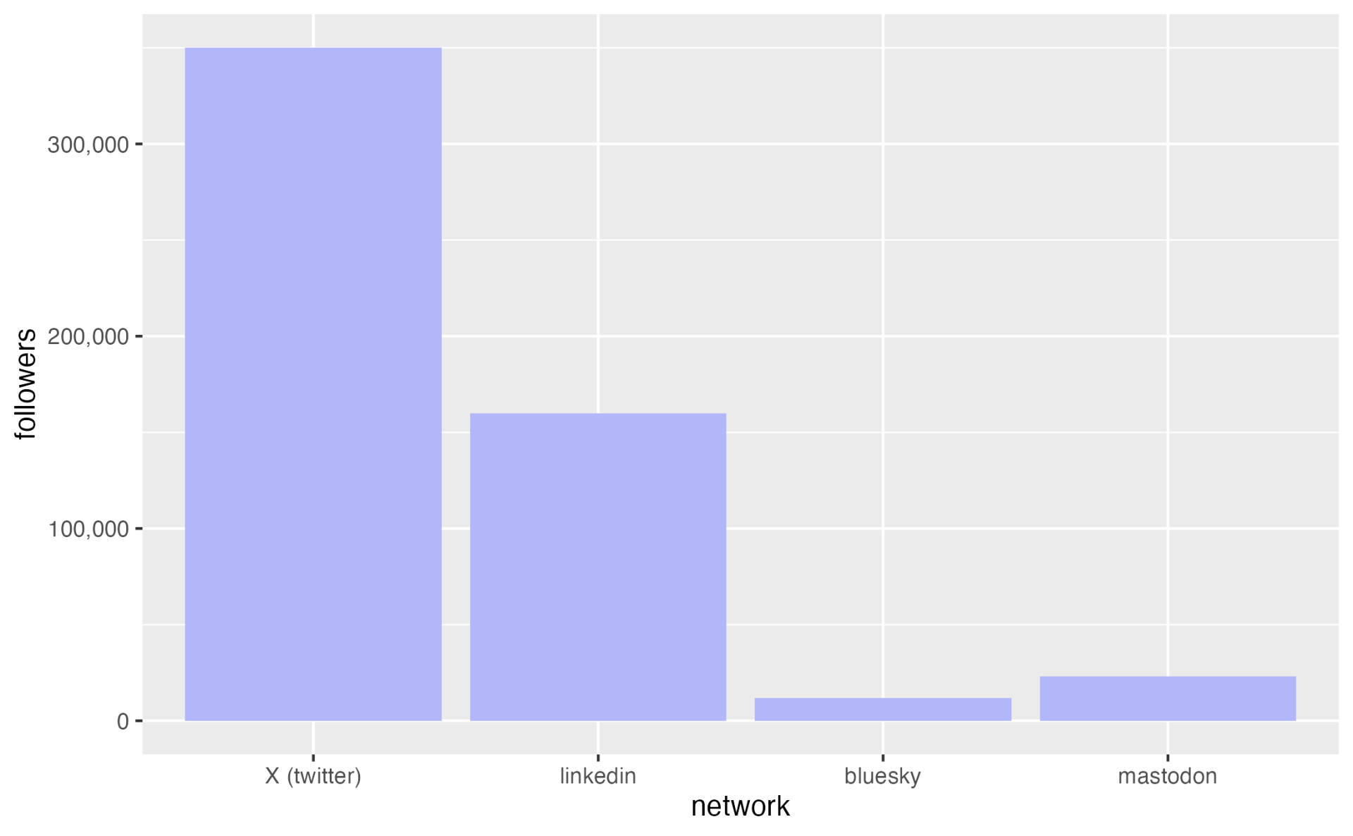
One source of data is how many followers I have on the these
platforms.
Here X (Twitter) shows a notable lead, but I strongly suspect that
many of my followers there are inactive (or bots). Considering I only joined
LinkedIn about a year ago, it’s developed a healthy number.
Given that I decided to look at activity based on my recent posts. Most
of my posts to social media I make across all these platforms, tweaking them
a little bit depending upon their norms and constraints.
For this exercise I took 24 recent posts and looked at what activity they
generated on each platform.
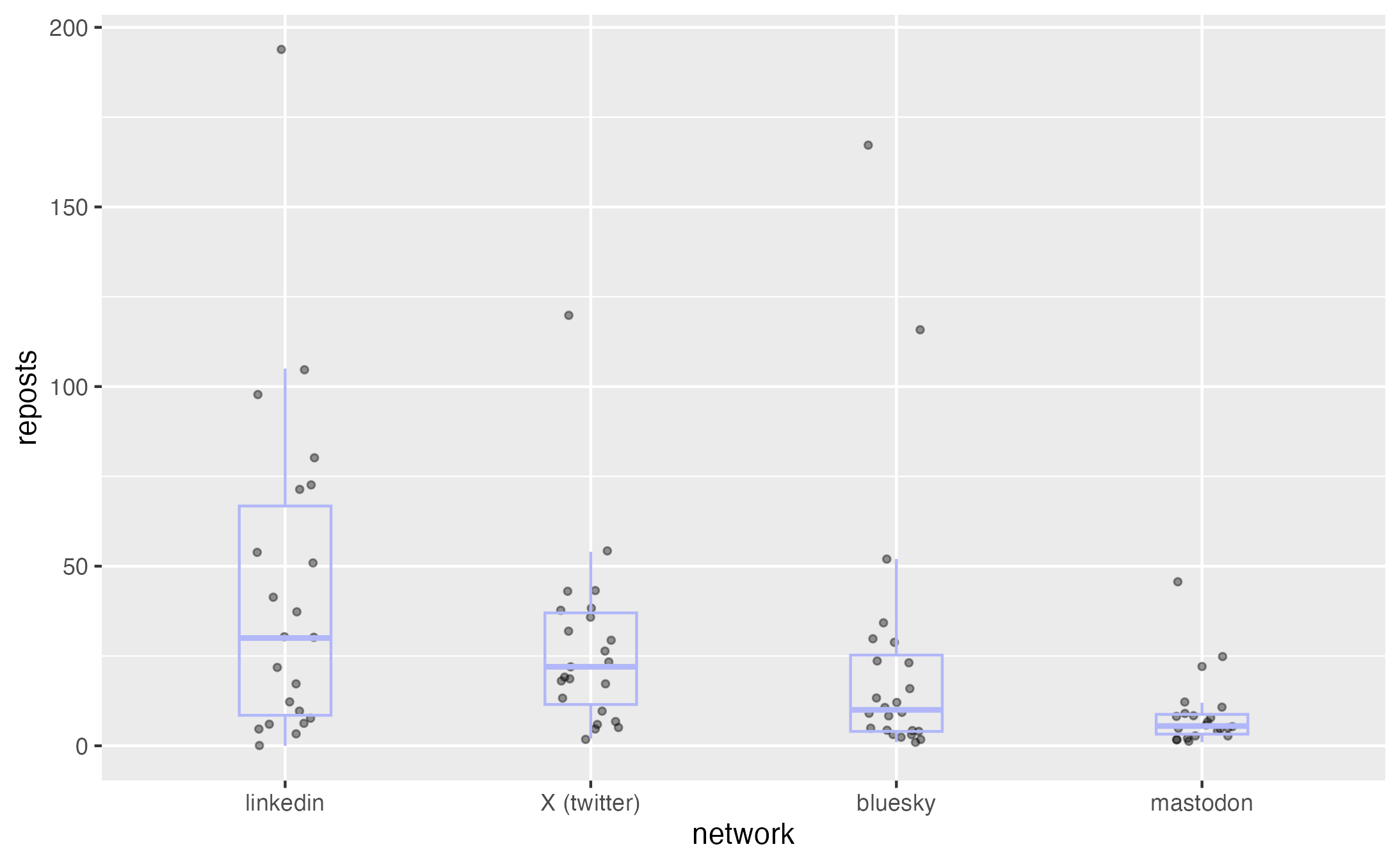
I’ll start with reposts. Although some LinkedIn posts get
reposted more often than X, the median is pretty close. Bluesky trails a bit
behind, but nowhere near as far as the follower count would suggest.
Mastodon, as we’ll see with all three stats, is far smaller.

Figure 2: Plot of reposts
This plot is a combined strip chart and box plot. When visualizing data,
I’m suspicious of using aggregates such as averages, as averages can often
hide a lot of important information. I much
prefer to plot every point, and in this case a stripchart does the trick. A strip chart plots
every data point as a dot on a column for the category. So every dot in the
linkedIn column is the value for one linkedin post. I add some horizontal
jitter to these points so they don’t print on top of each other. The strip
charts allow me to see every point and thus get a good feel of the
distribution. I then overlay a boxplot, which
allows me to compare medians and quartiles.
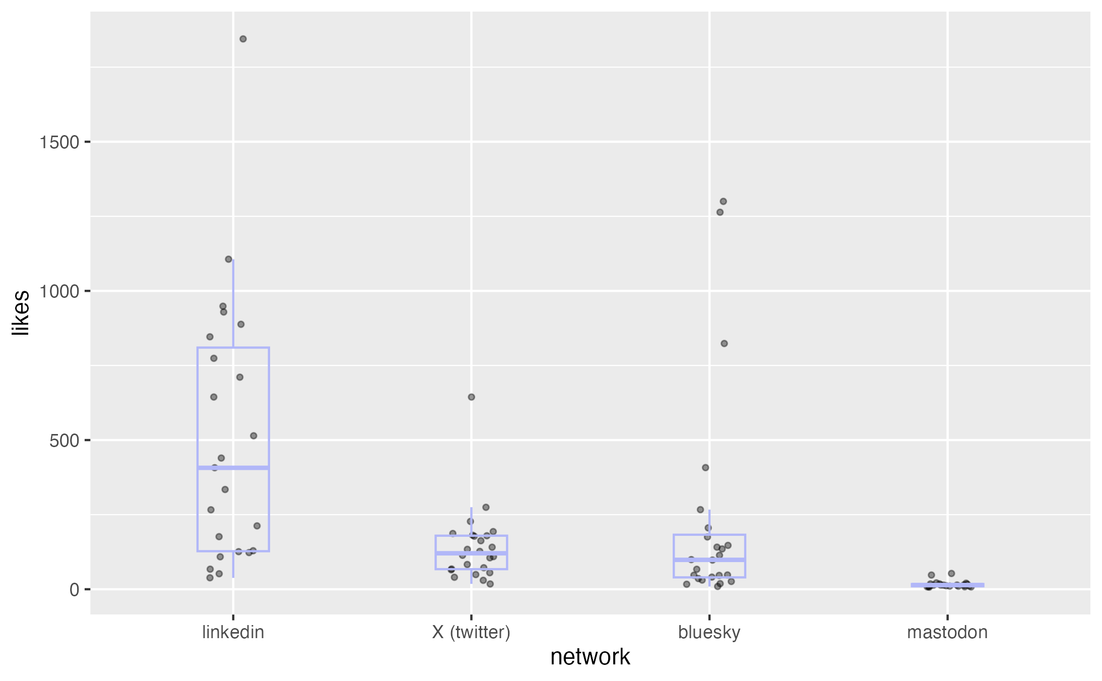
Shift over to likes however, and now LinkedIn is far above the others, X
and Bluesky are about the same.

Figure 3: Plot of likes
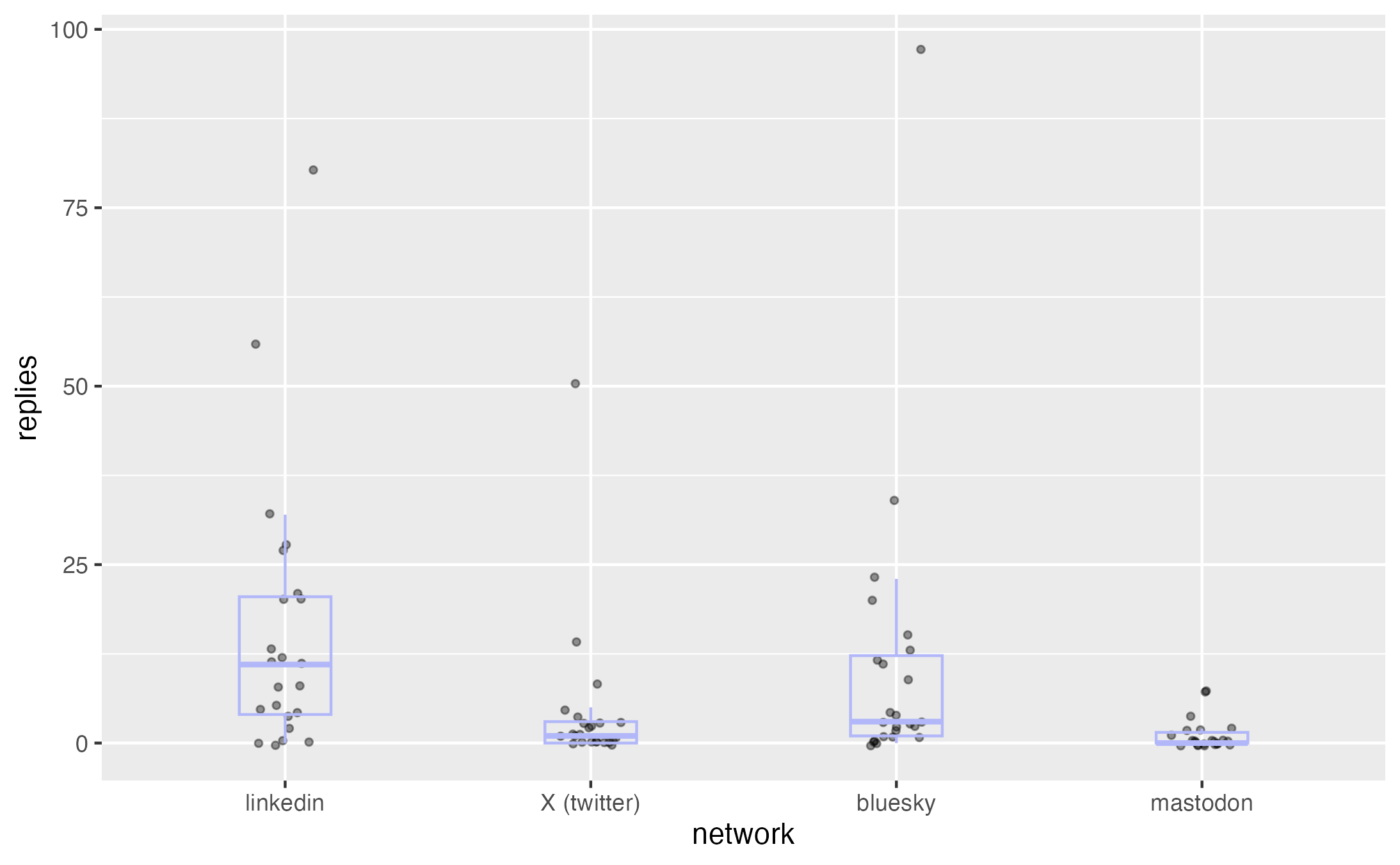
With replies LinkedIn is again clearly
averaging more, but bluesky does have a significant number of heavily
replied posts that push its upper quartile far above the other two services.

Figure 4: Plot of replies
That’s looking at the data, how might I interpret this in terms of the
importance of the services? Of the three I’m more inclined to value the
reposts – after all that is someone thinking the that post is valuable
enough to send out to their own followers. That indicates a clear pecking
order with LinkedIn > X > Bluesky > Mastodon. It’s interesting that LinkedIn
is a more singular leader on likes, it seems both higher itself and X is
lower. I guess that means LinkedIn people are more eager to hit the like button.
As for replies, it’s interesting to see that Bluesky has generated quite
a few posts that have triggered lots of replies. But given that most replies
aren’t exactly insightful, I don’t chalk that up as a positive.
Overall, I’d say that LinkedIn has taken over as the number one social
network for my posts, but X (Twitter) is still important. And Bluesky is by
far the most active on a per-follower basis.

