

Logos have always played a prominent role in branding, propelling forward the very essence of the company or organization to the masses. The success of a logo lies in how subtly it can depict the slogan or theme of the brand. It’s often the core visual representation of a company to its customers.
Scroll down to see the evolution of ten of the world’s most famous logo designs and discover what’s behind some of their hidden meanings.
Amazon logo evolution
The online retail giant takes its name from the largest river of the world and it’s iconic logo brilliantly portrays the very essence of its extensive store directory. Just look at the arrow from ‘A’ to ‘Z’ – it signifies the store houses a catalogue of everything.
Moreover, the end goal for any retailer, especially one the size of Amazon, is always happy customers, hence the arrow ends with a ‘smile’.
1995
When the company began in 1995, the first logo was a monogram of a translucent “A” which was placed on a water texture. Textures were a trend at that time. Designers were exposed to textures through the development of graphics from early computers.
As it was a start-up company, having the business name “amazon.com” and a slogan “Earth’s biggest bookstore” in the logo, showed customers the proposition value of the company.
1998

As the company began to expand so did the logo. Amazon began not only selling books online but other products such as music. The logo had a new slogan to advertise the offering.
The logo became more pleasing on the eye as it was simplified with a white (or transparent) background.
A play on weights on the logotype was considered. Amplifying the word ‘amazon’ with a thicker weight in comparison to the rest of the wordmark emphasized the focal point and companies name.
Introducing a slight amount of color with a gold swish made the logo look like a title (heading) but without it becoming too formal.
2000-present

The logo was shortened by removing the slogan as the company has become more recognizable. The logotype used the same simple and identifiable sans serif type.
Replacing the golden swish with an arrow points from ‘A’ to ‘Z’ symbolizes a customer can find everything. Additionally, the arrow can be seen as a smile to reflect a customer’s experience of shopping on the website.
Google logo evolution
Google’s logo is a wonderful way to show how simply a world-changing message can be conveyed and how you don’t need a whole image for that, or even something too abstract.
These are initially just plain letters, but on further analysis, you can see they feature the three primary colors in a row with a secondary shade breaking the line. It subtly signifies that Google doesn’t always care for the rules and it sets its own guidelines on how to change the world.
1998

This was not the first logo for Google but the first instance where it become more recognizable. The company uses a serif typeface with the iconic four colors (red, yellow, blue and green).
As computers became more popular consumers were excited about the future of technology. A futuristic trend was designed during this era. This is part of the reason the logo looks 3D with a shadow on a white background to create depth.
1999

Different color iterations were produced but it still used the same selection as the previous logo. This color pattern was chosen to focus on the primary colors with just a splash of a secondary color, as “google doesn’t follow any rules”.
The typeface changed to a serif font known as Catull, which made the ‘o’s’ slightly slanted. The letter “e” is also tilted giving a more professional and sophisticated look to the search button. The simplicity and playfulness of the logo stood out from other search engine companies and also allowed the design to be expanded across other industries.
It still kept the drop shadow look and the 3D effect through the use of texture and shading but with a more polished quality.
2013

Removing the drop shadow and textured shaded look, whilst also introducing softer angles, made the logo much more current and followed the flat design trend which was prominent in web design.
The change allowed it to function easier on all devices.
2015-present
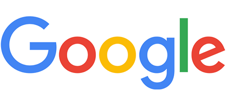
Google’s identity update garnered particular attention in 2015. The biggest changes include the typeface changing from serif to a new sans-serif type called “product sans”. This change made it more accessible and useful to a new class of devices.
It still retains the distinct multi-color sequence and angled ‘e’, however the colors have been adjusted to become more vibrant.
The logo continues to evolve along with Google’s identity to avoid ever being stagnant or old.
For a more in-depth look at the evolution of Google’s logo, check out this article.
adidas logo evolution
The three slants that define Adidas aptly represent a mountain which points to the many obstacles we have to overcome in life. The logo started out with just three stripes, but the clothing company decided to slant them and boom, a whole new amazing meaning.
1967
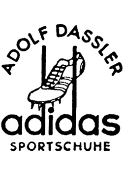
The company was founded in by the Dassler Brothers: Adolf and Rudolf. The company split in two in 1948. Adolf “Adi” renamed the former company as adidas and Rudolf founded a new one, Puma.
It was also the beginning of the three striped symbol. The three stripes can be seen on the footwear illustration but is also implied through the extended stems of the ‘d’s’. Even as the logo evolved the company always remained loyal to the three stripes look.
1971
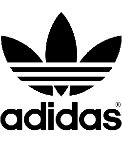
The trefoil logo was introduced showing the expansion of the company into leisure and apparel wear. The trefoil was a visual symbol of the company’s growth in a rapidly shifting market.
The three stripes are still in use to emphasize the adidas brand. It is not only shown across the trefoil but is also evident in the leaves. This is this logo that helped adidas transcend the sporting arena into popular culture.
The typeface was altered to a simple sans serif font and this logo is still used today to represent the adidas Originals collection.
1997-present

This was a radical change from the previous logo but also included the stripes. It kept the stripes but adding an angle to it gave the logo power.
The stripes rotated 30 degrees giving the overall impression of a mountain. The mountain image represents the idea of encouraging consumers to push themselves to their limits.
This logo remains fairly unique in that the logotype and logomark have no negative space in between yet it is still being legible.
2005-present

The adidas logo was further modified to a wordmark which is simpler and more visually distinctive. This logo was the umbrella identity for all the adidas owned brands. The simplicity of the logo suggests the confidence and leadership of the brand.
Still using the three stripes and also kerning the same sans serif typeface makes for a quality logo.
Mercedes-Benz logo evolution
What do you think the tri-star means in the famous Mercedes-Benz logo? Well, it broadly portrays the company’s aim for supremacy in style and quality over sea, land, and air.
1926
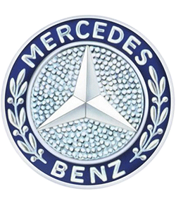
This is when the two companies Mercedes and Benz merged becoming Mercedes-Benz. The main colors were silver and blue and combined elements from both company’s previous logos.
Mercedes’ symbol of the three-point star was used to indicate the motor brand’s dominance over land, sea and air, with production of separate vehicles for all three environments.
The outer rim included the laurel wreaths used in Benz’s previous logo. The inclusion of the wreath reflected the success of the Benz company like the winners of sporting competitions.
The words Mercedes and Benz were also placed in the logo.
1933

The logo simplified dramatically. The laurel wreaths, the outer rim of the circle and the name of the company disappeared. This logo was quite modern for the period which is probably why it is so well praised and recognizable. It was a simple black circle featuring the famous tri-pointed star in the middle.
2009-present

The logo still retains the three-sided star that embodies dominance over air, land and sea. The thin silver circle that encases the star still defines the quality of Mercedes products.
The logo now is often joined by the company’s name either alongside or underneath the emblem.
The signature metallic gray hue represents the class and suave appeal of the products. The serif typeface provides charm and elegance, while also implying authority and power.
BMW logo evolution
Why do you think there are the blue and white quarters in the BMW logo? Well, interestingly, it is nothing to do with the car but instead partly due to their presence to the company’s iconic history in the aviation sector. Yes, BMW used to create aircraft engines during World War I for the German military.
1917

The logo hasn’t much changed since the company was created, using a circular logomark with the abbreviation BMW placed on the top of the circle. The blue and white fields represent the two national colors of Bavaria. A popular theory (that may also be valid) also suggests the white depicts the white propeller blade against the blue sky.
2000-present
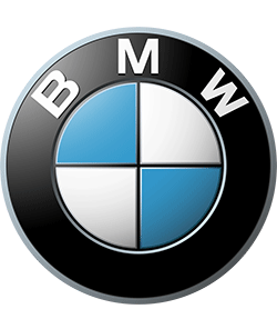
Slight alterations occurred but none dramtically changed the general concept of the design. The borders width of the circle decreased, the gold outlines changed to white and then to silver. The typeface evolved from serif to sans serif, allowing the company to bring the logo into the modern era.
Apple logo evolution
There are many theories surrounding the evolution of the Apple logo design, but the reality is the fruit shape contains a bite to simply provide scale and ensure people don’t think it’s a cherry.
1976

This detailed, almost illustrated, logo was created depicting Isaac Newtown sitting under a tree with the apple about to fall off. It included the company’s name, “Apple Company Inc”.
1976

The first logo didn’t even last a year before it was replaced with a much more ‘modern’design more fitting of a tech company. This logo’s silhouette is now one of the most iconic and recognizable corporate logos in history.
Although many like to think there is a hidden meaning to the ‘bite’ of the logo, such as the play on words (bite/byte), as explained, it was designed so it would not be confused with a cherry.
There was no hidden meaning behind the use of the colors either, only that the green was at the top as that’s where the leaf was. The colors were not to represent the rainbow pattern, simply Steve Jobs wanted it to have color to “humanize” the company.
1998-present

The silhouette was kept the same, but the logo is now known for being monochrome. This enhancement was to signify the sleek and cutting edge products, unlike a rainbow logo which could indicate more warm and fuzzy. Having a monochrome logo also allowed it to be used across many devices without it looking childish. A colored apple logo on your apple laptop doesn’t quite denote the same level of sophistication.
FedEx logo evolution
This is one of the most creative logos you will ever come across and its ingenuity lies in how smartly it has made the best use of negative space. Take a closer look at the logo and you will find a white arrow between the ‘E’ and ‘X’ which represents the speed and precision with which the company has built its delivery services.
1971

The original name for FedEx was Federal Express. The logo was slanted with a different color area of the logo. Using the word ‘Federal’ was to associate the company with the U.S. government, whilst also suggesting it was top of the delivery world. The colours blue, white, and red also reflect the colors in the U.S flag.
1994-present
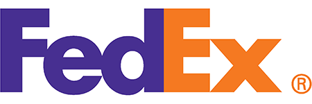
The current logo is one of the most iconic and recognizable of any company in the world.
The change from ‘express’ to ‘ex’ allowed the company to incorporate the negative space arrow, and identify the different sectors of the brand through the use of colors – FedEx Express is orange, whilst FedEx Freight is red.
The unique sans-serif typeface is the company’s own, allowing the negative space of the arrow to work extremely effectively.
Cisco logo evolution
Cisco is the legendary name in designing, manufacturing and selling premium network equipment. No wonder, their logo represents a digital signal that duly imparts the business theme.
But, there is also a dual meaning – The digital signal represents an abstract silhouette of the Golden Gate bridge, the famous landmark from the city where Cisco was founded, San Francisco.
1985

As well as illustrating where the company was founded, by two Stanford University employees, the company’s name “Cisco” is in fact an abbreviation of San Francisco.
1996

The logo evolved to include the company’s name ‘Cisco Systems’. It consisted of the same bridge but with a different silhouette and enclosed in a box. It was first in created in 1990 and was slightly updated in 1996.
The bridge is in negative space and makes the mark look more like a symbol through the removal of the lines that connect the structure, in comparison to the more realistic image from the previous incarnation.
Applying blue to the image and creating a slight hierarchy suggests a shift to a design with a clear association to tech.
2006-present

Still focusing on the original concept of the iconic bridge, this presentation addresses the objectives and ambitions of the company’s vision.
The bridge is simple with only 9 bold strokes. The logotype has removed the ‘systems’ while the typeface has been updated to be all in the same case and height.
The length of the company name makes the logotype look small which allows the bridge shape to be heavy and remain the focal point.
Starbucks logo evolution
1971

The Starbucks Logo is iconic for the mermaid mark, and it even originated as a topless mermaid.
‘The Siren’ came from Greek mythology, with the idea being to capture the seafaring history of coffee and Seattle’s strong seaport roots.
1987
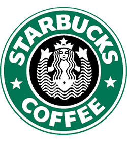
The logo was drastically simplified to become less ‘X-rated’, with the Siren’s hair covering her modesty.
Stars were added to the Siren’s crown and between the logotype, while the switch to green was not only a nod to the Alma Mater of the three founders, the University of San Francisco, it helped imply freshness and growth of the company.
1992

The logo was modified to include a close up of the Siren in the center of the circle and heralded as the ‘welcoming face of Starbucks’.
2011-present

Simplicity was key in this design. The removal of the outer circle and the company’s name was a drastic change from the previous logos. The company stuck with the green but made it vibrant. A more subtle form of the Siren preserves the future of the logo but still pays tribute to the original design.
Reducing the busy aspects of the design, such as two colors to one, removing four circles, and including one star instead of three, helped focus the company more in the lifestyle space rather than retail marketing.
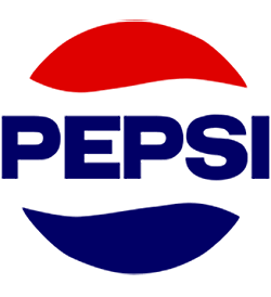
Pepsi logo evolution
Pepsi has seen some pretty drastic changes to its logo over time. Here are some of the major milestones in the history of the Pepsi design.
1898-1961


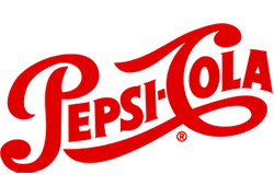
The Pepsi logo was launched in 1898 and used a handwritten, swirly script, font which looked similar to the Coca Cola logo. It also featured the bold red.
1961
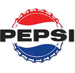
The logo underwent a significant change. The new design had a bottle cap in the background. The colors of the cap became blue and red, whilst the background was entirely white.
The name ‘Cola’ was dropped and has not been used since.
1969
The brand adopted a minimalist approach to reflect society’s radical changes and new technologies. Instead of having the white colour as the background, the white became the outline of the elements.
The typeface was updated, however the familiar shape of the bottle cap with the curves remained.
1991

The elements of the logo were altered so it was no longer a logotype inside the bottle cap. Instead the spherical shape was minimized and placed in the lower right corner.
The word ‘Pepsi’ became italic and placed on the top of the design. The consistent of red and blue colors continued to dominate the logo. The design was created to provide a refreshing and three dimensional look to consumers.
2008-present

The current logo has retained the iconic elements and colours, and has become two dimensional again.
The typeface has changed to lowercase with a slight alteration to the ‘e’. The spherical shape with the white swirl separating the two colours has been suggested to look like a smile.
-
Article contribution by Lisa Smith. Lisa is a designer by profession and writer by choice, she writes on almost all topics but design and fashion are her favorites. When not glued to her keyboard, Lisa also volunteers at animal rescue centers.
Want More?
Rebrands can do wonders for your business, if applied sparingly – Start here if you’re wondering if a rebrand might be in order for your business:
10 Famous Sports Teams’ Logos That Were Rebranded In The Past Year
Four Famous Brands That Should Rebrand To Stay Relevant
When Should You Consider A Rebrand For Your Business?
Instagram’s New Logo – Rebranding Tips And Alternative Designs

Written by DesignCrowd on Tuesday, October 25, 2016
DesignCrowd is an online marketplace providing logo, website, print and graphic design services by providing access to freelance graphic designers and design studios around the world.