Picture a logo so simple yet powerful that it tells a complete story at a glance. Take FedEx’s famous logo. Have you ever noticed the hidden arrow between the “E” and “x”? It’s a clever use of space that subtly represents speed and movement.
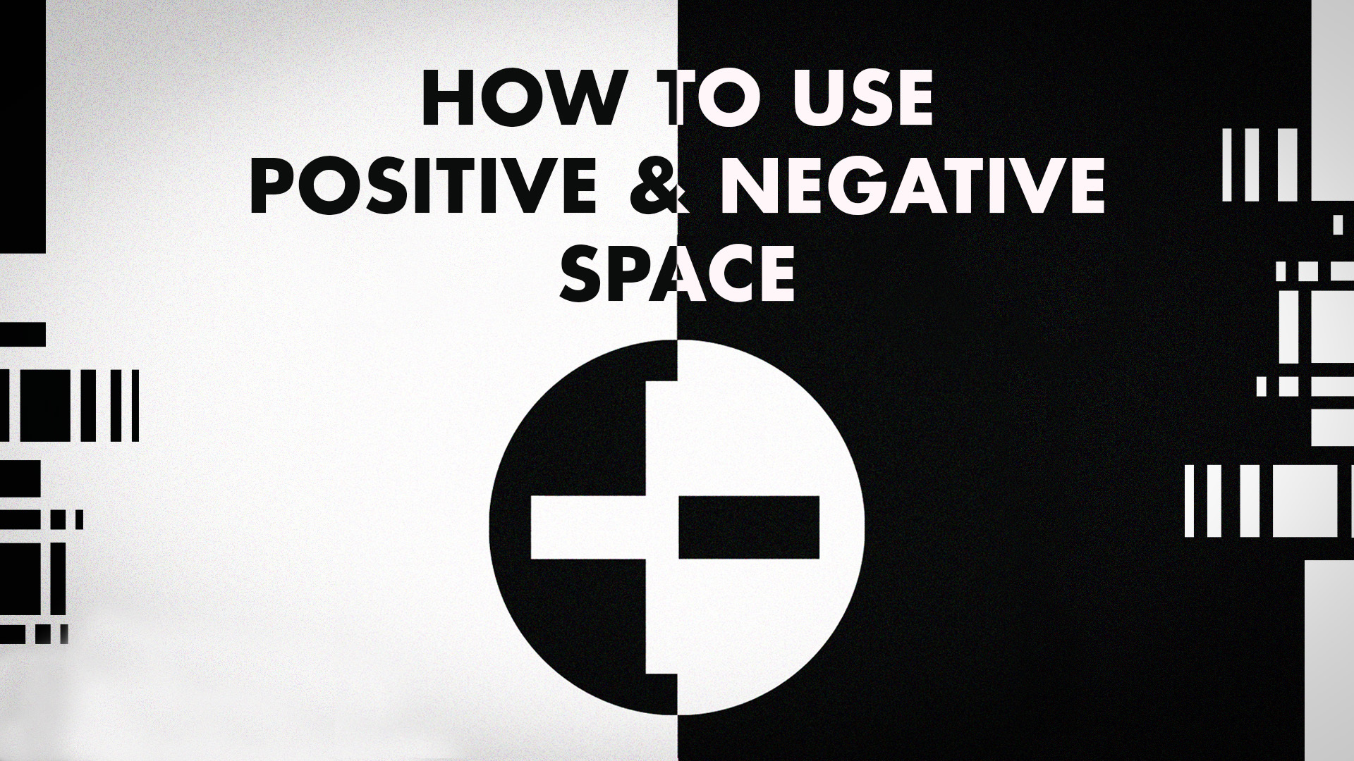
These designs aren’t just visually appealing—they’re smart. They use positive and negative space in perfect balance, making them striking and memorable.
Whether you’re a designer, illustrator, or brand strategist, understanding how to use space effectively can take your work from ordinary to unforgettable.
Let’s explore how positive and negative spaces create powerful visual identities.
Understanding Positive and Negative Space

You must understand the relationship between positive and negative space to create a visually compelling design. Learn more about these two:
Positive space
Positive space refers to a design’s primary subjects or elements—the areas that immediately catch the eye. This could be a logo’s central shape, an illustrated character, or bold typography. It’s what forms the recognizable part of an image.
Key elements of positive space
- Focal point: The main subject or object that draws attention.
- Defined shapes: The contours and structures that form a recognizable image.
- Color and texture: Often filled with bold colors or intricate details to enhance visibility.
When to use positive space?
- If you want to create strong, dominant visuals that immediately grab attention
- In branding, when you want the logo or symbol to be clear and instantly recognizable.
- To establish a sense of weight, presence, or authority in a design.
Negative space
Negative space is the area surrounding and between the main elements. While often overlooked, it plays a crucial role in defining and enhancing the composition. It can even form hidden images, adding depth and meaning to a design.
Removing unnecessary backgrounds is one of the most effective ways to create substantial negative space. A clean background makes the main subject stand out, making the design more transparent and impactful.

BrandCrowd’s background remover makes this process quick and effortless. With just a few clicks, you can remove backgrounds instantly, leaving you with a polished, professional-looking design.
Key elements of negative space
- Framing and contrast: Helps separate the subject from the background.
- Balance and readability: Ensures a composition isn’t too cluttered
- Hidden imagery: Can subtly communicate additional messages within a design.
When to use negative space?
- To create clever, multi-layered designs with hidden meanings.
- Minimalistic branding, allowing simplicity to make an impact.
- To guide the viewer’s eye naturally through a composition.
How To Use Positive and Negative Space to Establish Narrative Elements
Here’s how to use positive and negative space for your design:
1. Add hidden messages
 Source
Have you ever noticed the arrow in the FedEx logo or the bear in the Toblerone logo? These hidden symbols aren’t just cool details—they add meaning and make the design more memorable. Clever use of negative space can turn a simple image into a story, making people take a second look.
A great example of this technique is incorporating shapes like Letter A into logos or illustrations using negative space.
By using negative space creatively, you can add a surprise element to your designs. It keeps things clean while making your audience feel like they’ve discovered something special.
2. Direct the eye where you want
Good design isn’t just about looking nice—it’s about guiding the viewer’s focus. A well-balanced mix of positive and white space helps direct attention to the most critical parts of your design, whether it’s a logo, illustration, or website layout.
When you control where people look, your message becomes clearer. Negative space can be a tool for highlighting what really matters.
3. Set the right mood
How you use space in a design can completely change how it feels. Bold, busy designs with lots of positive space feel energetic and powerful, while simple, open designs with more negative space feel calm, elegant, or mysterious.
That’s why high-end brands use lots of clean, open space in their logos—it creates a sense of luxury. On the other hand, sports and tech brands often choose strong, bold designs to show power and movement.

Another great tool for working with negative space is Design.com’s Background Remover. This easy-to-use tool instantly removes backgrounds from images, making your designs cleaner and more professional.
4. Create optical illusions
 Source
Sometimes, the best designs play tricks on your eyes. Optical illusions happen when positive and negative spaces work together in unexpected ways. Think of designs where two images exist in one—like the famous Rubin’s vase, where you see both a vase and two faces.
These designs grab attention because they make people stop and think. Whether it’s a logo, a book cover, or an ad, using space cleverly can make your work more fun and memorable.
Check out some logo examples from BrandCrowd:

Classic Table Furniture by BrandCrowd

Hexagon Eye Optical Illusion by BrandCrowd

Contact Lens Optical by BrandCrowd
5. Keep it clean and readable
Ever seen a design that just feels too crowded? That’s what happens when there’s not enough negative space. Negative space keeps things straightforward, easy to read, and visually balanced.
Logos, websites, and posters all rely on space to be effective. Giving your design some breathing room will make it look better, feel more professional, and be easier to understand.
Applying Positive and Negative Space in Different Illustrative Contexts
Positive and negative space play a key role in different types of illustration, helping to create balance, focus, and storytelling in unique ways. Here are some examples to consider:
1. Editorial illustration
Editorial illustrations often simplify complex ideas. Creatively using negative space can enhance the storytelling aspect, making an image both thought-provoking and engaging. A well-placed silhouette or contrast can add depth without overcrowding the page.
For designers looking to streamline their creative process, tools like an AI Poster Generator can help generate visually striking compositions with well-balanced negative space

Image by Selwyn Legaspi
2. Children’s book illustration
Readability and visual clarity are essential in children’s books. Positive space is often vibrant and playful, while negative space helps define characters and settings in a way that keeps young readers engaged.

Children’s Book by tubikarts
3. Sequential art (comics and graphic novels)
In comics, balancing positive and negative space is key to guiding the reader’s eye from panel to panel. Negative space can be used strategically to separate action sequences or enhance dramatic pauses.

Illustration by Selwyn Legaspi
4. Character Design
In character design, well-balanced positive and negative space ensures an unmistakable silhouette, which is crucial for making characters memorable and recognizable from a distance.

Source
Conclusion
Mastering positive and negative space is about more than aesthetics—it’s about storytelling, clarity, and engagement. Whether crafting a logo, illustrating a book, or designing a character, understanding how space shapes perception will elevate your work.
So, next time you create, take a step back. Look at what’s there, but also what’s missing—because sometimes, the most potent messages lie in the spaces between.
Read More on Logo Designs Here:
Written by DesignCrowd on Thursday, April 3, 2025
DesignCrowd is an online marketplace providing logo, website, print and graphic design services by providing access to freelance graphic designers and design studios around the world.

