

The navigation bar, or nav bar, is a crucial element of web design, as it literally lets the user navigate through your site. It’s perhaps the most important item in terms of UI/UX design, as a badly designed nav bar makes the experience of using your website clumsy and disengaging. Rather than just a map, you should think of your nav bar as part of your overall web design and make sure it’s not only at its best for functionality, but also display.
Here’s a bit of guidance on how you can get the most out of this often overlooked design feature:
Cardinal Rules
- The navigation bar should be simple and legible.
- The navigation bar should be clear. That’s what makes it good at navigating.
- The navigation bar should be consistent across all pages of the website. A map is no good if it keeps changing, unless you’re at Hogwarts.
Starting from scratch
If you’re creating a brand new nav bar for a brand new website, start off by drawing up an information tree – kind of like a brainstorm. This is quick and easy to do. Just figure out every single page and subpage your website will need and draw a diagram of how they relate one another.
Information Architecture Tree
This will give you a guide on how the nav bar should be laid out, which will help you decide what type of nav bar to design.
Providing visual orientation in your navigation bar
The navigation bar should provide tools to help the user find their place on a website. This can be done in several ways:
Stylise your navigation bar
Navigation bars can be a great part of your design. Some suggestions for keeping them stylish as well as useful could be:
- Use a solid background color for clear legibility.
- Try a transparent background to play with layers on the page and create relationships between elements.
- Lay shadows behind the navigation bar to create depth.

Web Design for SIXPENCE Store – Fighter

Web Design for FCINQ

Web Design for Maximilla
Types of Navigation Bars
Horizontal Navigation Bar

Design Element of a Horizontal Navigation Bar
What is it?
A horizontal nav bar usually takes up the full width of a page at the top of a website. Currently this is probably the most common nav bar out there.
Why choose it?
Since it’s so common, UX will be enhanced as users will instantly know how to navigate the page. It’s usually quite sleek and not very invasive, giving you maximum space to put your content front and center. It’s also very agreeable to responsive design, offering a great experience across all types of screens.
Generally a horizontal nav bar lends itself most to pages with fewer subpages, as the more items you try to fit at the top, the harder it will be. Good clear fonts can help make the most out of your space.
Example 1 – Joha

Web Design for Joha
For this horizontal navigation bar, the target audience is parents buying clothes for their young kids. Having it at the top of the website makes it easier to navigate. Take notice of the little animations on each tab.
Example 2 – FH Studio

Web Design for FH Studio
Here the horizontal navigation bar is at the bottom and works well as it ensures the focal point is the high resolution images and videos.
Horizontal (fixed) Navigation Bar

Design Element of a Horizontal (fixed) Navigation Bar
What is it?
Same as the horizontal nav bar, except when the user scrolls down, the nav bar stays fixed in place at the top of the screen, making it perfect for long–scroll pages.
Why choose it?
This is perfect for long–scroll pages because it gives users maximum clarity and convenience when navigating a website. This feature also lets you play with UI, having the nav bar move depending on where you are in scrolling and creating a relationship between the layers of the website through your design.
Example 1 – 88& 90 Lexington Avenue

First Fold for 88 & 90 Lexington Avenue
When Scrolling for 88 & 90 Lexington Avenue the navigation bar is in the middle of the first fold until scrolling, when it moves to the top and stays there.
Example 2 – Quay Restaurant

First Fold for Quay Restaurant
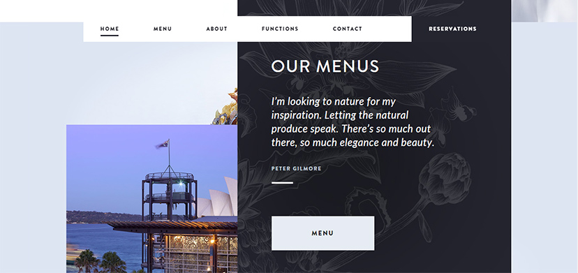
When Scrolling for Quay Restaurant
This design is slightly unconventional, as the navigation bar slightly changes when scrolling down, but not dramatically. It also moves from the bottom to the top of the page.
Vertical Navigation Bar

Design Element for a Vertical Navigation Bar
What is it?
A vertical nav bar is usually positioned to the left of a web page, but can occasionally appear on the right. It’s usually there to accommodate a larger number of subpages and normally uses a smaller font.
Why choose it?
If a website has a lot of sub–navigation happening within each title page, a vertical nav bar might help keep it all easy to travel through. Be careful though, a vertical nav bar will take up more space than the horizontal, so make sure you make it count and give it a great look that furthers your brand. Less content area also might involve more scrolling, so remember to keep not only the nav bar but also each page as easy to navigate as possible.
Example 1 – White Frontier Brewery

Web Design for White Frontier Brewery
Vertical navigation bar takes up the 100% height of the page and has a great relationship with the other design interfaces. You don’t need to scroll, which makes this a friendly UI/UX experience
Example 2 – Panche

Web Design for Panche
Taking it to a new level, this website subscribes to the long scroll trend, so they used vertical text on a vertical menu.
Hamburger Menu

Design Element for Hamburger Menu
What is it?
Made popular through mobile devices, the hamburger menu is increasingly breaking into desktop design as well. The hamburger menu allows you to hide content of the nav bar until you either move your cursor over it or click on it. It’s usually signified by three vertical lines representing a burger, hence the name.
Why choose it?
This is the perfect nav bar to put all your content front and center, taking up absolutely minimal space for admin stuff like navigation. It’s also perfect for smaller screens, which it was initially intended for after all. It’s definitely the most modern option out there, making it appeal to young, techy audiences and possibly causing issues for occasional users and older users not as familiar with this type of innovation. So know your audience before implementing.
Example 1 – Adidas Originals Tumblr Blog

Homepage for Adidas Originals Tumblr Blog

Hamburger Menu Pops Up for Adidas Originals Tumblr Blog
Adidas uses creative branding, including diamond shapes to evoke the usual three horizontal rectangles that make up the hamburger menu. The menu pops up on the left after clicking the hamburger menu.
Example 2 – Laser

Homepage for Laser

Hamburger Menu Pops Up for Laser
This website changes the conventional hamburger icon to a lightning bolt, making it even more important that its audience understand the concept of hamburger menus to be able to find it. Once clicked, the menu extends across the entire page, making it amazing for mobile devices.
Example 3 – Rally Interactive

Homepage for Rally Interactive
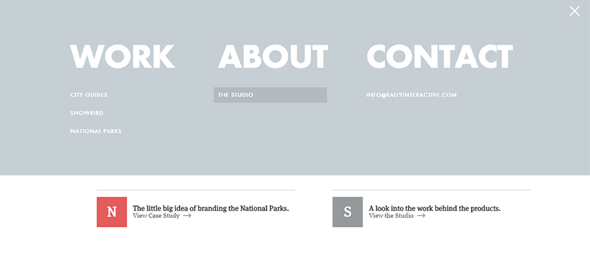
Hamburger Menu Pops Up for Rally Interactive
A more interactive hamburger menu. At first it looks like an ordinary hamburger menu. However, once clicked it beautifully ties the website’s background to the pop–up menu.
Branching out
After choosing the position of your navigation bar, go back to your tree. Will your nav bar have sub categories, if so do you want them to look like? If yes, how many tabs will you have? How would these sub categories be positioned? Always try to think how sub-categories apply to main tabs, to make sure nothing gets confusing.
While you want to be clear, you also don’t want to bombard the user with too many options, so make sure each subcategory is truly necessary. Check out these examples:

Web Design for CLEVER°FRANKE
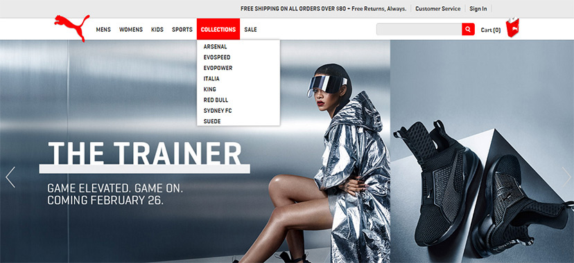
Web Design for Puma

Web Design for UFC Gym
Be unconventional
Don’t be afraid to play around a bit. Nav bars don’t have to be boring web features you just have to have. They can be a real focal point of an outstanding web design, both beautiful and ingeniously functional. Trying new things is the best way to come up with truly inspiring products, so get your creative juices flowing.
The only thing to remember is to always make sure users will understand what you’re trying to do. If users don’t know how to navigate your nav bar, it has failed.

Web Design for SolelilNoir

Web Design for Andrea Brugi

Web Design for When Pigs Fly
Want More?
Great digital design is about much more than just beautiful images. Learn how to navigate it here:
The Top Web Design Trends Set To Dominate 2016
5 App Design Tips to Get You Ready for the Apple Watch
User Interface Tips for Good Mobile App Design

Written by Jane Murray on Thursday, January 19, 2017
Jane Murray is a freelance copywriter based in Sydney. Apart from writing up a storm for the DesignCrowd blog on anything from logo design to Michael Jackson’s shoes, she enjoys reading literary science fiction and hanging out with most animals except wasps. Get in touch via LinkedIn.