Hi Codrops community! My name is Andrea Biason, and I’m a Creative Frontend Developer currently living in Brescia. I spend my days at Adoratorio Studio, where we create award-winning interactive and immersive experiences by combining strategy, design, and technology.
Today, I’d like to present four diverse projects that showcase our approach and vision of what a web experience can be.
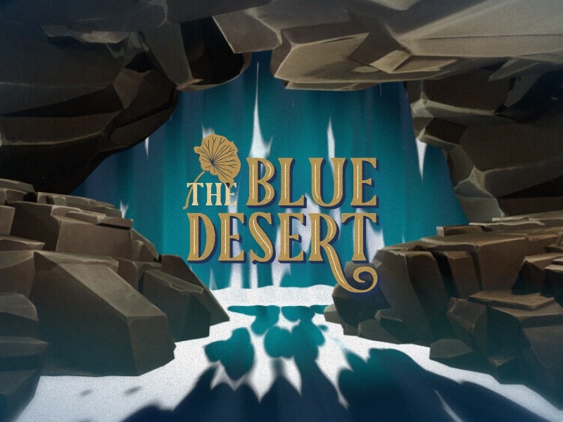
The Blue Desert is an R&D project developed to explore new ways of conveying information typically confined to PDFs, such as Global Impact Reports and corporate press releases.
We strongly believe in the power of storytelling to communicate data that might otherwise be overlooked — yet is truly future-defining — and we wanted to share that with the world.
The experience presents two narratives:
- A sci-fi overarching narrative that follows a wanderer’s journey through his devastated world, forever altered by a catastrophic desertification phenomenon.
- A data-driven narrative revealed through pins scattered across the experience, comparing the Climate Change Goals set by COP21 with the current progress — and shortcomings — we’ve made as a species.
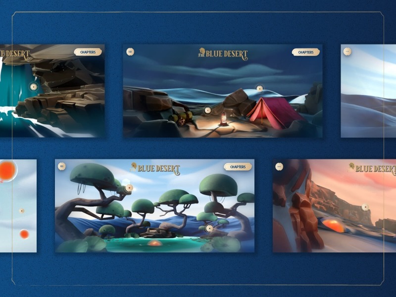
While creating The Blue Desert, we aimed to maintain an immersive, sand-inspired aesthetic that complemented the narrative and setting — from the color palette to the font choices and design elements. This visual continuity is evident in everything from the smallest icons to the most noticeable transitions, and especially in the brushed, soft, and warm style of the 3D models that define the entire experience.
The smooth camera movements guiding the user through the various scenes were studied in meticulous detail and often refined throughout the development process.
We believe that attention to the smallest details is what makes or breaks an immersive experience — and there are many we’re particularly proud of. Each scene offers a unique interaction, such as the rapid flow of a waterfall, the blooming of flowers on tree crowns, or the rejuvenation of the blue desert when touched by the “Komai” blobs.
When it comes to overall navigation, we’re always struck by the profound, AI-generated voice-over — carefully refined by human hands — paired with the original soundtrack and a rich variety of sound effects tailored to each scene.
One final element we particularly love is the moment you break through the clouds at the start of the experience and arrive at the wanderer’s campsite. It immediately sets a deeper level of immersion from the very beginning.
Challenges
The wanderer’s aphorism at the beginning of the experience reflects the project’s learning journey: “The more we know, the more we realize we don’t know.”
And that’s exactly what we found ourselves grappling with throughout the creation of this unique digital experience.
The main challenges we faced included:
- 3D challenges: Coordinating multiple scenes in a continuous flow, ensuring smooth navigation, and optimizing exported assets. We also had to manage the project’s large scale — particularly handling cameras, backgrounds, and high-quality textures positioned close to the point of view.
- Development challenges: Maintaining a consistent frame rate for users by implementing a dual optimization process for both desktop and mobile, along with leveraging Three.js’ frustum culling. The 3D and development teams worked closely together, experimenting with and implementing InstancedMesh, with a particular focus on Shader Materials and Vertex Shaders.
Personal Notes
In terms of R&D, The Blue Desert was definitely the most challenging project we engaged with in recent memory. This isn’t only true in terms of (heavily) expanding our understanding and knowledge of optimization and 3D/WebGL, but also in polishing (and in the beginning, often reworking) the art direction, camera movements, and not falling into the pitfall of “wanting every random idea to make it to the final experience.”
Given that the project was pretty much carried out in parallel between the 3D and Dev departments, the first phase for both teams consisted of a wide variety of specific experimentations that lasted from a few days to a week, in order to fully master — and then be able to customise to our needs — a variety of technical specifics, from texturing, UV map creation, and modeling, to understanding the shortcomings of optimisation tools like glTF-Transform, as well as specific tests on shaders and animations. The biggest lesson and achievement was definitely structuring (not without hardships) a smoother, more natural collaboration and hand-over process between the two teams.
Another unexpected outcome, given the unusual pairing of content and approach, was the audiences this experience gathered interest from: initially (and expectedly) from the design community, who enjoyed the story as well as the imaginative world it takes place in, the curated 3D models, and the original themes we produced for the experience. Secondly (and a bit unexpectedly), from many brands that took notice and reached out, finding the approach fresh and engaging as a way to highlight years of efforts in achieving higher sustainability standards.
Tech Stack
Vue.js, Three.js, GSAP, Howler.js, Blender
Ariostea is a brand of Iris Ceramica Group, one of the world’s largest ceramics producers and innovators. What initially started as a simple request for a new corporate website quickly evolved into a complete overhaul of their brand, positioning, and digital presentation.
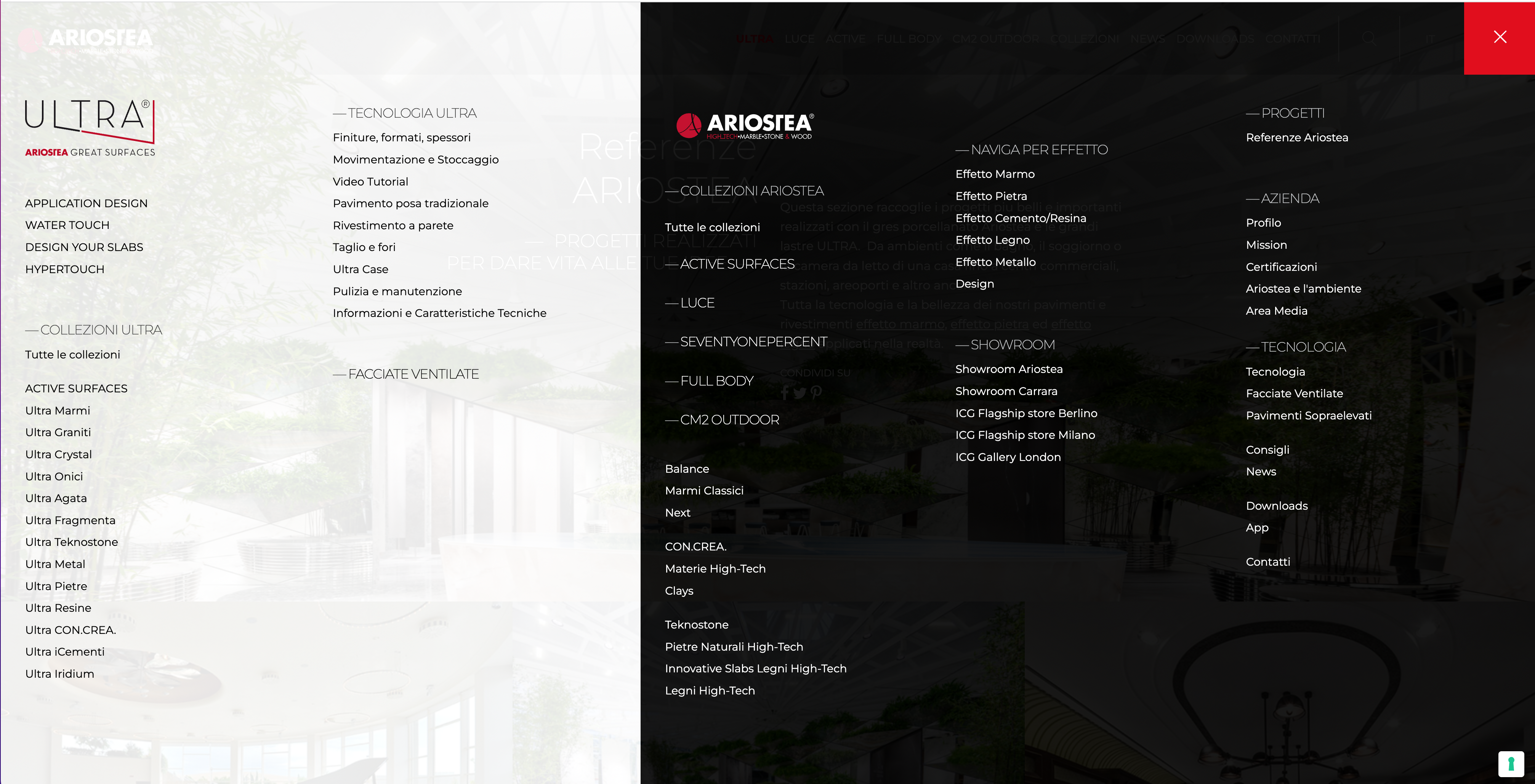
The first step in the project was completely revisiting the former sitemap (which consisted of more than 40 first-level pages — a mess we had never seen before), reducing it to eight main pages.
What makes us particularly proud of this work is the thorough implementation of the brand design elements — most notably the smooth-cornered, rectangular shape of Ariostea’s slabs, which became a cornerstone of the design system — as well as the integration of the client’s PIM to automatically source and update product data, textures, 3D models, and the catalogue.
While corporate websites generally tend not to stand out as much as WebGL experiences or interactive experiments, we find great satisfaction in crafting well-polished, strategically sound, and functional platforms that — like in Ariostea’s case — will stand the test of time and may serve as a foundation for bolder experiments to follow, as we’ll soon see with ICG Galleries.
Challenges
Approaching the design and development for Ariostea, we knew we would face three main challenges. Let’s delve into them one by one:
The sheer scale of the project
As mentioned above, the gargantuan amount of information presented on the website proved to be the first challenge. While a careful restructuring streamlined the UI and header — going from 40-something elements (I’m still in disbelief typing this out) to around 8 — the information itself wasn’t going to be deleted. Having longer, richer pages therefore meant creating a more diverse array of modules working in unison, featuring a variety of image and text carousels to better organize the content consumption.
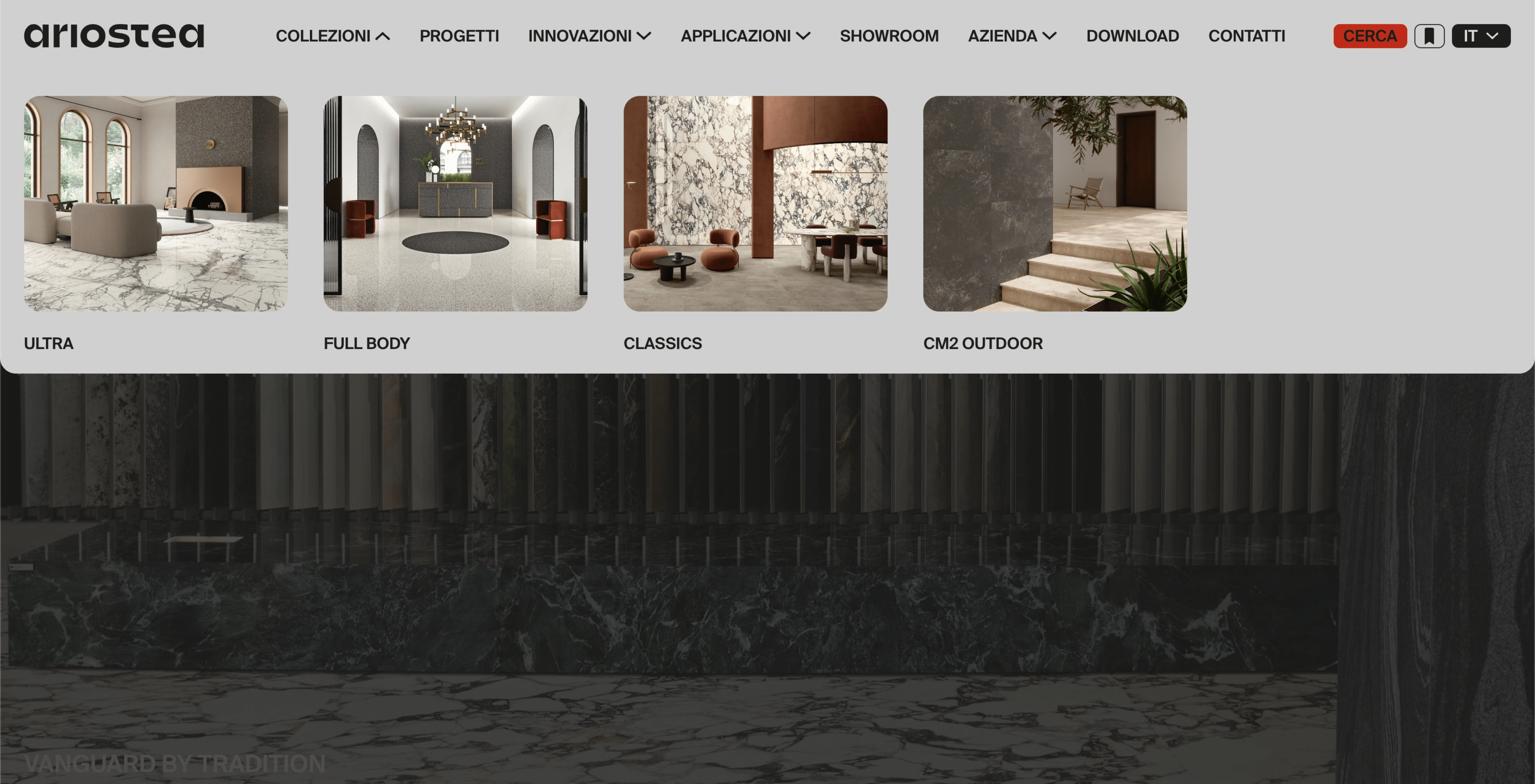
This was only the first step, as the richest section of the website was (who would’ve thought) the product catalogue — featuring more than 1,500 unique products.
Our main objective for the “Collections” page was to avoid overwhelming the user with such a diverse selection, which was also arbitrarily divided from a business — not user — perspective. We therefore created a progressive filter system, clearly displayed at the bottom-center, with intuitive options tailored to user needs such as appearance, application, and material size.
Finding a distinctive element / module / page that would take the project a step further
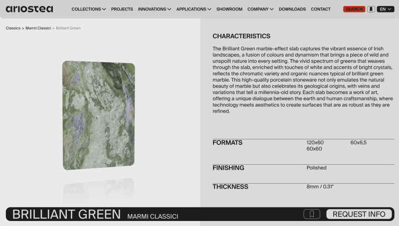
While integrating the brand guidelines into the design system as seamlessly as possible, we knew we wanted to design a single page that would set Ariostea apart — something that would act as a memorable visual for all users. That could only be the product page.
The design we chose to pursue presents an initial, card-like view featuring a texture preview, main data such as description and formats, and a sticky component showcasing the product name, collection, contact CTA, and the option to add the product to a wishlist.
The texture preview was integrated with a savvy, highly optimized WebGL, generatively sourcing from the client’s PIM and presenting an authentic slab, just like those seen in their showrooms.
Working in tandem with the brand’s IT to fail-proof the PIM connection
Given our extensive expertise in custom development and WebGL, as well as modular, consistent productions for corporate websites, the biggest challenge we faced was definitely coordinating and working in tandem with Ariostea’s technical team to smoothly integrate their PIM — a challenge that wasn’t accomplished without a wide range of creative solutions and nerve-wracking brainstorming sessions!
Personal Notes
Ariostea was our first time creating custom APIs to connect with the brand’s PIM — something that proved useful later on for developing other, more experiential projects for the group. Additionally, the delicate tuning of multiple animations to achieve a cohesive experience, with a strong focus on UX and content consumption rather than flashy, explosive transitions, was a careful effort that often goes unnoticed.
Tech Stack
Vue.js + Nuxt.js, Three.js, GSAP, Blender, WordPress
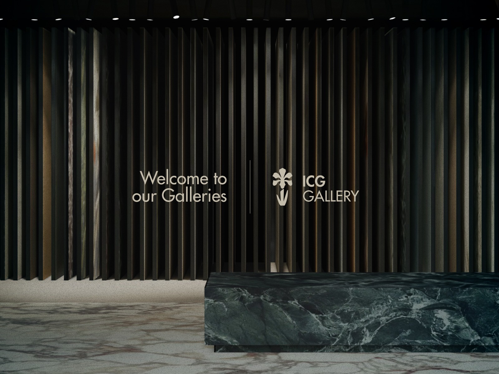
Iris Ceramica Group is one of the world leaders in ceramic production, with an ever-growing number of stunning showrooms around the world.
ICG Galleries are designed to showcase the breadth of the group’s products, brands, and innovations — simulating living environments, presenting new collaborations, and hosting talks and events.
Formerly represented only on the main company website, the objective of the immersive experience was to present ICG products in a contextualized setting, while also showcasing — through 3D and animations — the wide array of innovations and technologies developed by the company for ceramic surfaces. This idealized version of the Galleries was something the company had long been hoping to achieve digitally.
Based on three floors that highlight the group’s Values, Products, and Creations, the experience begins with a slider displaying the three isometric floor plans, allowing the user to start their journey freely from whichever floor they find most enticing.
While isometric views have been used in similar experiences before, for this project we were committed, first, to achieving a distinctive, warm, and refined art direction that embodied the group’s positioning and products — and second, to implementing them directly in the WebGL scene, rather than simply using images.
Each of the floors presents a custom-designed (and engineered!) space, beautifully adorned with surfaces and interior design elements from ICG — a process that, due to its level of detail, required painstaking shoulder-to-shoulder collaboration with the client. Animations were also created for each of the pins, ranging from simpler ones — like a selection of slabs being highlighted in the Material Library — to more advanced ones, such as the Caveau revealing itself behind the Vault, or a listening room coming to life on the ground floor to showcase the “Hypertouch” technology.
Given the numerous artistic and design collaborations the Group engages in, we also added a “bonus” floor — the Pop-Up Window — where a new setting or collaboration can be showcased every few months. We like this touch, as it allows the experience to evolve over time, not only in its more information-oriented pages.
The experience also includes two editorial pages: one showcasing every ICG location around the world, and the other highlighting the events organized at those locations.
Challenges
When proposing this project to the client, we knew it was something they hadn’t considered (or even thought possible!) before that moment. We also knew we were asking them to take a leap of faith, to some extent.
Being launched for the 2025 Milan Design Week (yes, you’re the first ones seeing this!), we’re incredibly proud to show how — through strategy, creative alignment, and close collaboration with the client — truly experiential and visually stunning results can be achieved, even in the B2B space.
Personal Notes
The final product we achieved with ICG Galleries is the result of many learnings from previous experiences — particularly in terms of WebGL experimentation — as well as a stable, proven tech stack and a well-oiled collaboration between the Dev and 3D teams.
Technically speaking, we’re very proud of the smoothness of the camera scrolling, as well as the synchronization of the pins with the 3D environment and its connected HTML overlays.
What definitely pushed us was adding a variety of animations to every interaction — from the technologies to the living spaces — creating an experience that didn’t feel like a static image, but rather a living, breathing space.
Tech Stack
Vue.js + Nuxt.js (SSR), Three.js, GSAP, Blender, WordPress
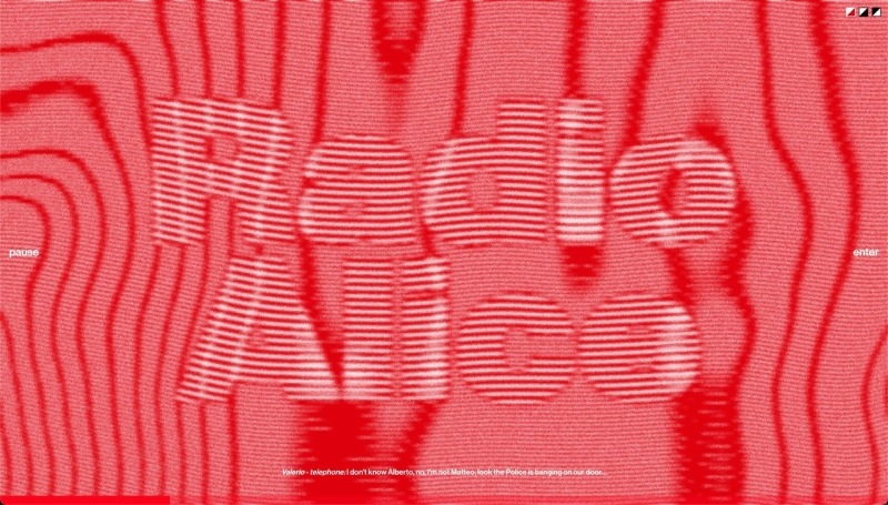
Emerging from the politically charged atmosphere of Bologna in the late ’70s, the Intrusion Project serves as a living tribute to Radio Alice — a pioneering force in the free radio movement that sparked a cultural revolution.
A project born from passion, it features seven audio-reactive shaders designed to amplify the powerful tracks of six genre-defining Italian underground artists, who reinterpreted the recording of the free radio’s final 23 minutes before it was broken into and shut down by police in 1977.
While designing the Radio Alice experience, we had two certainties. Design-wise, we wanted to reverse our usual approach by inviting members of our creative team who are typically less tied to digital to lead the design — intentionally foregoing recognized (and self-imposed) UI/UX standards in favor of a bolder, grittier experience.
Conceptually, we wanted to create an incisive moment that spoke directly to the gut of users, but we were also dead set on not letting the design and visuals overshadow the strong, generational narrative the project conveyed.
The design employs a brutalist aesthetic that emphasizes raw, unpolished elements — mirroring the disruptive nature of the radio station itself — while bringing the archival sounds of Radio Alice to life in a visually dynamic environment.
By creating a space where users can interact with and connect to the past, the site aims to embed the rebellious spirit of Radio Alice into our collective consciousness. The goal is to leave a trace as indelible as the events of 1977 themselves, encouraging new generations to absorb, reflect, and find inspiration in the courage of those voices.
Challenges
The first task for the project was defining a cohesive and scalable art direction for the seven audio-reactive shaders, tackled by our Interaction Designer in collaboration with the creative team. Once we had defined the visuals, the next challenge was transforming the source audio into texture via FFT (Fast Fourier Transform), an algorithm that breaks sound down into its individual frequencies, allowing our visuals to be influenced by a variety of inputs instead of just the combined track.
As always, when working on the web, optimization was also a key focus — aiming to create the lightest possible shaders that could perform well across all kinds of devices.
Taking a step back from the technical elements of the website, Radio Alice was one of the first opportunities for our Development team to implement shaders they hadn’t directly developed themselves, leading to a smoother collaboration with our Interaction Designer.
Personal Notes
We are particularly proud of the audio-reactive shaders. These not only create a mesmerizing visual experience synced to historical broadcasts but also embody Radio Alice’s chaos and creativity.
A detail we’d like to highlight is the ability to switch the experience’s color palette between three versions. The reason behind this choice is actually quite simple — and a bit childish: while the iconic red is how we showcase the project and probably the most authentic representation of Radio Alice, the black-and-white and white-on-black versions were just too stunning to leave out!
Tech Stack
Vue.js + Nuxt.js, OGL, GSAP, Web Audio Beat Detector
More about me
My academic background is anything but related to programming or design. I graduated from a classical high school and chose a university path that combined the worlds of communication, design, and development.
About 12 years ago, I began my journey at Studio Idee Materia, an independent creative agency in a small town in the province of Venice, with my latest project, Bertani, earning my first SOTD (Site of the Day) on Awwwards.
For the past 4 years, my path has become more focused on frontend development, since I joined Adoratorio Studio — an independent creative studio known for its drive toward innovation and the creation of deeply branded digital experiences.
Here, together with Andrea, Daniele, and the entire team, we share daily challenges and a philosophy that we try to convey and bring into the projects we develop.
Our Philosophy
It’s a philosophy based on obsessive attention to detail, the desire to always experiment with something new in each project, setting medium- to long-term goals, knowing that nothing is magically achieved overnight, and finally, being aware that the way we implement or approach a problem isn’t always the best one — but it’s the one that suits us best.
Our Stack
Depending on the needs of the project at hand, we’ve developed different stacks:
- The most commonly used stack is based on Vue.js + Nuxt.js + WordPress as the backend. Nuxt is used in both of its variants: SSR mode on a Node.js server, and generate mode deployed via CI/CD on Firebase servers. This stack is used for all corporate projects — especially in generate mode — to meet SEO requirements.
- For smaller and/or more experimental projects, or those without SEO concerns, we sometimes use a simpler stack that relies on Vite.js.
- For projects involving 3D, we’ve developed two stacks as well: one using Three.js, and a lighter one using OGL — used when we only need to write shaders without relying on 3D models.
Looking forward
As for our current experimentations, we’re still refining our skills in Three.js — particularly in optimization, shader development, and workflow integration with the 3D team.
Another topic we deeply care about is accessibility, as we believe our projects — however flashy — should be accessible to everyone, without compromise.
Last but not least, and I felt this needed to be addressed: in such a fast-paced, ever-evolving digital world, we’re continuously finding ways to use AI as a tool to support our creative coding and ideas — not as a jack-of-all-trades meant to replace us.
Final thoughts
If you’re a young (or new) developer, my tip is: don’t be afraid to experiment. Today more than ever, technology evolves rapidly and offers infinite possibilities to create new and exciting things. Don’t limit yourself to what you already know — go out and explore uncharted territory.
When you experiment and try new things, sometimes it may end up like this:
But a few, precious times, it ends up like this: