

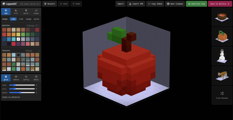
Agustin Capeletto has created a range of awesome tools at LayoutIt!, including the CSS Voxel Editor, which showcases the power of pure CSS for 3D rendering. Many in the frontend community are already familiar with his work, and if you haven’t explored it yet, now is the perfect time. In this article, Agustin takes us behind the scenes of his latest project, sharing how stacked grids and transforms come together to create a fully addressable 3D space—using nothing but CSS.
Transform and perspective are two of the most powerful CSS properties: they let us break free from the 2D realm and step into a whole new dimension. And when combined with stacked grids and their areas, they form the foundation for a fully addressable 3D space (complete with X, Y, and Z coordinates).
In this article, we’ll dive deep into the technique that enables us to build a voxel rendering engine using nothing but pure CSS. Want to see it in action? Check out the newly launched CSS Voxel Editor at https://voxels.layoutit.com!
Gaining Perspective
The first step is to create a sense of depth in our scene. We do this using the perspective property on a parent element, which controls how child elements are seen in 3D space. The value represents the distance from the viewer: a higher number makes the effect subtle, while a lower one creates a more dramatic perspective. For our voxel scene, we’ll use a value of 8000px to achieve a nearly isometric look with minimal distortion. While it’s possible to omit perspective entirely, we found that this led to worse performance, likely due to the loss of hardware acceleration.
<div class="scene">
  <div class="floor">
    <!-- cubes and grid layers will go here -->
  </div>
</div>
.scene {
perspective: 8000px;
}
.scene * {
transform-style: preserve-3d;
}
.floor {
transform: rotateX(65deg) rotate(45deg);
width: calc(16 * 50px);
height: calc(16 * 50px);
}The transform-style: preserve-3d property applied to all scene children is what keeps our scene truly three-dimensional. It tells the browser to maintain the 3D position of child elements, instead of flattening them into their parent’s 2D plane. Without it, our cubes and layers would collapse into a single surface, breaking the effect.
The .floor element is where the isometric transformation happens (rotateX(65deg) rotate(45deg)). Its dimensions are calculated by multiplying the grid size by the unit size. This sets the overall constraints of our scene and acts as the anchor from which all grid layers are stacked along the Z-axis.
HTML Cuboids
Now that our 3D space is set up, we can start building the shapes that will live inside it. In their simplest form, voxels are like 3D pixels, each one representing a position in a tridimensional grid along the X, Y, and Z axes. You might recognize them from games like Minecraft, where a whole world is constructed from blocky elements.
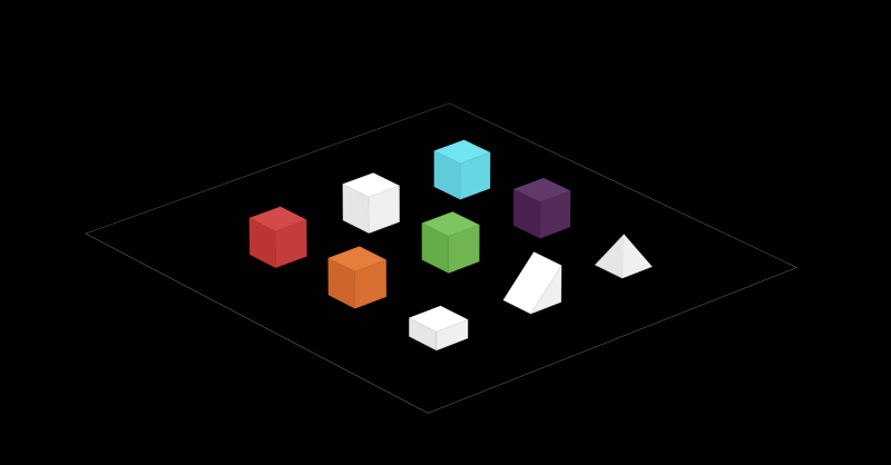
In our voxel scene, these HTML shapes will act as the smallest building blocks. We will focus on our cube component which will consist of a container and six transformed faces. All shapes follow a unit size of 50px, which defines the dimensions of the voxel, but also determines the stacking distance between grid layers along the Z-axis.
<div class="cube">
  <div class="face top"></div>
  <div class="face frontRight"></div>
  <div class="face frontLeft"></div>
  <div class="face backLeft"></div>
  <div class="face backRight"></div>
  <div class="face bottom"></div>
</div>
.cube {
position: relative;
transform: translateZ(25px);
}
.face {
position: absolute;
background: #fff;
inset: 0;
}
.face.top { transform: translateZ(25px); }
.face.bottom { transform: translateZ(-25px); }
.face.frontRight { transform: rotateY(90deg) translateZ(25px); }
.face.frontLeft { transform: rotateX(90deg) translateZ(-25px); }
.face.backLeft { transform: rotateY(90deg) translateZ(-25px); }
.face.backRight { transform: rotateX(90deg) translateZ(25px); }Each face is first rotated to match its orientation in 3D space and then is pushed outward by 25px along its local Z-axis. This is half the cube’s size, ensuring that each face is correctly positioned to form a complete cube centered on its origin. Finally, the entire cube is translated along the Z-axis by 25px to align its base with the grid.
As a final tweak to boost the 3D effect, we can apply a pseudo-element overlay to each cube face: the top remains untouched, while progressively darker shades are applied to the sides to simulate lighting. Although optional, this improves the perceived depth of the cubes.
.face:after {
  content: "";
  display: block;
  position: absolute;
  inset: 0;
}
.face.frontRight:after { background: rgba(0, 0, 0, 0.1); }
.face.frontLeft:after { background: rgba(0, 0, 0, 0.15); }
.face.backLeft:after { background: rgba(0, 0, 0, 0.2); }
.face.backRight:after { background: rgba(0, 0, 0, 0.25); }Crafting a Coordinate System
With our 3D space set up and our basic shapes components ready, we can start placing voxels. To do this, we’ll use CSS Grid as our X/Y coordinate system and then stack multiple grid layers along the Z-axis using translateZ.
In this example, each layer grid container is a 16×16 layout where every cell represents a unique (x, y) coordinate at that depth level (z). We can use the grid-area property to position a cube within any cell: for instance, grid-area: 8 / 5 / 9 / 6 places a cube in row 8, column 5 of that grid layer.
<div class="scene">
  <div class="floor">
    <div class="z" style="transform: translateZ(0px);"></div>
    <div class="z" style="transform: translateZ(50px);">
      <div class="cube" style="grid-area: 8 / 5 / 9 / 6;">
        <!-- cube faces -->
      </div>
    </div>
    <div class="z" style="transform: translateZ(100px);"></div>
    <div class="z" style="transform: translateZ(150px);"></div>
    <div class="z" style="transform: translateZ(200px);">
      <div class="cube" style="grid-area: 4 / 3 / 5 / 4;">
        <!-- cube faces -->
      </div>
    </div>
  </div>
</div>
.z {
display: grid;
grid-template-columns: repeat(16, 50px);
grid-template-rows: repeat(16, 50px);
position: absolute;
inset: 0;
}Notice how each layer is translated along the Z-axis in 50px increments, matching our voxel unit size. This stacking creates a fully addressable 3D space: the CSS grid defines positions along the X and Y axes for each layer, while the translateZ values assign depth (the Z coordinate) to each level. Together, these techniques let us place voxels in a complete 3D coordinate system.
You can see a complete example of a voxel scene in this Codepen.
Optimizing for Performance
Rendering a 3D scene with a large number of HTML voxels can quickly become performance-heavy. To keep the DOM size manageable and ensure smooth rendering, we can apply several optimizations:
- Face culling: Only render the visible faces of each voxel. Depending on the camera angle and the neighboring voxels, many faces will be hidden from view and can be omitted from the DOM. In most cases, only three faces of the cube will be visible at a time, so we can use this to our advantage.
- Voxel visibility: If a voxel is completely surrounded by others, it will be invisible from any angle. These internal voxels can be removed entirely so only the outer shape of the voxel model is present.
- GPU load: when possible we should avoid using opacity, gradients, and transparency, as they can lead to increased GPU workload. Solid colors for simple shading are more efficient.
Next Steps
For Layoutit Voxel Editor, our next focus is on open sourcing the code, boosting performance, and potentially evolving it into a dedicated library. The long-term goal is to import complex scenes that scale smoothly, handling larger voxel counts without slowing down. One path to achieve is by merging adjacent cells across all axes, reducing the number of elements that need to be rendered.
Beyond the editor, this stacked grid technique can be used to generate game assets, create hero illustrations, or explore other interactive visual experiences. The possibilities are still being uncovered!