

Color gives life to paintings, drawings, and life itself. So use it wisely, especially for your business. Around 80% of consumers recognize your brand because you have a distinct color associated with you (Oberlo).
Use that knowledge to your advantage. Theories like color theory and color psychology are great ways to start manipulating color for a stronger brand identity.
But no worries, we’ve got you covered with our rigorously researched blog on color palette trends to liven your brand. Check out the color designs below and see which one is the best fit for you.
Color Theory vs. Color Psychology
Before getting into the trends, we need to talk about how color combinations came to be and how they affect the viewer’s mood. Two concepts come to mind: Color Theory and Color Psychology.
Those two work hand in hand since one explains why color combinations work, and the other talks about how a color combination can incite the behavior of your market.
First, we have a color theory. It discusses how to pair colors with one another and explains why those combinations work on any medium. That’s where the color wheel comes in.
Second, we have color psychology which explains how those color combinations reach the viewer, whether in art or choosing a distinct color of your brand, impacts whoever is seeing it.
Now you know two of the theories behind choosing your color palette, let’s get into the trends and find your distinct brand color.
Color Trends to Liven Your Brand
We’re getting to the fun and exciting part. Let’s find you your unique palette that strengthens your brand and marketing scheme. We listed twelve trends just for you:
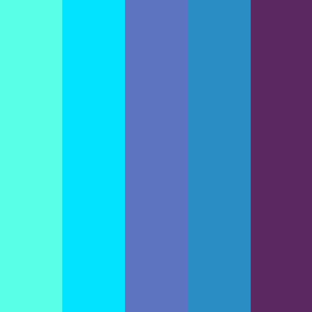
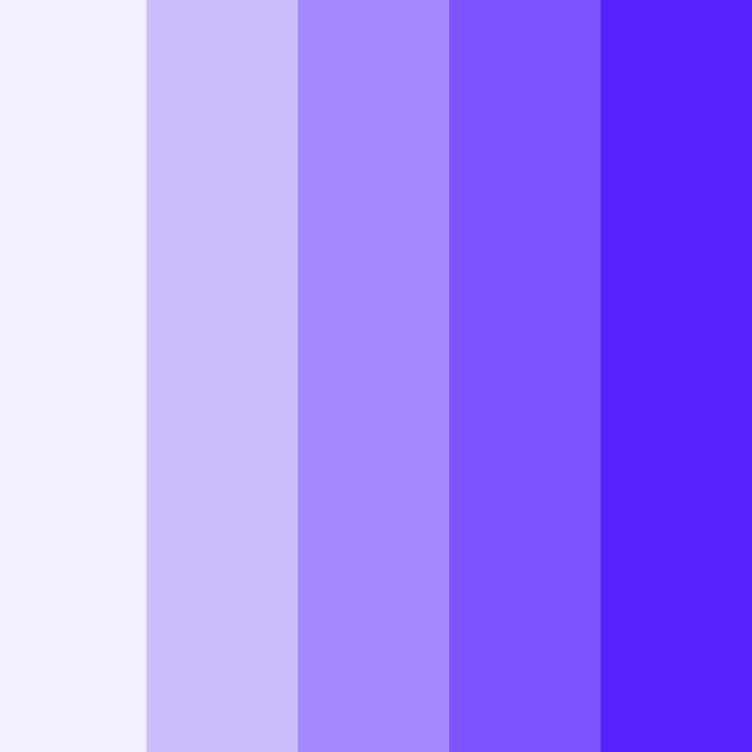
Analogous Color Scheme
Take a pick of three colors beside each other on the color wheel. And there you have it, an analogous color scheme to give life to your design. From the theory, analogous colors are colors beside each other on the wheel and come in threes.
You can subtly say what you mean through your palette and exude harmony and comfort through your choice. You can apply them on Instagram posts or on your physical merchandise.
Find your inspiration below.


Calming, Soft Colors
This trend is perfect if you want color schemes that exude serenity. Soft tones give your business that friendly vibe, and it’s easy on the eyes, making looking at them enjoyable.
You’ll mostly see watercolor-type designs here and cute pastels that give your brand that optimistic vibe that invites growth and wellness for all to see. Check out the graphics below for ideas.


Get Metallic
The 2000s saw a different color trend away from the black and grunge. Think Barbie’s playhouse with pink and cut-out wordings. Aside from that, think about metallic hues as well.
Since retro styles are making a comeback, metallic highlights are also in. The Y2K era is rising again, but more on the futuristic edge of holographic metals. Take a peek at the designs below and choose a visual.


Memphis Design
This trend is an up-and-coming design because of its abstract and modern qualities. The color scheme was wild and deserved mention different from the retro design.
It’s a stand-alone design that creates an atmosphere of fun and adventure. The mix of vibrant colors like pastels and neon colors with geometric shapes gives this design an edge above anything retro. This design looks great on email signatures and business cards.
Check out the designs below for your next hip design.


Monochromatic Color
For this trend, you can pick a color, any color. But the catch is that you use just one hue and the variation of tint and shade. For example, your business is crochet, and you want to take photos. And let’s say you chose purple as your brand color as well.
You can use Lilac as the background and possibly Amethyst for your social media posts. Then for your logo, yarn, and hook or a mascot logo of a cat wearing crochet items, in the shade of Mulberry and utilizing negative space.
See, you can use just one color and still have an exciting take on your business design. Take a look at the examples below for inspiration.


Muted Flower Glow
Muted colors are one of the most calming tones you’ll ever find. Pair that with flowers, and you have a vibrant yet detailed design that shows the subtle beauty of flowers.
Using flowers is a common practice to enhance the color wherever you put it. Now combine the muted colors and flower patterns, and you have a refreshing, vintage look that people love. Find your flower glow below.


Pantone Color Of The Year
Even if it’s overused and over-discussed, Periwinkle is still one of the unique colors you can use with warm and soft tones. Though even if it was other colors per year like 2019’s living coral.
Coral works well with Autumn color schemes, but the feel changes when added to warm and cool colors. When added to warm colors, coral works well as a highlight, but with cool colors, the contrast gives an air of professionalism. Find the right shade of the year for you below.


Retro Blocking
Color blocking was a movement created by Piet Mondrain, a Dutch painter. It uses colors to create abstract shapes. When done right, it gives a vibrant view of your brand.
And since retro is coming back in town, creating abstract geometric shapes with psychedelic colors gives your brand a fun nostalgic feel. Usually, you’d use three or more colors together to create your Grab your retro blocking design below.


Saturation in Moderation
Compared to the other trends on this list, saturated colors are also a rising design. Whether to put emphasis on certain parts of website design or business cards, this type of color palette allows you to become more attractive.
In a sense, it’s the call-to-action of colors since the chosen hue is richer. Highly saturated colors that work well are warm colors together or warm and cool colors together since they beautifully contrast each other.
Which of the designs below do you think you can use?


Sophisticated Jewel Tones
For this color scheme, the colors are gemstone-inspired. So the redness of rubies, the vibrant green of emeralds, the sunkissed shine of topaz, and even the deep blue of Sapphires are some examples of this color scheme.
They make your brand look luxurious and work well with earth tones. Aside from that, it gives off a soothing feel to your brand. Find your jewel design below.


Take Your Pick For A Color Palette Today
And there you have it, our list of color trends to liven your brand! We hope you learned and find your design inspiration through this blog.
If you’re having a hard time deciding, you can consult our community of designers or use an online logo maker to DIY your primary visual for your brand.
Have fun designing!
Read More on Color Here:
Written by DesignCrowd on Tuesday, June 21, 2022
DesignCrowd is an online marketplace providing logo, website, print and graphic design services by providing access to freelance graphic designers and design studios around the world.