

Email marketers spend much time creating relevant and personalized email campaigns and appealing imagery, but can all subscribers read these emails?
Content with poor color contrast can be difficult to perceive, even for people without visual impairments. So, readers with color blindness or low vision struggle even more.
When your newsletters are challenging to read, it can hurt your engagement rates and conversions. The most well-written email will probably be ignored if its copy blends into the background or its buttons aren’t distinguishable.
This issue isn’t limited to emails alone. The same principle applies to your brand visuals, like your logo. If your logo has low color contrast or lacks accessibility, it may be difficult to recognize or remember, especially for visually impaired users. When using a logo maker, for example, always check contrast and clarity to ensure your design is both beautiful and inclusive.
In this article, we explain why color contrast is essential in emails. We’ll share fresh statistics on vision disorders. Discover how to measure color contrast, while we offer some tips for overcoming accessibility issues in your emails.
Why Color Contrast Is Important in Emails
Color contrast is the distinction in color and luminance, making a certain object, e.g., email copy, buttons, links, and imagery, stand out in the background. Poor color contrast makes your emails a headache for all recipients, particularly those with color blindness or low vision.
The higher the color contrast, the more accessible the emails. Take a look at the example below and notice how difficult it is to read text with low color contrast:
Original Images by Khim John Blazo
Imagine that you receive emails from a brand you know and buy from, but they’re almost illegible due to poor color contrast, and you need to squint every time you read them.
You’d probably give up on the brand’s future newsletters, get annoyed, and unsubscribe, even if the email content is valuable. Remember that recipients spend about nine seconds looking at an email, so make these seconds count.
Vision Disorder Statistics
Now that you understand why color contrast is significant in emails, let’s examine some fresh statistics on vision disorders to see how many people require accessible email color contrast:
How Color Contrast Is Measured
When you’re unsure whether your color contrast is accessible enough, you can always refer to the Web Content Accessibility Guidelines (WCAG), which gauge content by analyzing the distinction in perceived luminance between two colors, expressed as ratios.
The ratio varies, from 1:1 (when you can’t read anything, e.g., white copy on a white background) to 21:1 (black copy on a white background). Always check whether your email copy and other elements have a contrast ratio of at least 4.5:1 to meet these standards.
Here are some tools you can use to check your emails’ color contrast:
- WhoCanUse — Besides color blindness, this tool allows you to understand how people with different visual impairments, from low vision to glaucoma, perceive your color combinations. Direct sunlight simulation and night shift modes are included.
- Accessible Colors — You can check whether your email color contrast meets the WCAG. It analyzes the entire email body, except images.
- WebAIM — Besides the color contrast checker (link contrast included), this tool can also consider font sizes.
- Contrast Ratio — This contrast checker accepts Hex, HSLA, and RGBA values (ways to define colors in digital design).
- Color Contrast Analyzer — a tool with easily adjustable sliders to check your email’s copy and imagery.
Bonus:
- Coblis — a color blindness simulator that lets you check how color-blind people perceive your emails.
Making Sure Your Color Contrast Is Accessible
There are three levels for accessible contrast ratios under the WCAG:
- Level A — The easiest criteria to meet, in which your emails will look pretty much the same as you designed them. This level has minimum accessibility requirements and doesn’t make your emails fully legible for recipients with visual impairments.
- Level AA — The gold standard for accessible newsletters. Here, you need a contrast ratio of at least 4.5:1 for regular text and 3:1 for bigger text. You also should include alt text with all imagery. For example, dark-gray copy (#333333) at 18 px on a white background (#FFFFFF) would pass Level AA.
 (Source: Accessible Colors)
- Level AAA — The strictest level to pass, ensuring that your content accommodates recipients with serious visual impairments. Here, you can’t use medium-toned colors for your emails—only a combination of very light and dark colors, with a ratio of at least 7:1 for regular text and 4.5:1 for bigger text. For example, a pure black copy on a white background meets this standard.
This can be challenging to achieve if your brand colors weren’t designed with accessibility in mind, but if you don’t specifically target recipients with visual impairments, Level AA should be fine to provide an inclusive experience for your audience.
What To Review To Overcome Color Contrast Issues in Emails
Color contrast matters when you want to provide an accessible experience for your recipients. Here are a few simple, yet essential, aspects to check to overcome color contrast issues in your newsletters:
Colors of email background and text
Check if the color contrast between the copy and the background is high enough. For example, gray copy on a white background will cause readability issues for all subscribers, particularly those with visual impairments.

It’s better to choose classic dark-gray text on an off-white background. For all other color combinations, opt for light copy on a dark background and vice versa (dark text on a light background).

Links and button colors
Keep the color contrast for links and buttons accessible enough, and avoid making them change colors on hover. To draw recipients’ attention, we recommend using a bigger font size or underlined text.

(Source: Email from Airtable)
Email imagery
Add descriptive alt text to all email imagery to ensure accessibility, and if images don’t load, your subscribers can use alt text to perceive the context. It’s also important to avoid placing text over complex images and backgrounds.
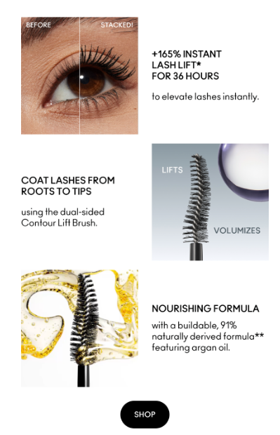
(Source: Email from MAC Cosmetics)
Dark mode
Did you know that almost 65% of users would like websites to switch to dark mode automatically? It’s important to consider this popular feature while building accessible emails.
Some email clients invert your email’s color scheme when recipients use dark mode, which can lead to unexpected results and readability issues. Always check your emails to see how they look in dark mode before hitting the “Send” button.
 (Source: Email Love)
Wrapping Up
Color contrast is one of the most significant factors in email accessibility.
If your color contrast is poor, recipients with visual impairments won’t be able to interact with your content properly and probably will unsubscribe from you or stop reading your emails. This could damage your relationships with your subscribers and lead to lower engagement and conversion rates.
Aside from color contrast checker tools, you should also add alt text to visuals, use background images sparingly, opt for high-contrast colors, and check how your emails look in dark mode. These steps will help you make your email content accessible and engaging for more people, enhancing your brand reputation and revenue.
Written by DesignCrowd on Monday, April 28, 2025
DesignCrowd is an online marketplace providing logo, website, print and graphic design services by providing access to freelance graphic designers and design studios around the world.