

Part 1: Introduction to Displace
Skill level: Intermediate/Advanced
When I first got my hands on Photoshop, I headed for the filter menu to investigate some of the nifty things I could do with my images. As I worked my way down the available filter list, I eventually came to “Distort”.
In there I found a list of goodies that looked very interesting. One by one I clicked to find out what each would do. Then I came to “Displace”.
“What on Earth is that?”, I thought.
Without hesitation, I clicked and was presented with a rather strange dialog box asking me to provide some completely foreign parameters.

Not having even the slightest clue, I figured I’d accept the defaults offered and press on.
OK!
Next I was presented with a standard file selection dialog asking me to “Choose a displacement map”! “Huh? A displacement map? What’s that?”, I pondered.
CANCEL!
“I’ll have to look into this Displace thing and come back to it later.”
Eventually, that’s exactly what I did and this is what I learned.
The Displace filter has been around ever since Photoshop 2.0. It’s sole purpose is to move pixels within your image. It does this with the guidance of a “displacement map”, a separate Photoshop document that essentially tells Displace which pixels to move as well as how far and in what direction to move them.
The tool itself hasn’t changed much since it’s introduction. There is no preview while working with it, making it a rather awkward tool to use. Arriving at a desired end is pretty much a trial and error affair. However, armed with a knowledge of it’s inner workings, your chances of success will be greatly improved.
One of the most common uses of Displace is to conform a texture to an object.
Conversely, you can conform an object to a texture. E.g., say you want to paint an American flag onto a brick wall.

(Note: I typically use Windows keyboard shortcuts, but for the most part, I will show CS5 menu commands herein for clarity.)
- Open the brick wall image.
- On a new layer, paste and fit the flag as desired. Mode: Multiply; Opacity: 70%.

The result is reasonable, but just doesn’t look quite right! The solution is to Displace the flag layer using the brick wall as a displacement map.
To make the displacement map:
- In a new document, open the same brick wall image.
- Desaturate it.
- To prevent pixel ripping when applying the map, apply a slight Gausian Blur (1-2 pixels should suffice).
- Convert to grayscale mode. (Click Image > Mode > Grayscale).
- Save as a .PSD file (ensure Maximum Compatibility is enabled).

Apply the displacement map:
- Back on your WIP image, with the flag layer selected, click Filter > Distort > Displace. In the parameter dialog, the default values of 10%, 10%, Stretch to fit and Repeat edge pixels will suffice in this case. OK.
- Locate the map you just made. OPEN.

Ah, much better! The flag now looks more realistically painted on the wall as the paint conforms nicely to the nooks and crannies of the brickwork.
But WAIT! There’s more. Lots more!
Displacement maps come in two flavors. The previous example utilizes a simple map – a grayscale image.
Here’s another example that uses a simple map to displace the building into a rather unusual shape. Can you visualize what the map looks like?

A compound map on the other hand, is an RGB mode image. It uses the brightness values in the red and green channels to essentially apply two maps simultaneously.
In the following example, a compound map was used to create a realistic water reflection. We’ll learn to make and apply this effect in Part 2 of this tutorial.

These examples barely scratch the surface of what can be done with Displace. It truly is a powerful tool! Photoshop does ship with a dozen or so maps, but I haven’t found them very useful. For the most bang for your buck, you’ll be making your own displacement maps.
“But if I’m going to make my own, I need to know exactly how they work!”
You’re absolutely correct, so let’s take a look under the hood.
The Displacement Map
A displacement map determines the amount and direction of movement of the pixels in the targeted image. It does this by interpreting the brightness value of grays in the map.
In a simple map, light values move pixels up and to the left to a maximum of 128 pixels for pure white. Neutral (50% gray) leaves pixels where they are. Darker shades move pixels down and to the right to a maximum of 128 pixels for pure black. Brightness values between black and white move pixels a corresponding distance. Simple maps should be flattened and converted to grayscale mode.

In a compound map, movement direction is determined by the brightness values found in the red channel and the green channel. The red channel maps white = left, black = right. The green channel maps white = up, black = down. The blue channel does not contribute at all. Distances are determined as in a simple map. Compound maps should be flattened and must be RGB mode.

In both cases, displacement maps must be saved in native Photoshop (.psd) format with Maximum Compatibility enabled. In most cases you’ll want your map to be the same size as the intended target.
When you are ready to apply your displacement map, you will be given the opportunity to fine tune the movement hardwired into the map itself.

- The first two parameters in the Displace dialog ask for Horizontal Scale and Vertical Scale. These values are percentages.
Say your map contains some pure black. By default this will move pixels 128 pixels down and to the right. That represents 100%. The default “10” in the dialog would reduce that distance to 12.8 pixels. A value of “50” would mean 64 pixels. A value of “0” would negate any movement. You can input any value from -999 to 999. A negative value would reverse the map instruction. At -100, your black would move pixels up and to the left 128 pixels. In addition, since the horiz and vert inputs are independent, you can exaggerate or completely change the initial intention of the map. - The defaults of “Stretch to Fit” and 3. “Repeat Edge Pixels” will be fine most of the time. Rather than detail these settings here, I’ll leave you to your own devices to experiment at will.
Since Displace doesn’t provide a preview, trial and error is your only option. But with a little practice and experimentation, I’m confident you’ll get the hang of it in no time.
Part 2: Water Reflections using Displace
Now that you know how Displace works, it’s time to put your newfound knowledge to work.
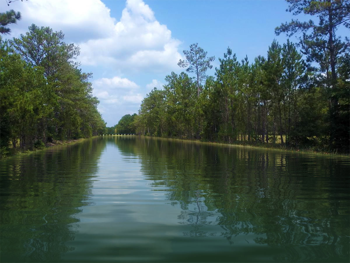
In this part of the tutorial, we will start with this image of a grassy field.

…and flood it with water.

Make the Displacement Map
The first thing we’ll do is make the displacement map. It’ll take a few minutes to build, but this is a generic map. You can use it for any project in which you wish to include a realistic calm water reflection.
Map the high and low points of the surface:
- Open a new image. 1000px wide X 2000px tall. RGB mode. Fill white.
- Click Filter > Noise > Add noise – 400%, Gaussian, Monochromatic
- Click Filter > Blur > Gaussian Blur – 2.0 pixels

Create the tilt of the surface:
- Open the CHANNELS panel.
- Select the Red channel. Click Filter > Stylize > Emboss… – 180 degrees, 1 pixel, 500%.
- Green channel. Click Filter > Stylize > Emboss… – 90 degrees, 1 pixel, 500%.
- Blue channel. Since it does not affect Displace, a black fill will hide it for our purposes.

Establish the perspective:
- Return to LAYERS panel.
- Convert the background layer to a regular layer so it can be transformed.
- Click Edit > Transform > Perspective Pull one of the lower corner points outward to a width of 600%.

- Trim extra pixels. Click Select > All, then Image > Crop
- Repeat steps 7 and 8.
- Resize. Click Edit > Transform > Scale. Set Height to 50%.
- Trim image. Click Image > Trim… > Transparent Pixels. Your image should now be 1000px square.

Set the relative distance perspective:
- Open the CHANNELS panel. Select the red channel.
- Click Q to switch to QUICK MASK MODE.
- Draw a gradient, white to black *, top to bottom, the full height of the image.
- Click Q again to switch off QUICK MASK MODE.
- Fill with 50% gray.
- Select the green channel.
- Switch to QUICK MASK MODE.
- Draw a gradient, white to black *, top down, about 15-20% of image height.
- QUICK MASK MODE off.
- Fill with 50% gray.
* Black to white if you’ve changed the default Quick Mask Options to Selected Areas.

- Return to LAYERS. Click Filter > Blur > Gaussian Blur – 1.5 pixels.
And that should do it!
- Save the map in native Photoshop format (.PSD) with “Maximum Compatibility”. (You can check your Maximum Compatibility setting if necessary in File > Preferences > File Handling.)
Your finished map should look very similar to this:
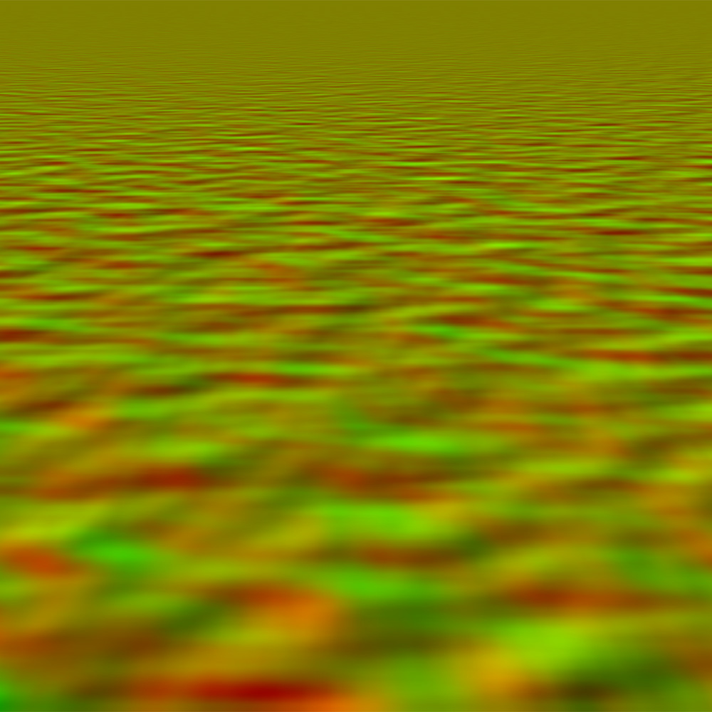
If you wish, you are welcome to take this map. However, you must convert it for use as a displacement map.
- Click the above image to get full size.
- Copy it and open it in Photoshop.
- Save it per Step 23 above.
You are now ready to make some awesome water reflections.
Flooding the Field
Prepare the flat reflection:
The first task is to build the flat reflection of the trees/sky over the field. To make a reflection of a straight on, distant scene is as simple as making a rectangular selection, copying that to a new layer, flipping it and aligning. However, in this case, with the tree lines along the edges of the field, the scene has a great deal of depth as illustrated with the vanishing point grids for each of 3 planes.

To build this reflection will require a bit more effort. We will make 3 separate selections, 1 corresponding to each of the planes (illustrated here by the red, green and blue tints). A couple of Snap To Guide Lines will assist in ensuring the selections align without overlapping or leaving gaps.

Make a selection of the leftmost plane. Jump it to a new layer (Ctrl-J). Using Transform, flip it vertical, drag it straight down and skew it to align along the tree line.

Make a selection of the center plane. Jump it to a new layer (Ctrl-J). Using Transform, flip it vertical and drag it straight down to align with the previous layer.

Make a selection of the rightmost plane. Jump it to a new layer (Ctrl-J). Using Transform, flip it vertical, drag it straight down and skew it to align along tree line and with the previous layer.

Merge the 3 sections. Trim extra pixels – Click Select > All, then Image > Crop. You’ll be left with two layers: The background and the flat reflection.

For a more realistic shoreline, sculpt the edges along the tree lines with the erase tool.
We’re almost home. Just a few more prep steps needed.
As the water gets closer, the color of the water itself and surroundings influence the reflection. In an open scene with a blue sky, that would mean more blue. In this case however, with the grass/dirt below and the trees above, I chose a dark greenish-blue shade.
Make a new blank layer beneath the reflection layer. Ctrl-Click the reflection layer to make a selection. Fill the new layer with the chosen color. Deselect selection.

Add a layer mask to the reflection layer. Apply a black to white gradient from the bottom to the top of the reflection to let some of the atmosphere color through.

To simulate wind generated rippling in the distance along the shoreline, we’ll use motion blur.
Ctrl-Click the reflection layer image to make a selection. Ctrl Alt Shift-Click the reflection layer mask to intercept that selection. This will result in a gradient selection from the top of the reflection. Click to Lock transparent pixels for the layer. Click Filter > Blur > Motion Blur… – 90 degrees, distance to suit (depends on image size and your own preference).

And now for the magic! Click the reflection layer image (not the layer mask) to make it active. Since we want to displace ONLY the reflection itself, Ctrl-Click the reflection layer image to make a selection. Because the layer image and the layer mask are linked, the displace will be applied to both.
Click Filter > Distort > Displace. Setting the scale may take some trial/error depending on the size of your image. This map seems to provide the best results using a vert scale twice that of the horiz scale. I used horiz: 25%, vert: 50% in this case on my WIP size. Since the map is not the same size as our target image, Stretch to fit is needed. The default of Repeat edge pixels is fine. Finally, locate and open the water displacement map we just made.
BAM!!!

After a few more minor adjustments, we’ve fabricated a very realistic and convincing image of a flooded field.
Here is the finished image:
Phew! Congratulations if you made it all the way through this lengthy tutorial. Double congrats if you actually understood it and were successful!
The Displace filter is a terrific tool and you should now have a pretty good understanding of how it works. Now it’s up to you to practice, experiment and discover just what other amazing things you can do with Displace.
If you have any questions or need clarification concerning this tutorial, please feel free to contact me via site message.
Now, go forth you talented choppers, and Displace!
Photoshop tutorial by kr43m0r originally posted on Worth1000.
Looking for more tutorials, try this one for How To Create A Partial Submersion Effect or visit blog.designcrowd.com/tag/tutorial for more helpful hints and tips to boost your designer skills

Looking to earn from your graphic design skills?
Check out the design jobs board and start earning today!
Written by DesignCrowd on Thursday, June 8, 2017
DesignCrowd is an online marketplace providing logo, website, print and graphic design services by providing access to freelance graphic designers and design studios around the world.