Gyms rake in huge sums of money annually. That’s probably why the amount of fitness clubs worldwide is predicted to go up 1.5% in the coming years. And with great revenue comes a greater competitor count. It is crucial that you present your brand in the best way possible, regardless of niche. Creating high-impact gym logos is one way to do that.
Before you take a peek at our logo collection, we should probably talk about logos that work best for different gym niche. The current market is full of subtypes, but today let’s discuss these gym types:
Free weights
Gyms that focus on free weights are seen everywhere. They provide members with basic equipment such as resistance bands, weights, medicine balls, etc.
Neo Athletix by Creator
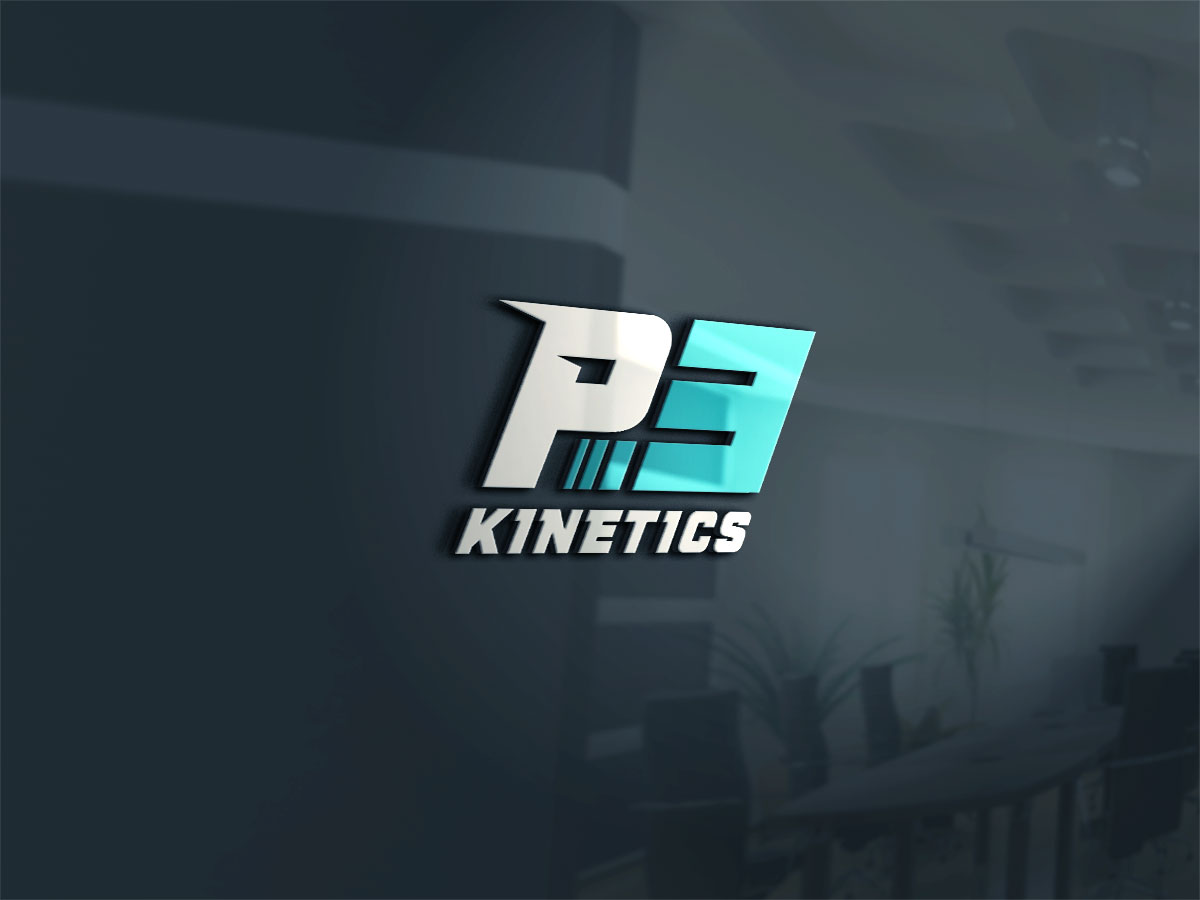
P3 Kinetics by Sergio Coelho
These logos typically come in a single color or two to create an accent. This is an interesting observation in brands worldwide. Nearly half of successful companies created logos that feature one color. They used one of the three colors the most: blue, red, and black.
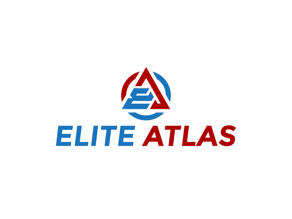
Elite Atlas by johnsonaaron192
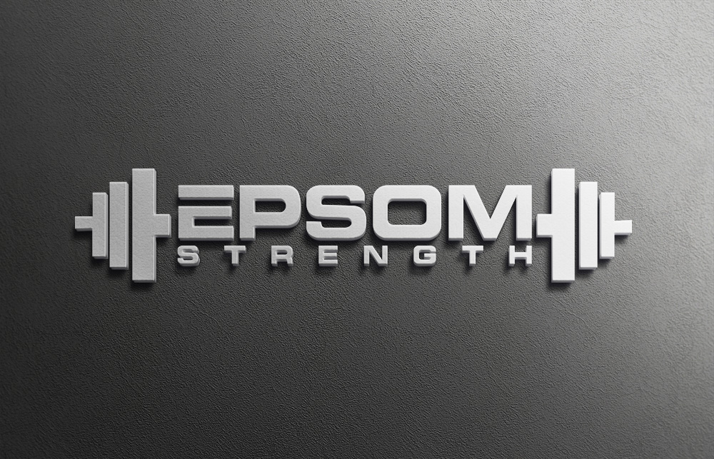
Epsom Strength by ATM design
Evolution Athletic Zone by AHMED PUSON
The Warehouse Gym by Hanisome
The typography in free weights gym logos use a mix of font types to create contrast and emphasis to the brand name. This gives the logo command and the quality of being eye-catching.
CrossFit
You’re probably wondering what the difference between CrossFit and the typical gym is. It began when a training gymnast named Greg Glassman’s incorporated bodyweight exercises with weights. It resulted in high-intensity workouts or HIIT.
Sohiit by Liyana
CrossFit Bala by GLDesigns
Sublime Crossfit by MarcusGir
This lifestyle is an exemplary product of good branding. It isn’t much different from the typical gym, but it was marketed well and that made all the difference. CrossFit gym brands go for sleek fonts and capitalized text to embody the challenge that comes along with the routines.
The Package by **INCREDIBLEDESIGNERS**
CrossFit Rookie by Gigih Rudya
Illustrations work well with this gym type as the depiction of sculpted muscles gives people something to aspire for. You can even select images of people doing cardio, pushups, and other exercises to create different elements in your logo.
Women-Oriented
Let’s talk about this category that refers to women gym-goers. Examples of this gym type include yoga, pilates, pregnancy gyms, and more. The use of thin lines and slender shapes is often used in this category to create an inviting and relatable image.
Coreworx by borzoid
Anima by Bulbul Ahmed
Viveka Coaching by kimcam
Yoga is a more prominent gym type since it is practiced 36.7 million in the United States of America alone. 72% of this number is comprised of women which is a considerable amount. The practice is well known for its zen philosophy which explains why relaxing muted colors on yoga logos look so right.
Malone by Soonia
Active Balance by tekiongs
The color blue is prominent in these design examples because it’s proven to give people a sense of calm and relaxation. This is a lesson in color psychology that greatly benefits exercises that put stress relief and mindfulness at the forefront.
Sen Soul by Nigel B
Tranquiltiger by inspiral
Train Her by pixeljuice
But of course, chunky text in bold yet feminine colors still have a strong impact. Heavier logos that use defined shapes and text look better on dark backgrounds.
Yoga Mecca by TSEdesign
Gyms with a more uncommon niche like pregnancy fitness will benefit from using illustrations. This gives their audience a more upfront idea of what services they offer.
Mellow Gym by SJL
Boxing
Logos from boxing gyms feature gloves as its focal point because it is a staple tool in boxing. Using the color red, whether alone or prominently, is a good way to make your logo look energetic and powerful.
Dogtown Athletics by ReDoDesigns
Boxing Australia by bojboga

City Fighters by Logoredion
Reno Nevada by Fourtune Design
Formed fists are also a common element of boxing logos, too. It adds a challenging touch to the logos and allows creative touches through typography and other design elements.
Fight Central by victipedia
Conquer Boxing by Graphicsexpert
Fit Box by atopapa.ara
Boxing-focused gyms are typically managed and owned by well-known trainers. The logos we’ve provided can suit boxing gyms that are named after industry figures or simply just personal trainers who have a knack for business.
Lyndo’s Boxing by Shank
Parkour
This fitness activity is commonly done in cityscapes today. It originated from France as a military training consisting of surpassing obstacles using body strength alone.
Forge Parkour by Rox Art Design
Parkour Warrior Fitness by Bithe Akther

Urban Flux by nzvm
Futuristic and font types that are on the thicker side work for this gym type since it can allude to industrialized and urban areas. Adding characters like ninjas or urban characters can represent stealth and vigor. These characters are known for scaling up buildings just like a parkour pro.

Smash and Grab by Senseless
Swiss Parkour Association by creative masters123
If you are not a fan of detailed illustrations, you can instead go for simpler looking characters like stickmen. Simple figures still portray movement well without complex elements.
Abstract Parkour by town
Final Set
A good logo cultivates trust among customers especially in the earlier part of their journey. Having an effective fitness logo is improving your social media marketing campaigns with fitting graphics. This paves an opportunity for you to acquire more members since the social media-obsessed millennials and GenZ make up 80% of new fitness enthusiasts in recent years.
Brand symbols that are consistent with the main focus of your gym can make it likelier for target customers to identify the services you offer. Overall, gearing your campaigns to your specialty will allow you to gather a stronger following than brands who don’t. Picking a logo that is particular to your niche can help boost acquisition and retention rates.
To sum it up, being thorough with your design process yield an output that is adaptive enough to be put on any marketing material. Digital channels and more physical items like swag bags will build a remarkable representation of your company. You can produce high-quality print output better and faster with a good logo.
Ready to give your gym an extra lift? Our huge talent pool of amazing artists can’t wait to win your gym logo project.
Become a logo expert yourself and check out our other blogs:
Written by DesignCrowd on Thursday, February 27, 2020
DesignCrowd is an online marketplace providing logo, website, print and graphic design services by providing access to freelance graphic designers and design studios around the world.

