It’s 2020, but we’re still not over the way the previous decade shaped design history.
Bold brands have taken the step towards a better version of themselves through visual communication.
When thinking about the noteworthy rebrands that happened in the past decade, people will probably start thinking about Dunkin Donuts. The bread and coffee chain taking the “Donuts” in their name was the talk of the town.
We seldom talk about the big strides tech companies are taking in terms of design and branding.
Businesses in the technology sector flex and adapt to the growing needs of the market. They create innovations and expand to industries that will find value in their goods and services. The same goes for brand identity.
Well established companies know that keeping up a look that embodies their story and voice is an essential part of
Usually, businesses start to rebrand when their company undergoes significant changes.
Changing assets like logo design, web page design, and other marketing assets help them communicate with their audience in a more timely and relevant fashion. Refreshing your identity will make your businesses look up to date, which never hurts a brand.
You can give your brand the same all-star treatment by following the steps of the brands who made it.
Take a look at five of the tech rebrands worthy of your attention. Here are their names:
The brands mentioned above were able to create powerful and on-trend reinforcements of their identity. They altered their identity from their logo to their services. These companies were able to fortify their operations with strategic design.
Dropbox
The hosting service provider was founded in 2007 by MIT students. Since then, it’s been used widely as a way for teams to store their files, synchronize, and create smoother workflows.
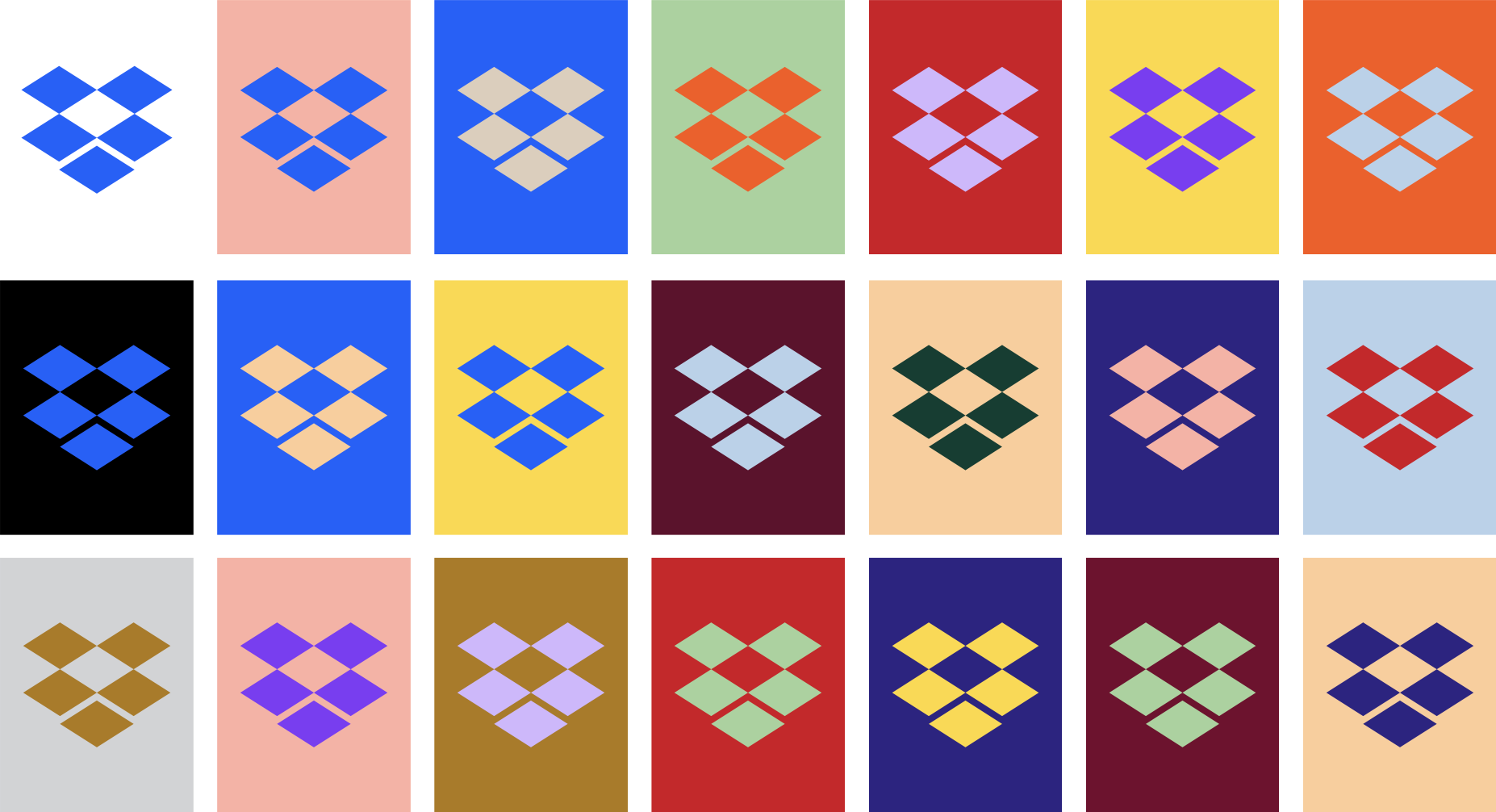
In 2017, they launched their new design that featured an abstract illustration of their box logo. This came with a wide spectrum of bold color combinations and over 250 different fonts. Dropbox decided to give itself a new look that allows teams to take pride in diversity through design. It was done to allow teams to express themselves freely.
The file-hosting service was their oyster.
Some called it clever, but some design fans did not feel the same. Their clean and simple interface was now colored with eye-catching colors. This change was huge for a lot of people and easily became the talk of the community.
Dropbox
For this phase of Dropbox, they wanted to break free from the monotony of their users’ lives by creating a space that allows them to be creative and create an environment that encourages that.
Head of Dropbox Brand Studio said in a statement, “Our new brand system shows that Dropbox isn’t just a place to store your files — it’s a living workspace that brings teams and ideas together.”
And that’s exactly what they did.
Microsoft Office

The office suite was introduced to the world back in 1988. Back then, the version contained only Word, Excel, and Powerpoint. Today, it has over 8 tools including, Outlook, Publisher, and many others. 155 million people use this software today.
It was conceived in the totally groovy time of the 80s. But Microsoft never lets the branding of this product unattended.
In fact, they spent a whole year mapping this rebrand out. The thing that they really took time on developing? The tool logos.
They have constantly rebranded it since the 80s and for the previous decade.
This rebranding project of theirs was done using the company’s Fluent Design System which is an improved version of their previous design language. Containing guidelines, the language ensures that their product will be packaged in a simple, yet unified manner.
Microsoft Office
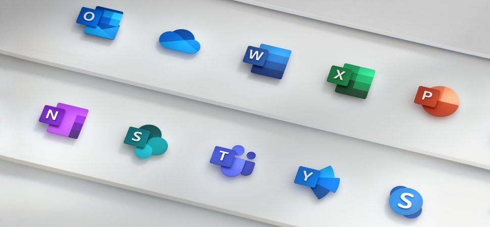
Microsoft prioritized making a great impression and expectation as their products evolve and improve its features. You can see that clearly from the logos above. It’s modern and visually competent, which captures the personality of this productivity suite. This brand never falls behind.
Logitech

Offices and gamers all seem to run to this Swiss computer parts manufacturer when it comes to reliable peripherals and software.
Logitech has been a well-known leader in the tech world since 1981. Another thing they’re also known for is their exquisite taste in design.
This rebrand didn’t apply to visuals alone, but to the brand name as well.
The company changed from head to toe. Dropping the “tech” from their name resulted in a catchier sound. After successfully piercing through the competitive market, they now feel no need to keep the tech at the end of their name.
Logitech’s chief design officer reasoned, “A company transformation of this magnitude should come with an equally bold transformation of its brand.” They’re a reputable source of computer products as well as design ideas.
Logitech
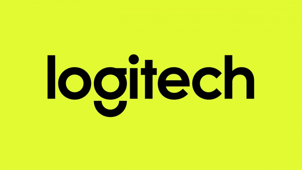
This esteemed company also bid their farewell to the eye-shaped illustration seen in their past logos. Instead of redesigning the hieroglyph-like element, the designers used a stocky font to fill the space.
It was a symbol of the emerging cyber industry in the ‘80s, but it did confuse a lot of people.
In 2015, it was replaced with a modern wordmark that featured only lowercase characters. The font they used is called Brown Pro which looks like the fun cousin of Futura.
Before, the only colors you’d see in the Logitech logos other than black were teal and red. This time, they incorporated a bright shade of green and purple on the mix.
Android
This Google-made operating system launched in 2008
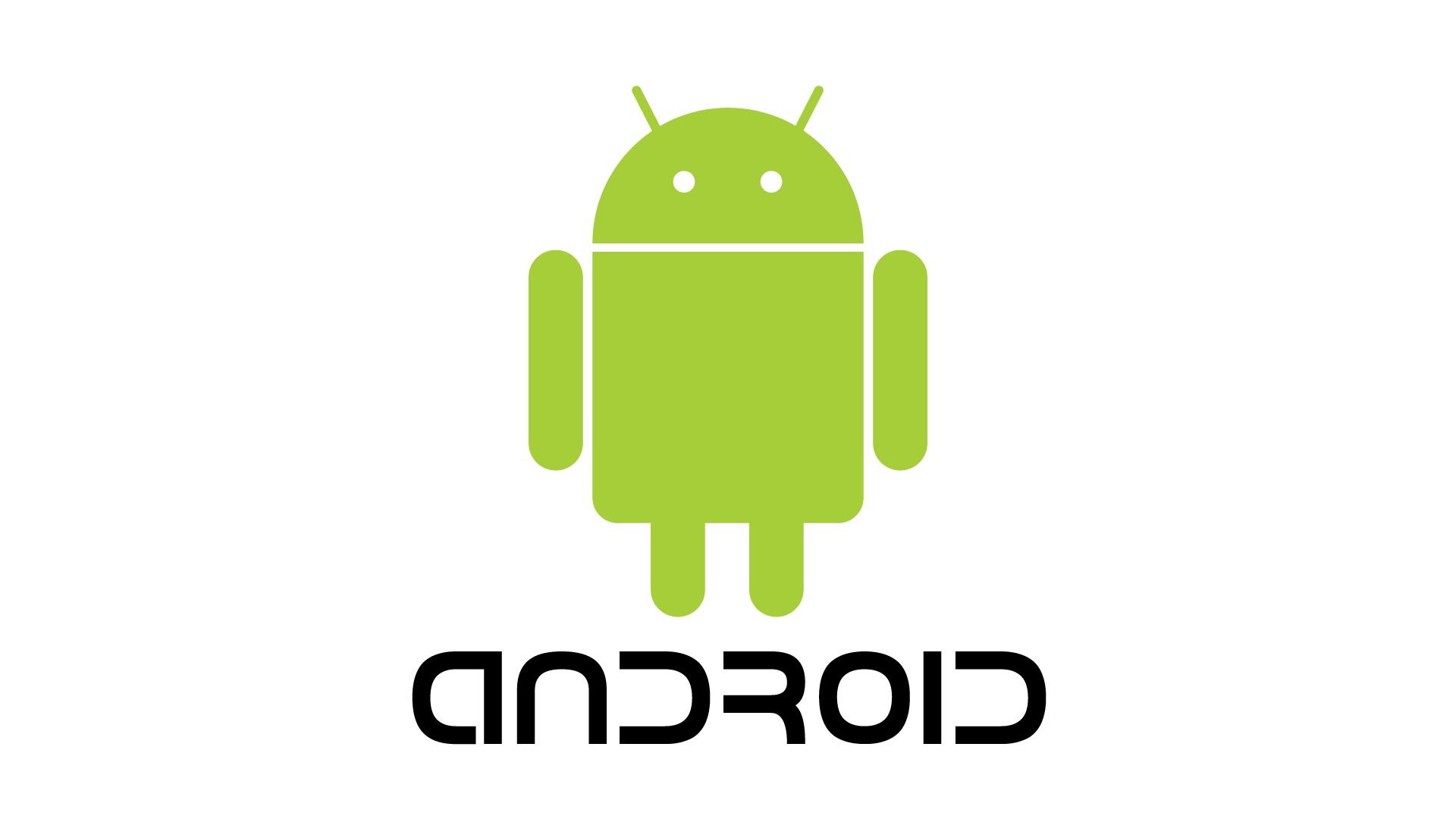
For the longest time, consumers have associated the brand with the wide-bodied robot with an antenna. Android was typed in incomplete strokes that looked so modern but sacrificed some degree of readability. In 2019, Android dramatically changed. The font, illustration, and color really took a turn.
Android
Part of improving a company is fixing an appropriate visual identity for each of its eras. People considered the brand’s redesign as long overdue.
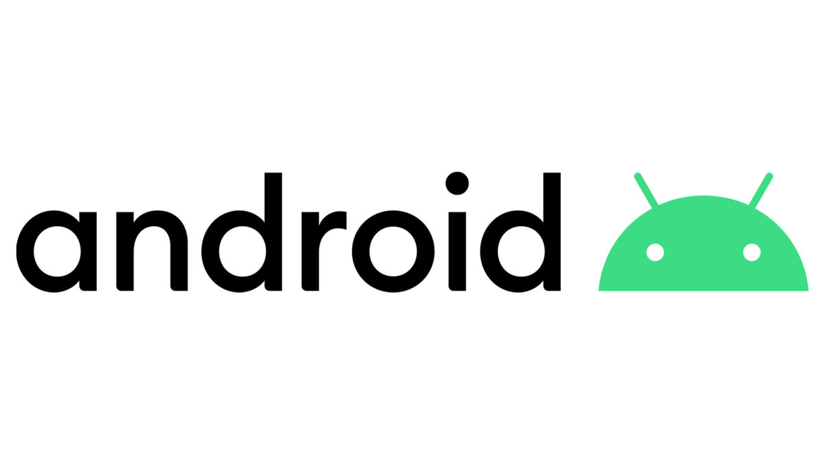
The team that spearheaded this project said that their main focus was to make android’s design more accessible. You can see their efforts show when you start taking note of better contrast in their color scheme. The full strokes of the sans serif font seen on the logo have improved its readability, too.
Bugdroid stayed but showed only its head.
Android’s beloved robot mascot was beheaded, yet it was still honored as sweet as its product code names. The robot was given a set of new clothes, too. Artists gave the droid a bluish shade of green that made the logo look subdued. This pairs well with the neo-grotesque typeface they selected for the refresh.
Upwork
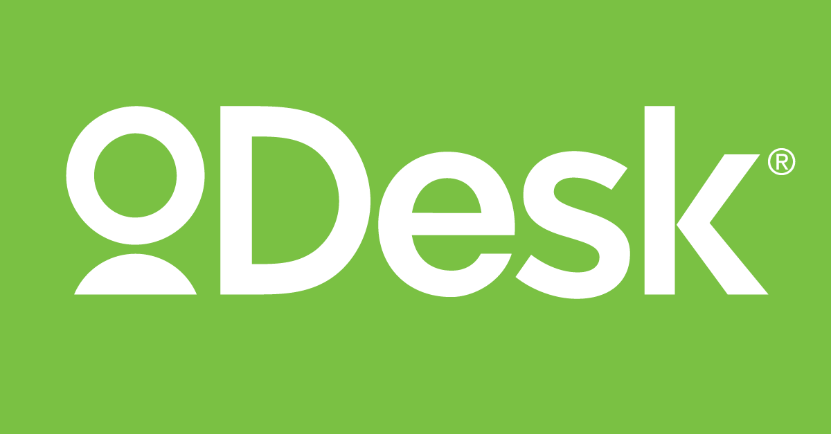
Formerly known as oDesk, this freelance powerhouse marked their name change with an equally appealing design reinvention.
It all started when oDesk merged with Elance. This merger marked a huge change in the company’s future. Processes that involved hiring, feature, development, data science, and the likes were drastically improved with the new management.
Big shifts in management and operations are best paired with a rebrand. For Upwork at this time, It seemed fitting to equip it with a game-changing branding plan.
Upwork
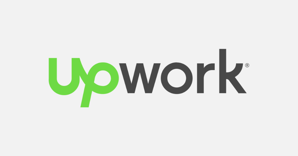
They launched a new and improved platform with a strong and curvy wordmark. The sans serif font was made intriguing by the color contrast. The looped cursive font type they used for the first two letters of Upwork also helps lead the eye. You won’t see much change in the color. It’s still green but in a much livelier shade.
This was a smart move from the company. Knowing when to rebrand can really amp up your presence. Not long after this, the platform continuously saw an uphill trend in revenue despite competing with other sites like Toptal.
Unboxing the new you
Although they are best known for their strong potential for profit. Tech companies are a helpful resource to learn more about effective design. There are a lot of companies in this sector that excel at branding. It’d be a waste not to discuss them.
They are a great source of inspiration for other brands that are looking for a pick-me-up.
As we have tackled, rebranding boosts a brand’s growth when done timely and properly.
Don’t do it just for the sake of rebranding or you might just end up with a branding mishap like Gap. The clothing company changed its iconic logo to follow the san serif craze turned out to be way off-brand. Within a week, Gap reverted back to its old logo.
To help you figure out if your brand really needs, try bouncing these three quick questions with your team:
- Is there a specific problem that we need to address?
- How will this new version of our brand help solve this?
- What changed about our target customers?
Other companies have different reasons behind their brand refresh initiatives. The most common problems that push companies to rethink their visual identity are management changes, outdated design, PR disasters, among many others. It’s always best to start by evaluating your company’s pain points or growth areas.
Are you ready to shape the world with your tech business idea? Don’t forget to use a powerful brand identity and marketing asset to create a lasting impression.
Find the online graphic artist that will create the collateral your brand needs by posting a design contest here.
Get inspired:
Written by DesignCrowd on Friday, April 17, 2020
DesignCrowd is an online marketplace providing logo, website, print and graphic design services by providing access to freelance graphic designers and design studios around the world.

