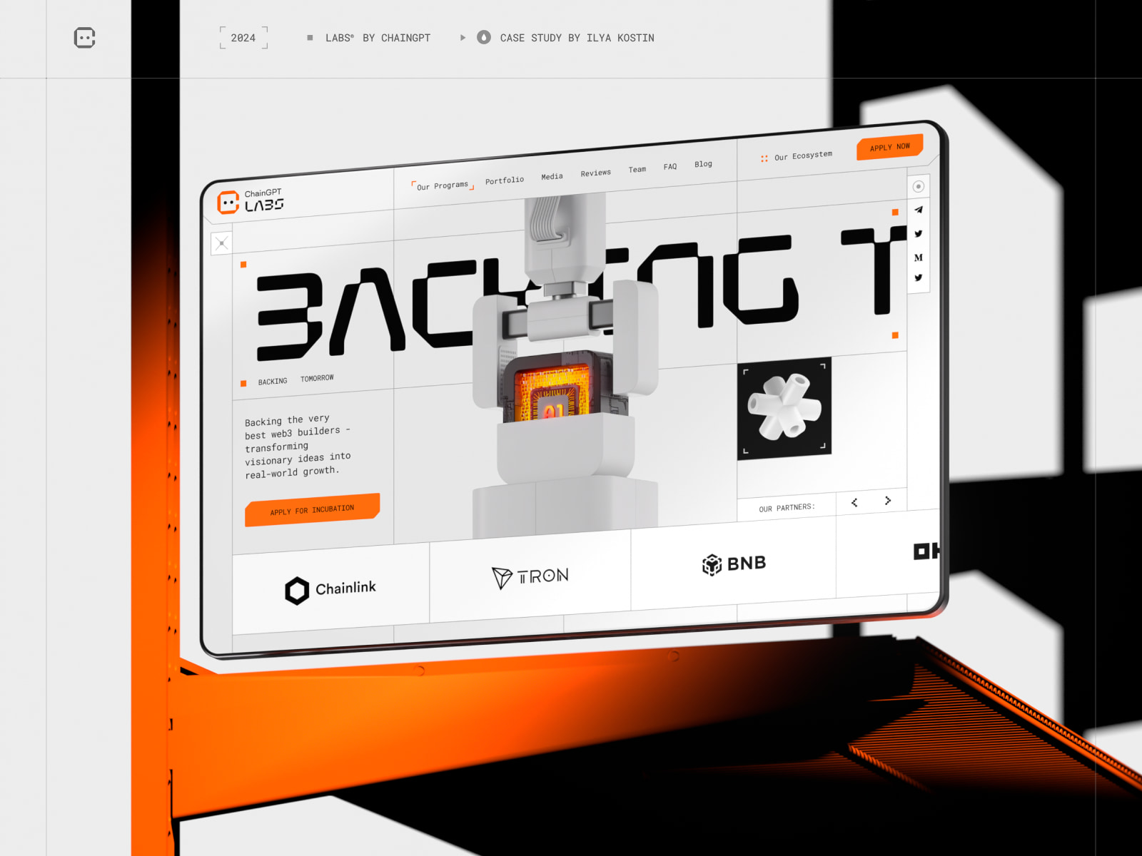
In this case study, we will explore the creative journey behind ChainGPT Labs, examining how the Sigma Software Design team developed a visually cohesive and functionally advanced platform to support the next generation of Web3 startups. From branding to 3D design and interactive web development, this analysis highlights the challenges, solutions, and tools used to bring this vision to life.
The Client’s Story
Before we enter the Lab®, let’s briefly discuss ChainGPT’s existing product ecosystem.
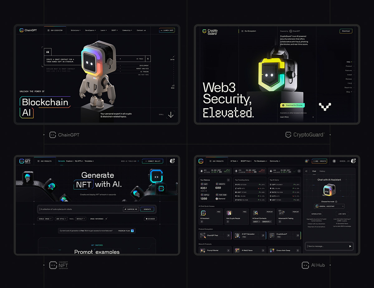
ChainGPT is a blockchain-focused infrastructure platform that provides AI-powered tools and solutions specifically tailored for the Web3/crypto ecosystem. Since 2023, we’ve been working with the client’s team to create the brand identity, design and develop an award-winning website, multiple web applications such as a Generative NFT Creation Tool, a Web3 Security Extension, and many more.
The brand’s expanding product family now includes 10+ products, all designed and developed by the same teams. Designing multiple products for the same client poses a challenging requirement: the visual identity of each new product should be inherited from the primary branding but still look unique and product-tailored. Same, but different, but still the same (yep, just like in the popular meme).

It All Started With the Cute 3D Robot
ChainGPT branding is centered around the robo-mascot – a friendly little robot with the brand’s logo around his face. I designed and rigged this character back in 2023 using Cinema 4D & Octane Render. Today, we use him across all ChainGPT products in different variations, skins, environments, etc. Essentially, he’s as important to the brand identity as the logo.
We customize the appearance of this robot based on the product’s purpose, accent color, and meaning. The team has already created more than 15 variations of this little fella, including light, dark, spaceman, a judge called Mr. Robotson, and many more.
Entering the Lab
In February 2024, the client’s team approached us to expand the brand ecosystem even further by introducing a new member to the product family: ChainGPT Labs.
ChainGPT Labs is a platform that focuses on supporting innovative Web3 startups. It provides funding, incubation, and acceleration services to help these startups grow, offering resources like strategic partnerships and tokenization strategies.
What we knew from the start:
- We needed to develop a distinctive visual identity for this new product while ensuring that it remained visually connected to the main product;
- We should probably use a light theme to convey the all-white feeling of the laboratory. At the time, all other ChainGPT products were dark-themed, so we had the challenge of adjusting the existing visual identity for light backgrounds to work as well as dark ones;
- Our robo-mascot should be used in the UI, but this time, we would adjust him for the experimental laboratory environment. Our goal was to convey the meaning of startup incubation and funding;
- The nature of this project is as experimental as it could get (even the ‘Labs’ name), so we wanted to convey that meaning by choosing a unique display typeface for headings, creating a unique (a bit brutalist) grid structure, etc.;
- We should use Webflow to allow the maximum flexibility of content management for the client’s team. This website has a dedicated blog section, so we needed to ensure that content managers could create new posts as quickly and efficiently as possible.
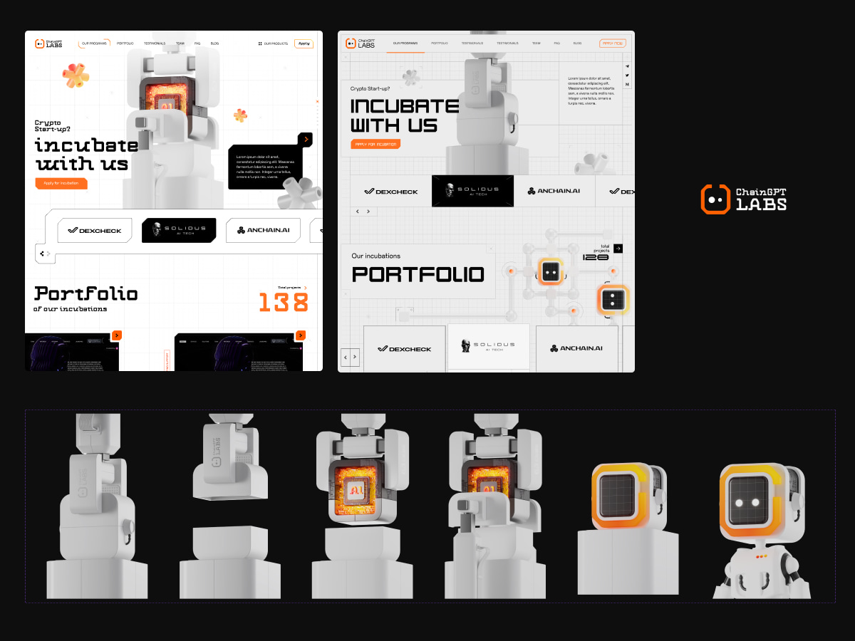
We took this list into work and started an exciting process of exploring unique layout possibilities. Here are some early explorations:

3D Illustrations & On-Scroll Interactions
Together with Sigma’s in-house 3D designer, Dmytro, we took our existing 3D model of the robot and transformed it into the Lab-oriented scene by adding sci-fi capsules, incubation chambers, and other laboratory-inspired elements. We made sure that all 3D scenes conveyed the meaning of experimentation as much as possible by choosing a striking white and orange palette.
All 3D illustrations (Hero Sequence, Robot, Coin) are implemented as videos with alpha channel (more on that topic below), while the capsule is a static .webp image. Glass reflections are added separately as another semi-transparent image – we made a small segment of the glass tube and then cloned it vertically via code. Doing this ensures that all assets retain small file size and excellent quality while allowing us to achieve the planned effect.
We added a position: sticky parameter on the capsule to achieve an immersive on-scrolling interaction. Scrolling animation is controlled by GSAP ScrollTrigger, native Webflow interactions, and the Lenis smooth-scroll library.
We’ve also added an appear animation to all headings on the page by combining multiple effects:
- Flicker animation, done with GSAP Flip;
- Scramble (decoding) animation, done with GSAP ScrambleText.
Videos with Alpha Channel
We aimed to achieve better immersion by overlaying 3D animations above the UI. To make it possible, we used videos with alpha channel (transparent background). This is definitely one my of my favourite techniques, here’s why:
- It allows to achieve small file sizes while preserving great quality (unlike .GIF or image sequences);
- It allows us to work much faster without implementing custom WebGL scenes for all 3D illustrations. While still maintaining excellent Webflow compatibility and great performance. It basically serves as a cheaper alternative to WebGL for immersive 3D renders;
- At first, it seems complex and impossible to implement for all browsers, but once you dive deeper into it you realize how powerful and accessible this technology actually is.
Here’s how we usually work with alpha-channel videos:
To support as many browsers as possible, we need to prepare two files for each video:
– .webm (VP9 codec) for everything except Safari;
– .mp4 (h265 HEVC codec) for Safari.
Two files needed because Safari doesn’t support .webm with alpha channel, and Chromium-based browsers don’t support HEVC codec. By using this combination of .webm and .mp4 we can achieve approx. 95% global browser coverage, which is great!
After preparing all files, we load both formats as shown in the code below and let the browser decide which version to use:
<!-- Video component -->
<video width="xxx" height="xxx"
autoplay loop muted playsinline>

<!-- Provide the Safari video -->
<source
  src="https://example.com/movie-safari.mp4"
  type='video/mp4; codecs="hvc1"'>

  <!-- Provide the Chrome video -->
<source
  src="https://example.com/movie-chrome.webm"
  type="video/webm">
</video>
Our pipeline for video conversion and compression:
- After finishing the animation, 3D artist prepares an HQ video, rendered with Apple ProRes 4444 codec;
- To convert it into .webm, I use FFmpeg.
- To convert it into .mp4 HEVC, I use Apple Compressor.
FFmpeg is an incredible terminal-based tool for converting videos and (most importantly) compressing them heavily while preserving the quality. File size of all videos on the Labs website is 1-2 MB max., per file.
For anyone who wants to dive deeper into FFmpeg, I highly recommend these resources:
- Incredible article by Alex Barashkov;
- In-depth YouTube tutorial by Yuri Artiukh.
Also, here’s an example command for .webm conversion, we’ve used similar code for all alpha-channel videos on the page:
ffmpeg -i original_video.mov -c:v libvpx-vp9 -pix_fmt yuva420p -deadline best -crf 32 -b:v 1700k -an video_output.webmFFmpeg doesn’t have GUI, so it may not be the tool for everyone. Rotato Converter is a great alternative, which allows to perform the same thing much faster via the easy-to-use interface. One downside is that it doesn’t allow to fine-tune compression settings, so the file size will be bigger compared to FFmpeg.
GSAP Preloader and Page Transitions
Here at Sigma Software, we believe that the first impression matters a lot and can affect the UX in both positive and negative ways. That’s why we implemented an advanced, fully synchronized loading sequence instead of a simple spinner/loader.
This sequence combines multiple effects, all synchronized to be perceived as a seamless opening animation:
- Same flicker/scramble text effect from page headings, now applied to the counter (GSAP Flip + ScrambleText);
- Once the counter is complete, column wipe effect starts playing in combination with masked pixel effect. Pixel effect utilizes GSAP techniques similar to those outlined in this excellent resource by Ilja van Eck.
- Once column wipe is complete, we toggle the flicker/scramble text effect again in combination with moving text marquee.
To better see how column wipe works in combination with pixelization, here’s a comparison of pixel effect turned on/off:
An initial plan was to toggle this animation only while loading the site, but then we realized we could take the simplified version of the same code, optimize it, and use it for inner page transitions too!
WebGL Footer, Built in a Different Way
Website visitors tend to remember the first and last thing they see, so we decided to implement a small interactive surprise inside the footer. Being a huge fan of new tools & techniques, I was fortunate to get an early access to Unicorn Studio – an innovative low-code three.js editor. It was my first experience using Unicorn on a client website (and not for a personal experiment), and it worked just perfectly while preserving good performance, even on low-end devices.
We saved a lot of time by choosing Unicorn over building a GLSL shader from scratch, and were able to implement this cursor interaction using a minimum amount of custom code. It’s exciting to think that just a year ago it would’ve been impossible to implement this so fast!
Fluid Responsive
All of ChainGPT websites are fluid-responsive, meaning that an entire site resizes proportionally (including fonts) when user resizes the browser window. This allows us to translate complex grid structures on any screen size, without worrying about the multi-column layout and without writing the complex logic to resize these columns. In order for this to work, we specify font sizes in REM, use vw and vh and apply a couple of other small tricks.
One particular trick is the responsive menu. ChainGPT ecosystem includes many products, and there just isn’t enough space to include them on smaller screens. We solved this creatively by detecting a vertical min-height breakpoint and changing the number of columns inside menu based on the viewport height. Smaller viewport = two colums, bigger viewport = one column.
Tech Stack & Design Tools
- Built on Webflow, which serves as the CMS and helps the client’s team spend less time preparing blog posts and case studies;
- GSAP and native Webflow interactions for animation;
- Lenis for smooth scrolling;
- Unicorn Studio / three.js for WebGL interactions;
- Swiper.js for sliders and galleries;
- Amazon S3 for video hosting.
- 3ds Max, Vray Render, Cinema 4D, Octane Render for 3D design & animation;
- Adobe After Effects, FFmpeg for video preparation/optimization;
- Figma for UI design.
Conclusion & Credits
It feels great to finally push this project to the world and see how it’ll perform there, but this result wouldn’t be possible without a fantastic team effort. Let’s list everyone who’s been involved in this project:
- Agency: Sigma Software Design;
- Art Direction, UI, Motion: Ilya Kostin;
- UI, 3D Design: Dmytro Repei, Paul Ilnitski;
- Development: Michael Adamenko, Oleksii Paziuk, INTERS3CT team (Milana Tucakov, Vladan Mikic);
- Management: Anastasia Verblian;
- Client’s team: Ilan Rakhmanov, Sharon Sciammas, Chris Duggan, Timo Guylian Busch.
Additionally, I would like to thank everyone who supported this website on social media. We’ve never imagined receiving so many positive reactions from the design/dev community!

