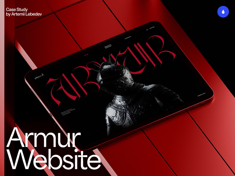
A portfolio site is always a personal story. In essence, it is an extension of your personality, whether it’s creativity, a creative business, or something else. The main task is to convey a person’s vision, capturing the overall emotion and feeling.
It is also important that this is combined with a functional part that will be:
- Easy to update
- Easy to manage
- Scalable
- Have certain patterns and a system that can be repeated on other pages
From Posters to Web
Alexandra approached me with a rather ambiguous task. She was inspired by posters in the spirit of neo-futurism, with a touch of darkness. Most people understand that such experiments involve an abundance of decorative elements. However, websites are a bit different — we need to focus on the content, remove all unnecessary elements, and at the same time, add visual imagery that will be accurately associated with this particular person.
Background and First Concepts
The first concepts were very raw and underdeveloped. At the initial stage, I focused on finding the emotional and visual connection without concentrating on other aspects. We went through about seven options, each with its own unique features—some elements we kept in mind, while others we discarded without hesitation.

Approach to the Core Idea
When I work with independent artists, musicians, or tattoo artists, I make sure to thoroughly study their work. I aim to understand the core message and the energy that emanates from the creator.
This often helps me find the thread that just needs to be pulled in the right direction. That’s exactly what happened here. One of Alexandra’s popular yet somewhat scary works is the creation of a mask for the movie Hellraiser. The mask was meticulously handcrafted. Alexandra shared some behind-the-scenes shots. I can’t show all of them, but I will share a few.


The primary materials used in the production of costumes and decorations are latex, metal, and plastic. The knight served as the main character, bringing all these elements together logically.
Modeling & Design
The biggest challenge I face in every project is this: to model, render, and, along the way, figure out how we’ll integrate it—whether through video, Spline, WebGL, or some other method.
It’s crucial not to overload the scene, so I always keep in mind that the model shouldn’t be hyper-realistic or have an excessive number of polygons. Otherwise, everything will fall apart.


In addition to the model not being heavy, it should be available in all formats and resolutions, and it should seamlessly blend with the overall image of the website.
We tested each potential frame with the content and only then prepared the movement that we had discussed and envisioned.

Camera Binding
We initially understood that creating depth would require more than just basic rotation or movement of the model along one axis. To achieve depth, sometimes it’s enough to simply show it. Together with Alexandra, we decided to use the camera to display the model along each axis, adding depth to the main page.
Controlling the camera is a challenge that can be approached in several ways:
- Directly control the camera as the user scrolls.
- Create a camera rig in the original render.
- Link After Effects and synchronize everything accordingly.
We chose the second option, which we tested against the content. It’s important to understand that this is an iterative process, and we may need to take a step back each time.
Other Pages
Initially, we assumed there would be more pages, each containing a part of the knight, such as a hand on the About page, a head on the Service page, and so on. The main page would be the core, with all the other pages featuring scattered pieces of the knight.
However, after some discussions, we decided to limit ourselves to a few pages. Therefore, we transferred part of the knight, particularly the head, separately to the Services page.
Mobile Version
For the mobile version, we needed to have fewer frames per scene or reformat the entire interactive. The second option seemed too unusual to me, creating such a distinction. In the end, we chose the first option and simply reduced the number of frames and adjusted the aspect ratio. The scene mirrors the movement from the desktop version, just with fewer frames.

We kept everything as it was on the looped version of the services page, without altering any of the movements. The quality of the render and its optimization made this possible.
The Power of Collaboration
This project began as a huge experiment. Most of our communication was through messaging apps. I was so engrossed that I think I worked on this project 24/7 because I was determined to achieve great results. Sometimes, interesting ideas would come to me at random times, and I would immediately share them with Alexandra for her thoughts. We would then combine our solutions and discover something entirely new. In the end, it turned out to be an amazing project, thanks to our close collaboration and shared desire to create something unforgettable and memorable.
Now, Alexandra continues her work in film, and I hope to see new projects soon that I’ll gladly add to her website!
Technologies and Software
- Frontend: Webflow, Lenis Scroll
- Backend: Webflow, Amazon S3
- Tools: Figma, Cinema4D & Redshift

