Fishing plays a huge part in society. It is a form of livelihood as well as recreation.
This roundup will feature some of the best fish logos that you can use for your brand. Each one is designed to capture unique qualities in any fishing club, fishing supply store, seafood restaurant, and other related use.
This animal is an excellent choice for a brand mascot logo. Besides its relevance, it also has a meaning in art and literature, which can be used by different brands. It symbolizes freedom, salvation, and religion.
It is crucial to have a compelling brand logo. This symbol must capture who you are and present it to the audience in a remarkable way. This will help you reach your target audience and connect with them.
An effective logo design will allow you to communicate what you can offer and what makes you unique. The following fish logos you will see down below will help you achieve that. Check out the overview here:
Text logos
Typography is a powerful element that you can use to demonstrate your brand traits. Even brands from different industries such as Coca-Cola and Google have used text logos to represent their brand.
For fish brands, you can use different fonts and colors to create a compelling design even without illustrations that may result in visual clutter.
To create a text logo, you want to look for an appropriate font. There are two types of commonly used fonts which are serif and sans serif fonts.
Serif fonts are letters that have the tailed element at the end of each stroke. This style of text is seen as old-fashioned and elegant. While its counterpart, sans serif fonts, do not have this element. This produces a cleaner look that is often used by modern brands.
Atlantic Sportsmen by AlexTurner _monkeys
Balzani Seafood by Manish Andani
Baton by TrulyAce
Beyond The Reef by Adsonix
Captive Raised Reef by MikroDesign

Catch Logo Design by Second Eight
Dispongeables™ by Buck Tornado
Dog&Fish by Burak Bal
Doon Doon Campground by A Casa de Lilith
findio by JimjemR
F I S H A Florida “Kraker” Bar and Grille by archemran

Fishbone by alexpours
FishRocket by Levon
GeoMapFish by ZoneArt

Koi Construction Inc. by Jay Design
Logo for fish & seafood restaurant by Dmitriy Kudlik

LURE ME by Design Nation
Mr. Dry by kpeychev
NinjaRigged by volebaba
Ocean Storm Fishing Tackle by damakyjr
Outdoor Marketing Group by Shine Designs
Paradise Point Takeaway by lalpispita
Tail & Fins by Nekiy
The Panel Fishing by Shadowcaster_studios

TrollTrue by Arthy
tuna logotype by Yoga Perdana
Pro tip: Limit your use of color
While it’s true that colors give life to your design, you want to be careful of adding them into your design. Designers recommend using two to three colors for your logo design. This keeps it coherent and prevents an oversaturated design.
Illustration logos
Show off your creativity with an illustration logo. Drawings such as fish clipart or fish vectors allow you to have an attention-grabbing design and, at the same time, give you a powerful visual communication tool. One of its advantages is that graphics are self-explanatory. Using images alone, your audience can figure out what type of goods or services you have to offer.
It is common for fish logos to contain fish, fish hooks, fishing rods, water, and other relevant objects. This is often used as the logo’s focal point and can even help guide the eyes of the audience to the business name.
Simple drawings are best for fishing logos and seafood logos. An overly complicated illustration may make the logo less versatile and make it hard to apply.

Angler Fish by Artistic Quest
aquascape by user1512435721
Bronze Fish Brew Co by Mandy Illustrator
Chopped Fish Sushi Logo by Lisa Jacobs
creatif fish logo design by Grafast Design
deadfish by logogo
DING FISHING LOGO by harrysvellas

Dolphin Leaf Logo by freestore 839
dolphin sunrise by brandshop
Eco Fish by Levon
ecoikan by zhArt
Fish and ships logo by Slavisa Dujkovic | logo
![]()
Fish Chart by CreativePixels
fish lemon by zhArt

Fish Outdoor Logo by freestore 839
Four Star Seafood by Art Girl
Goin Coastal by mera design crowd
Henrys Lake Foundation by jika,
Hungry Fish Seafood Restaurant by Oliver Balard
identi.fish by rum
Jumping Whale by Alfrey Davilla

Little Whale Productions by olvanita
Manna Systems, Inc.™ by MBARO
Mr and Mrs Fish by JACQUI

Nelmare ( Fish logo ) by Roden Dushi
Rocket Fish by arishu
Roojai by humibest

Shark by eclipse42
 Soldfish by Atvento Graphics
![]()
STINKVIS by Pixelsteak
Tangy Fish by khushigraphics
USA fish by S4rt4
Pro tip: Make it scalable
Think about how your logo will look on different collaterals. Picture it on big brand assets such as signages and smaller print outs such as business cards. It should look understandable in various sizes. That’s why you have to make sure your design isn’t heavy on details and has a strong silhouette.
Shape logos
If you’re looking for something that will help tie together the elements in your logo, shape logos might be the one for you. This type of design makes use of different figures to add ornaments to the logo. It can also give the logo a solid body, acting as a frame to create emphasis.
Shapes add depth both visually and figuratively, too. According to shape psychology, consumers associate traits with figures that affect how they see brands that use them. For example, brands that use circles appear more harmonious, those who use triangles are perceived as edgy, and more. Learn more about it and use it for a strategic design.
Adipose Coast by DAVIDEZIGN
Andry’s Fish Farm by MWaleedE
Angler.cr by DonJ

Beach Fishing Logo by user1528015220
Big Fish Cut by wonderland
Color Fish by rossini11
Double fish by logotipokurimas
FISH BALL by pandalungan

Fishdish by mrgembel33

Fish Flame Logo by freestore 839
fish grill by abnmh
Fish logo by Levon
Fish Logo Design by Elif Kamesoglu
Fish Tank Palace by LogosFactory

fugufizz by larismanis

Kahuanui by Rosalia….
Kilikana Sports Fishing by Gitta_Jensen
Lele Super Abang by tururu
Pike Fishing Club by Logobrands
Pokei Poke by Mike Jones
Seawave by Biswarup Garai
Simple Logo Design by amiofice 2
The Bass Academy by Kinetec

Whale by krasnoshchek
“Whats the Freshest” by logo_me
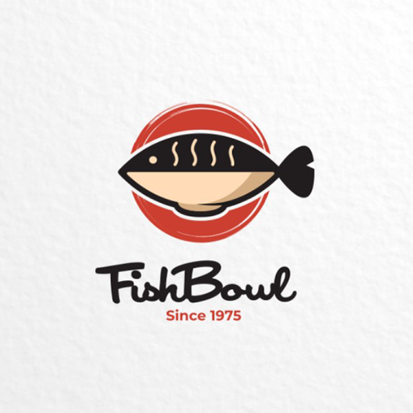
fishbowl by Garasigrafis
This fishbowl logo uses a red circle to stand as the background of the illustration and typography. The neutral colored image and text were lifted up by the striking form and color of the ring. It framed the design nicely and made it striking.
Pro tip: Know your audience
Knowing who you are designing for will help you figure out what type of design works best for your brand. You want to consider what will best intrigue and connect with your audience. It’s best to start thinking about their age and interests. From there, you can try to figure out if they’d appreciate a vintage logo design, modern logo design, and the like.
Conclusion
Logos help solidify your business. Having an established brand will make you easier to remember and find. As a result, people are more likely to talk about your brand and spread awareness.
Start improving the way you present your business to the audience by getting a custom logo. Today, you have the option to work with a community of freelance designers at once through a logo design contest. Crowdsourcing platforms like Designcrowd makes this possible. Learn more about it and get ready to receive up to 50 design submissions today.
Using a fish and fishing logo maker is also a good idea for working on a tighter budget. The BrandCrowd logo maker lets you generate and customize designs in minutes. This easy to use tool allows users to apply their brand colors, typography, and other elements to make a truly unique logo. Try it right here.
Read more articles on design and inspiration:
Written by DesignCrowd on Tuesday, February 9, 2021
DesignCrowd is an online marketplace providing logo, website, print and graphic design services by providing access to freelance graphic designers and design studios around the world.

