PowerPoint decks allow you to organize thoughts and segments of your presentation correctly. It aids any presenter with a powerful visual aid that helps relay information effectively.
A study by Nadya Khoja found that 47% of speakers in MarTech 2018 aim to assist their audience in processing information using a compelling presentation design.
Even actress Emma Stone seized the opportunities of PowerPoint presentations to kickstart her career. Stone presented slides to her parents to let her pursue a career in Hollywood when she was fourteen. Look where she is now. She’s an Academy award-winning actress with an established filmography.
Creating presentations has become a vital skill for corporate employees or anyone, really. But designing presentations in PowerPoint is no easy task. That is precisely why we’re here to guide you through the process.
Well-designed pitch decks truly are powerful tools to have around. These materials drastically improve tutorials, annual reports, business pitches, and a variety of other talks. To get yours started, you can head over to these sections and start learning more:
- 8 PowerPoint design essentials
- Great examples of PowerPoint design
PowerPoint Design Essentials
No one wants to have their presentation lacking any detail or element. You always want to have an asset that packs a punch to create as much impact as possible.
For speakers, the “10/20/30” rule is something that they live by. The rule encourages lecturers to have ten slides, 20 minutes to present, and a font point that is no smaller than 30 points. Practicing this can lead to concise and remarkable PowerPoint presentations.
Condensing an elaborate presentation to fit those numbers may get challenging. Learning the essentials of PowerPoint design is a great help to many resource persons and designers who are struggling out there.
This quick list of PowerPoint design must-haves will help you become more confident in creating a compelling demonstration.
Branding
From business cards to PowerPoint decks, your marketing collaterals should always represent you. One good way for you to differentiate yourself from the market is to create a distinct visual identity. You need to use unique design elements to prevent yourself from being confused for another brand.
Doing this can be as simple as including your business logo, company mascot, using fonts and colors consistently, and more. Creating consistency in the way you present your brand helps you drive revenue growth by 33%, according to research by Lucidpress.
Visual Coherence

Before zeroing on the nitty-gritty of a presentation, humans will focus on its entirety first. This is where coherence comes in.
Designers use the Gestalt Theory to help guide their design process. It concerns the visual perception and coherence of humans.
The theory has six principles: similarity, continuation, closure, grouping, figure, and symmetry. Being mindful of these principles will give your design balance and create a better impression on your audience.
Images and Illustrations

65% of the population are visual learners. So instead of using text, excellent presenters use visual tools such as pictures, graphs, and illustrations. These tools help express emotion and may be used to visualize data.
Overall, it is a best practice not to overload Powerpoint slides with words.
Pro tip: Choose stock images wisely.
You want to be as original as you can with your custom PowerPoint. It’s best to be extra careful when selecting a stock image. As much as possible, stay away from overused stock photos. You know what we’re talking about. Your audience has had enough of the same picture of a distressed man sitting in front of his laptop.
Check out the best free stock image websites to narrow down your search fast.
Color

Your presentation should be easy to see read. Now, it is a common misconception that the only way for you to do this is by typography.
However, color plays a part in readability too.
When selecting colors for your presentation, avoid using over-saturated colors that are hard to see. Instead, you can combine either light and bold palettes to create complementary, analogous, and monochromatic colors.
Additionally, you can make your presentation more friendly to people with dyslexia. Do this by not using light shades of colors like green, red, and pink too much in your design as these colors make it hard for dyslexic people to read.
Pro tip: Use color for emphasis
The critical parts of your presentation like your CTA can get more attention with the use of color. Warm colors are often used to add importance to information, including red, orange, and yellow. By doing this, you can give elements a sense of urgency and importance.
Hierarchy

Size, space, and grouping all play a part in creating an order of importance. This serves as a visual cue for your readers to pay attention to a particular point of your slide. It helps them digest information in a more efficient way.
Give prominence to the part of your content that is considered a priority. It is a common practice for designers to place vital information like headlines or big figures in a higher position on the slide and using a much bigger font for it. Think of this as the “Look at me!” part of your design. Spacing your elements can also lead more eyes to the design and keep visual clutter at bay.
Typography

Ever seen a PowerPoint design before that could have been improved with a better font choice? You can avoid that by knowing how to use serif and sans serif fonts appropriately. Serif fonts are best for formal events, while sans serif fonts are for more laid back settings.
Fonts like Futura, Garamond, Rockwell, and Raleway are some of the best fonts for presentation slides.
At this point, you might be wondering what font size is best for you. As mentioned in the 10/20/30 rule, it is recommended to use 30 pt or higher text.
Effects

Sitting for minutes on end while staring at inanimate slides can get boring for many of us. Animation effects help alleviate some of this boredom.
This design element can help you emphasize points, entertain, and keep your presentation from becoming a snoozefest. Transitions like fade, cut, uncover, and cover are some of the best effects on PowerPoint.
However, you want to work towards providing variety. As usual, never overdo it. You don’t want your audience to come out of that presentation dizzied by your PowerPoint.
Content

At this point, you probably have a stunning design. All you need to do is provide quality content for your audience. You want to include the problem, solution, timetable, summary, and call-to-action while keeping brevity in check.
The best way to present these subjects is by using bullet points instead of using long-winded paragraphs. Experienced speakers stick to using six bullets a page.
Keep in mind that you will be projecting this from feet away. Not every member of the audience has the privilege of taking a closer look at your slides.
Great examples of PowerPoint design
We’ve got a list of PowerPoint design inspiration for you. These examples have managed to create a captivating report with the help of good content and graphic design. The designs featured in the list below offer fresh and creative ideas that you can learn from.
Get ready to see how they have effectively used design tricks and essentials to make your PowerPoint decks shine.

Company Biotechnology PowerPoint Design by Imazing

Company PowerPoint Design by Best Design Hub
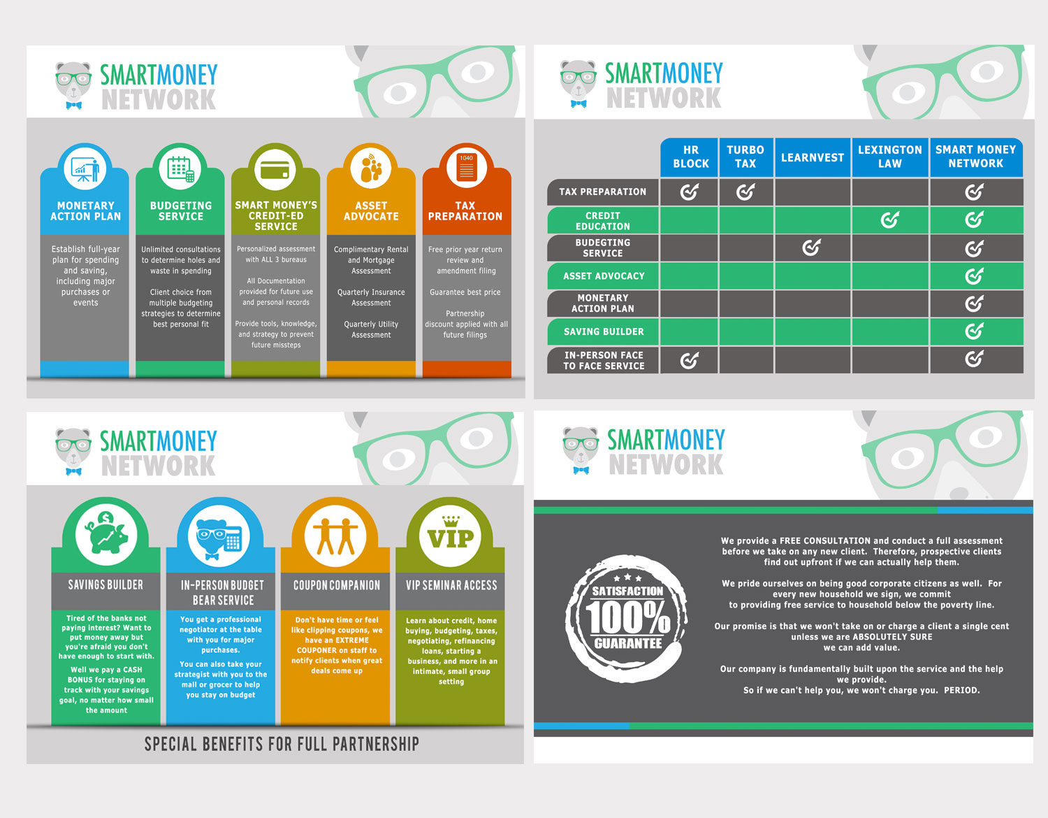
Financial Planning Financial Planning PowerPoint Design by ordelya.nicole
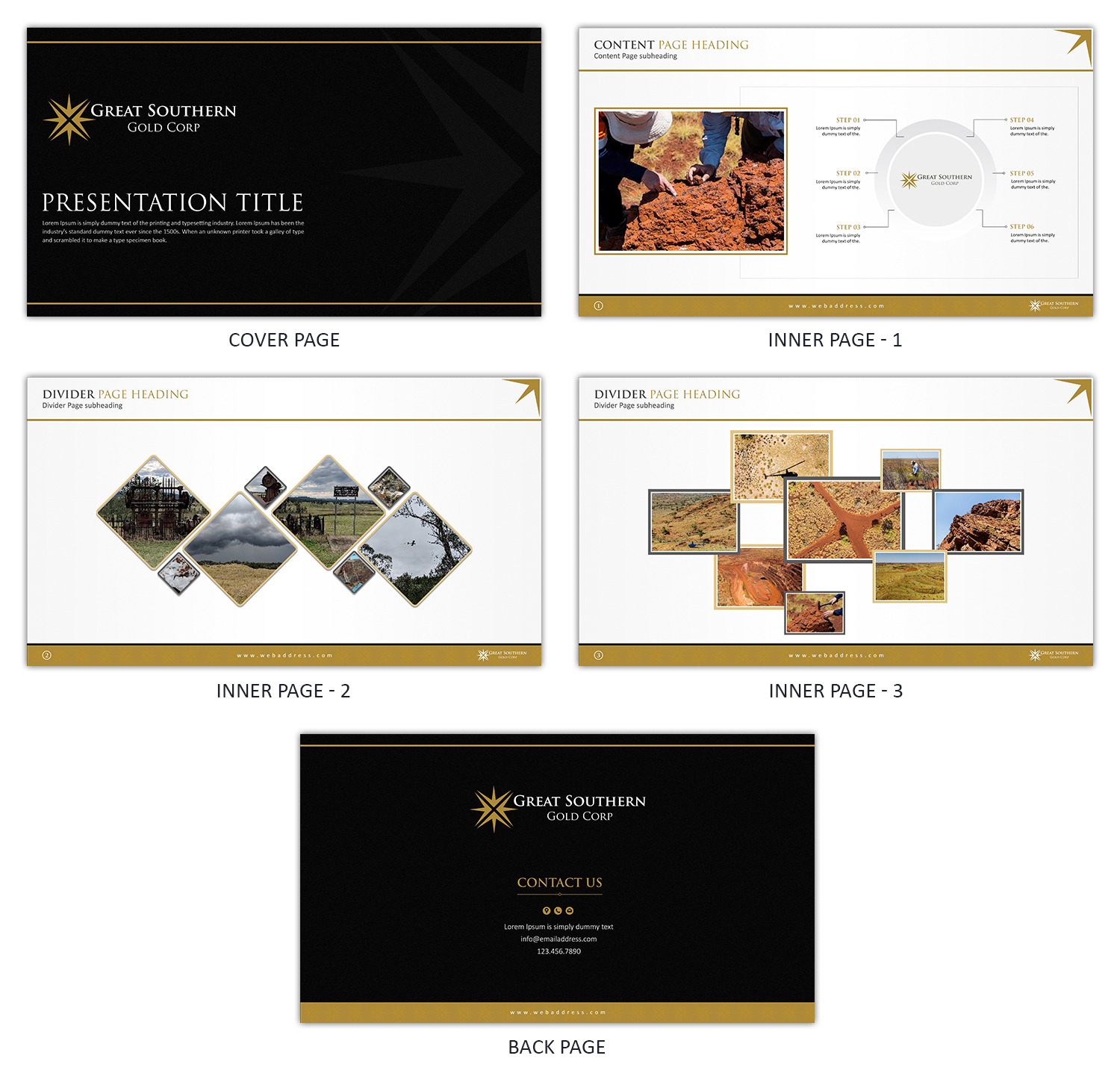
Great Mining PowerPoint Design by SD WEBCREATION

Management Consulting PowerPoint Design by SD WEBCREATION
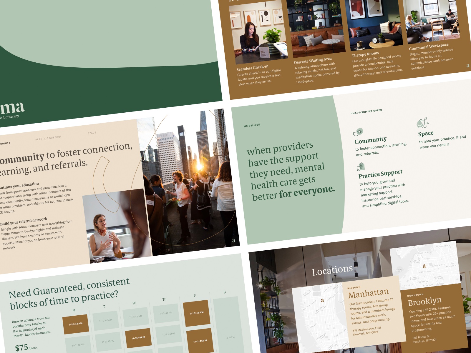 Membership Sales Deck by Meg Lewis
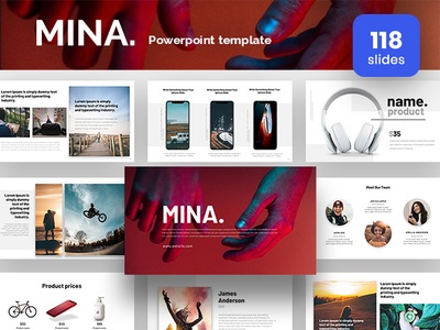 Mina Powerpoint Presentation Template by Azad
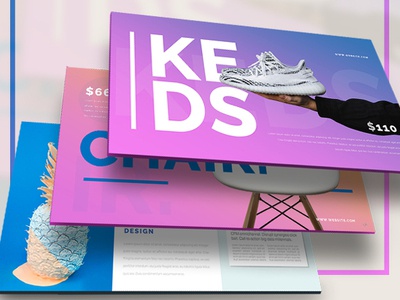
Most Powerpoint Presentation Template by Azad
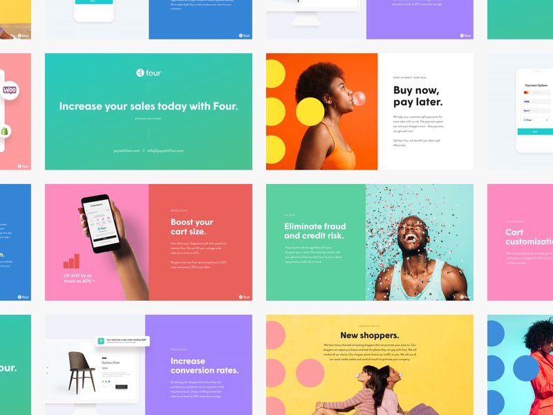
Sales Deck by Janna Hagan
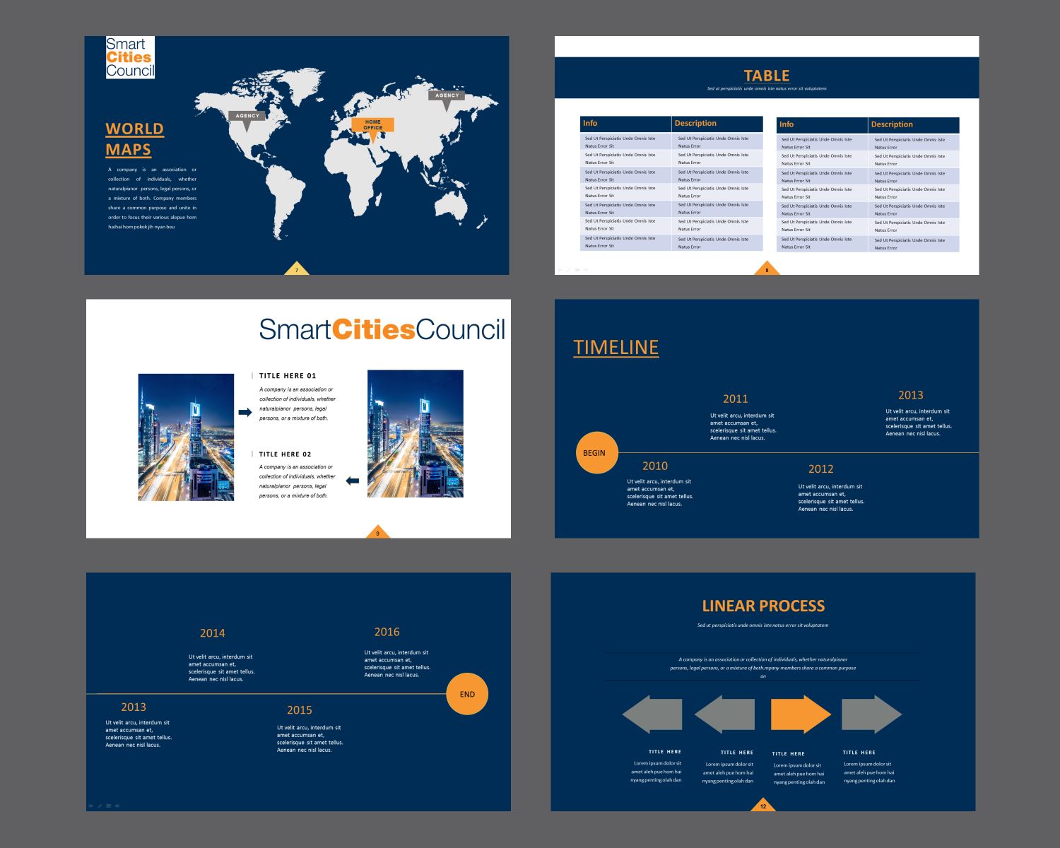 World Information Technology PowerPoint Design by 4AD
Of course, you don’t have to do it in the exact same way as these examples. You can have fun with your design and instill your brand personality to make it even more unique.
Conclusion
There’s this thing called “Death by Powerpoint.” It is a well-known phenomenon brought by all the bad practices of PPT design. This includes terrible illustrations, lack of contrast, information overload, and more. It hinders any presenter from engaging their audience.
As long as you keep these PowerPoint design essentials in mind, you won’t have to worry about creating a presentation that doesn’t connect with your audience.
Plus, your audience can make it out of your presentation alive and awake.
You can become an effective communicator with the help of graphic design. Getting a custom PowerPoint design will allow you to build a sharper brand image.
Running a PowerPoint design contest is a quick way for you to achieve this. Through design contests, you can collaborate with professional graphic designers to achieve your ideal presentation deck. Prepare to receive and evaluate original submissions that will follow your design brief closely.
Discover the benefits of design contests today.
More articles you will enjoy:
Written by DesignCrowd on Friday, August 28, 2020
DesignCrowd is an online marketplace providing logo, website, print and graphic design services by providing access to freelance graphic designers and design studios around the world.

