Visual is a hot topic in the world of digital content, which includes your website, your blog posts, your branding elements, and even social media posts. Website visuals have become stunning, in order to attract and keep visitors; busy and impatient Internet users prefer visuals to text; and, let’s face it – well-designed visuals enhance the aesthetics of any content.
In the past, hiring a graphic designer was a must. Today, it’s a different story. If you can harness a few creative juices and are willing to learn how to use software that is already available, you can produce amazing visuals (and make your own logo) all on your own. Here are a few how-to tips that will have you designing in no time.
01 Don’t be a CopyCat
Your brand image must be uniquely you. It’s great to look for logo design ideas used by others. You can actually get some great ideas by doing this. But in the end, your designs must be customized for the brand image you are trying to portray. And there are certainly lots of template designs that are appealing and attractive. But others are using them too. Take the best ideas you find, and then go about customizing your designs to make them unique.
02 Your Colors
These are as important as the design itself. Consider the difference between the brands Rolex, the upscale watch company and Dollar Shave Club, a subscription-based razor and personal product company.
|
Rolex Logo Signage |

Dollar Shave Club Logo |
The Rolex brand appeals to high-end clientele and uses a logo that includes black and gold. If you check out their website, you will see that the palette continues with shades of black, gray and gold.
Dollar Shave Club prefers a more “rugged” look, and, while this logo has a black background, the true color palette is brown and orange, as depicted on its website and all of its digital marketing everywhere online.
What colors best depict the message you want to give? You might want to take a look at the research on color psychology as you consider the colors you want to use for your brand – in your logo, on your website, and on the graphic designs you choose to create.
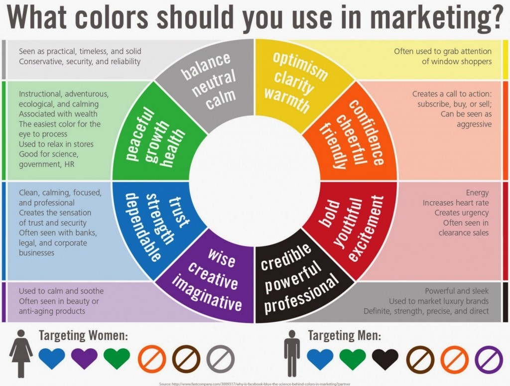
Color Guide for Marketing Your Brand (via FastCompany) |
But do limit your color palette to just two or so colors. Brands that use too many colors can be mentally confusing to their audiences, and you look indecisive when you do this.
03 White Space – It’s the Relief
If you have accessed any websites that are crowded and just filled with content and images, you understand how irritating they can be:
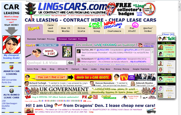
LingsCars.com – There’s a lot to see here. You might be surprised to learn Lings Cars is a very successful online business |
There is just too much information to take it all in. There are too many colors, too much text, too many banners, and no ‘breather space’. As you design your website, or create any other visual content for your audience, be mindful of the need for white space. It allows brains to ‘rest’ between images and text.
04 About Those Fonts and Typography
If the brand name is a part of a logo, choosing the right font is a design decision. Consider Coca-Cola’s classic wordmark logo; the same goes for other well-known brands, like Taco Bell, or Remax Realty.
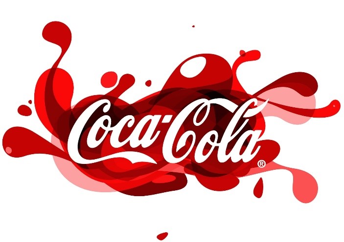
Coca Cola Logo |

Remax Realty Logo |
Font and typography on your website are also visual design decisions. As you think about font, think about your brand’s image and message. You obviously do not want a formal, conservative font if you have a product that is ‘casual’, fun, or cheeky. It would look out of place and even confuse a visitor.
It can also be too ‘busy’ (and unattractive) if you use a lot of different fonts. Stick to two, three maximum.

Flyer featuring 6 fonts making it very hard to read |
While the designer of this promotional ad probably thought he would grab more attention with all of these fonts, you have to agree it is rather a ‘turn off’ and just looks scattered and random.
Now take a look at a visually appealing example of a site that uses just a couple of different fonts.
The PayPal website looks sleek and is easy on the eye.
05 Contrast
This is a key design principle. Contrast occurs when any two elements on a web page are different. It may be color; it may be differences in typography; or it could even be a texture thing. Human eyes seem to like contrast. The key here is that the contrast has to be bold, not just minor.
Contrast can increase focus and grab attention. Consider Spotify’s use of vibrant colors and gradients:
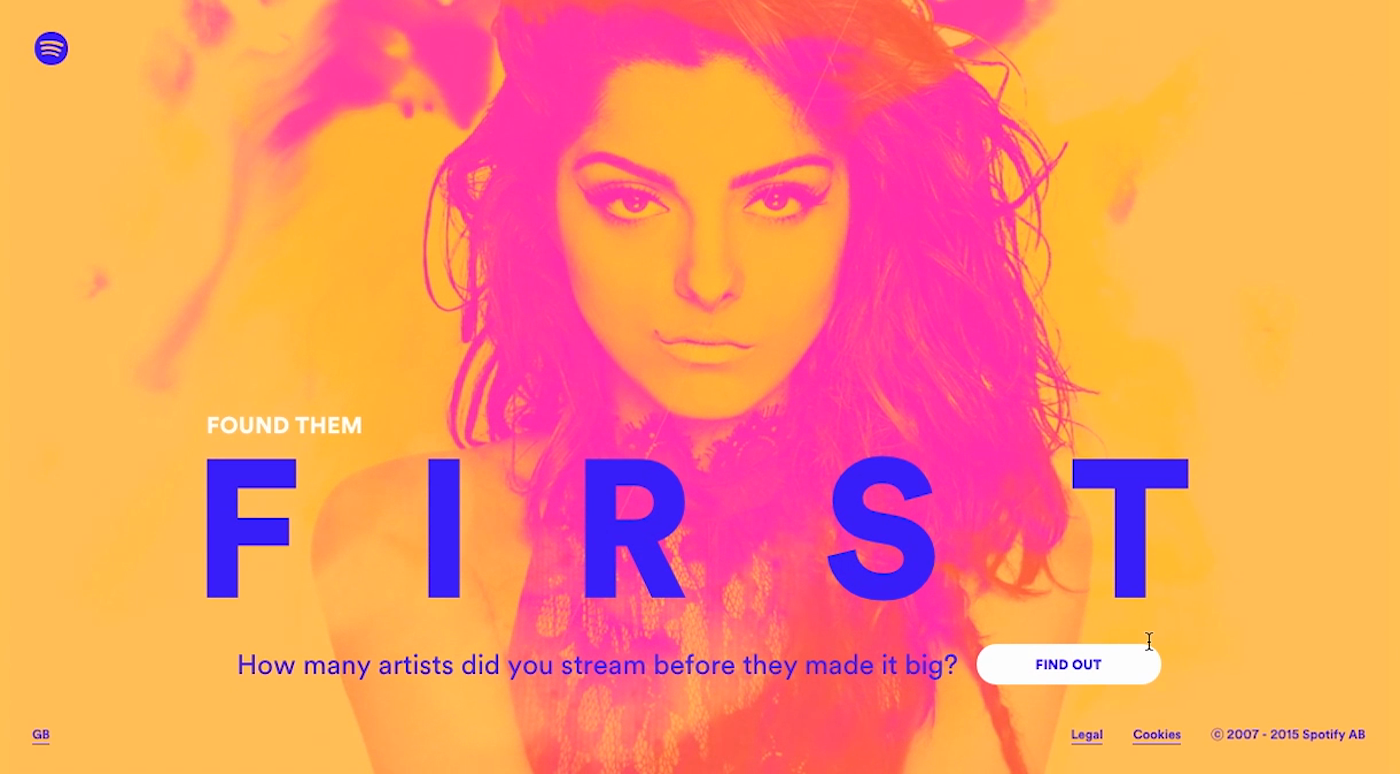
Spotify Embraces Bright Contrasting Colors |
Use typography as a design element. High contrast black on white looks amazing for this eyewear company’s business cards.
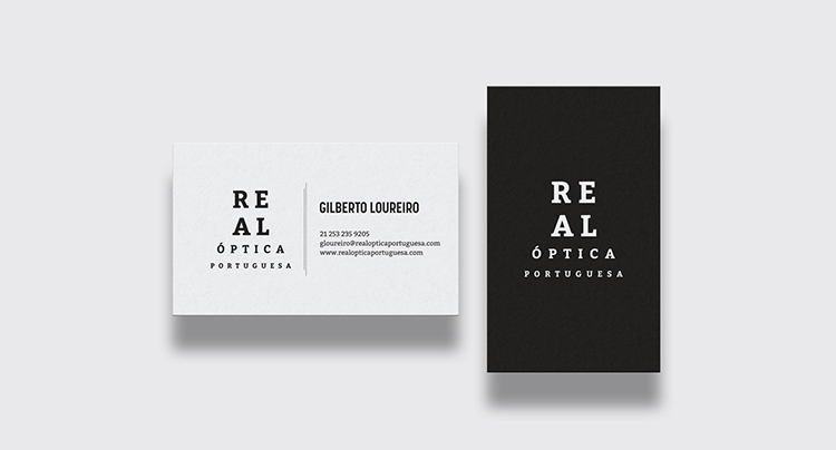
Serious, eyewear business card by HYPdesign
06 Experiment
It’s fun to experiment with graphic design elements, as you create your own visuals. Come up with your ideas, craft them into a design, and get feedback from your friends and colleagues. If you already have a following/customers, throw those design examples out for comment. There is nothing better than getting opinions from your target audience.
In your experimentation, you may also want to use the services of other experts, especially if your designs are to be a part of a presentation or, let’s say, the creation of engaging infographics or brand visuals – try DesignCrowd to access a community of 500,000 talented professional graphic designers.
Conclusion
You may not consider yourself a creative designer. You don’t have to be. You can study the principles of design, look at examples, and become your own ‘expert’. Such elements as alignment, hierarchy, repetition, proximity, balance, and space are technical aspects of design that you will want to become familiar with and use wisely. Yes, it will take time and experimentation, but, n the end, you can craft great design elements all on your own. And given the design software tools that technology now supplies, what’s stopping you?
Guest Author: Ethan Dunwill is an entrepreneur, blogger and contributing writer for several websites. He also provides master-classes about business and marketing. Connect with Ethan via Twitter and his personal blog.
Want more?
Brand Optimization: 4 SEO Tips To Improve Visibility
20 Graphic Design Trends You Can Use Right Now
5 Big Trends Influencing Graphic Design in 2018/19
Written by Jo Sabin on Friday, October 5, 2018
Jo Sabin is Head of Designer Community at DesignCrowd. She’s led the company’s public relations and social media programs since 2012. With more than ten years’ experience working with Australian and international tech startups in the creative industries, Jo has been instrumental in meeting DesignCrowd’s objectives in Australia and abroad. Get in touch via Twitter.

