

Typography is becoming more and more of the main visual element in all successful movie poster designs.
The graphic designers who created the movie posters for the 2018 Oscar Award finalists have put typography front and center in their designs.
In this article, we analyse the five of the most common typefaces used in 50 examples of stunning, must-see movie poster designs from the 2018 Oscar Awards.
Creating a typeface for a movie or film production poster is determined through the era the film is set in, the film’s setting and the genre.
For example, the film The Post depicts a drama about the first female publisher of a major American newspaper. While you would think to create a serif typeface (similar to that time or even the publication), the graphic designers created a san serif typeface that would signal the idea of ‘change’ and an ‘evolving world.’
Visual Hierarchy. In all poster (and every other category of) designs it is important to understand which element the emphasis should be.
Throughout most of the nominated films dominant design trend is text. The hierarchy of text is highlighted through size, weight, colour, case, position, and most importantly choice of typeface.
Anatomy of Type
Whether it’s using your own typeface or using preowned fonts, a basic knowledge of typeface and typographic terms is super important.
Here’s a quick run down of the key typographic terms to understand when designing your poster:
Kerning
Kerning is the adjustment between letters.
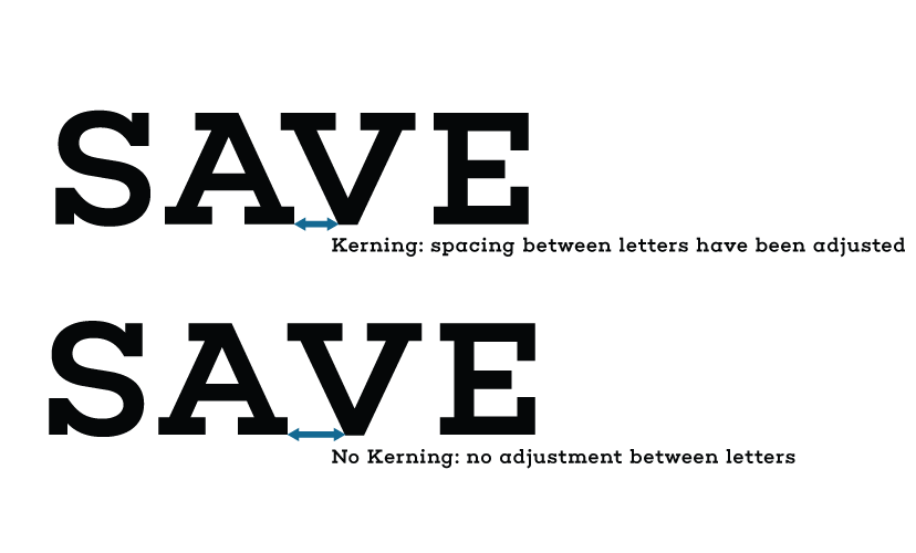
In some of the 2018 Oscar movie posters, kerning is exaggerated for dramatic impact. Whilst others make sure the ‘A’ and ‘V’s are not too far apart.

|

|
Line Weight
Line weight plays an important in typography for posters. Weight refers to the visual lightness or heaviness of a typeface.

The heaviness of letters can make text look larger, whilst a light typeface can make the text look less important. The weight needs to either juxtapose or relate to the visual hierarchy of the rest of the poster. For example, the movie poster for The Big Sick plays uses hevey font weight combined with bold color to make the title pop.

Here are the five critical typefaces identified from the 2018 Oscar film poster designs.
01 Sans Serif Typeface

|
|

Typical characteristics of sans serif typeface:
- Footless forms at the end of the stroke
- Modern
- Simple
- Readable in all scales
- Less detailed – minimal
- Still popular to use for headings
- Used for all gentres, settings and eras
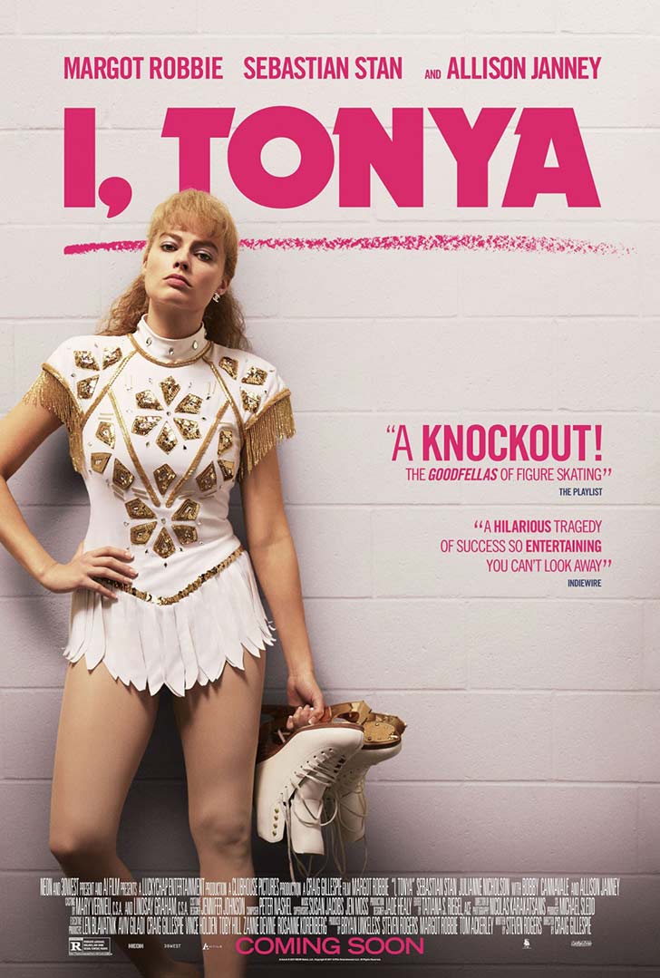
The sans serif typeface used in the I, Tonya movie poster is an amended variation of Dynamo Shadow font.
|

|
|
|


|
|
|
|
|
|
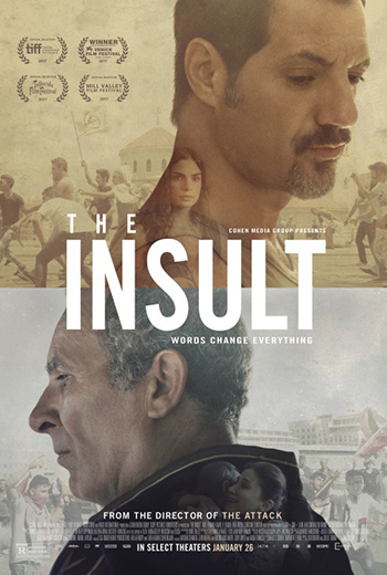
02 Serif Typeface
|
|
Typical characteristics of serif typeface:
- Classic and original type
- Has tails at the end of the stroke
- Much easier to read especially in the print world
- Has a little bit more presence and sets a tone to each poster
- The typefaces have weight contrast within each letter
- Genres: classic, documentary, drama, historical
The script typeface used in the The Greatest Showman movie poster is called The Greatest font.

|
|
|
|
03 Script Typeface


Typical characteristics of script typeface:
- Footless forms at the end of the stroke
- Modern
- Simple
- Readable in all scales
- Less detailed – minimal
- Still popular to use for headings
- Used for all gentres, settings and eras
The script typeface used in the Lady Bird movie poster is called Amador font.

|

|

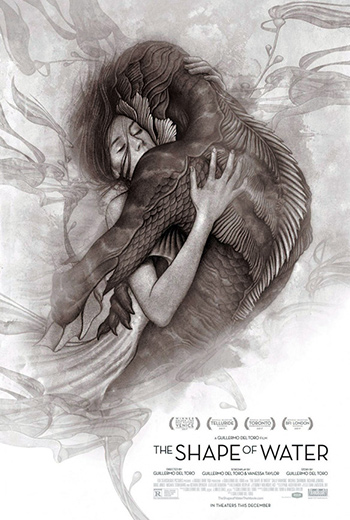
04 Descriptive or Decorative Typeface

|

|
Key characteristics of descriptive or decorative typeface:
- No structure or definition to the typeface
- More of a natural style
- These typefaces are unique and creative
- Instant recall
- Popular typeface for sci fi and fantasy movies
Using these typefaces makes viewers remember the typeface. For example, looking at the movie Blade Runner 2049, you immediately know that this movie is the sequel of Blade Runner.
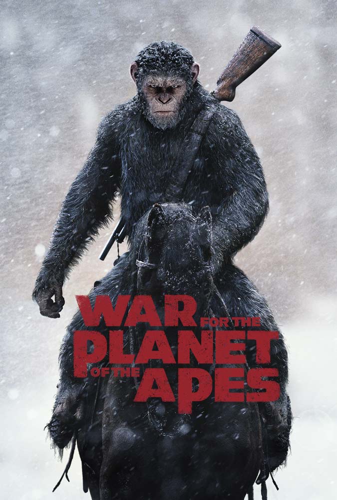
The descriptive typeface used in the War of the Planet of the Apes movie poster is called Planet of the Apes font. 🙂
The descriptive typeface used in the Baby Driver movie poster is called Gunplay font.
Apologies for the poor quality of the poster: Heaven is a Traffic Jam on the 405.

|
|

|
|
|
|


05 Combination Typeface
Characteristics of combination typeface:
- Juxtaposition of two different typefaces or even two different weights.
- As mentioned previously two different line weights allows certain typefaces makes certain words the focal point.
- Juxtaposing different typefaces is a growing trend at the moment.
- It is important to the get a great balance between the typefaces, have one typeface smaller than the other, or even in caps in order to create a harmony to the poster.
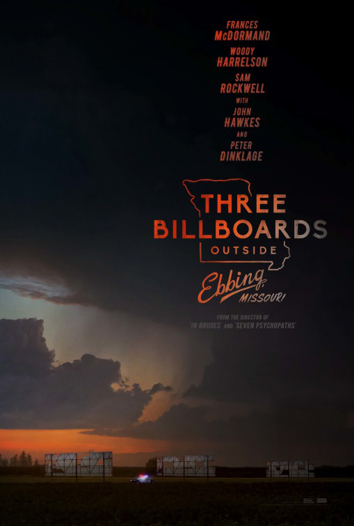
The combination typeface used in the Three Billboards Outside Ebbing Missouri movie poster design is called Biko font.
|
|
In Conclusion
As the poster designs for the successful 2018 Oscar Awards finalists demonstrate, using the correct typeface is important. Remember you need to develop a basic understanding of typefaces. To get you started, research the era, genre and setting of the film, this will give you a mood board of the typefaces in use. From there, place the typeface with your other visual elements and hey presto a winning film poster is created.
Want more?
Check out these movie company logo design ideas and these other articles on typography and movie related design:
Learn everything you need to know about typography
40 Must-See Movie Posters From Drama, Comedy, Documentary, Horror Genres
Iconic Movie Posters Reimagined
10 DesignCrowd Film Posters That Made Us Grab The Popcorn
20 Movie Posters Redesigned With One Letter Changed In The Original Title
Written by Divya Abe on Monday, March 5, 2018
Divya Abe is an expert graphic designer ready to share her knowledge with the crowd. Besides spending quality time on the internet she enjoys anything to do with cats. Get in touch via Google+.