

Creative people will know that creativity comes in waves, whether your brainstorming logo design ideas or a flyer to promote a sale for your business. Sometimes you may be brimming with inspiration and ideas, and sometimes your mind can feel foggy – it’s entirely human.
While this ebb and flow of creativity is common, how do you keep your creative squad inspired to produce exciting ideas and print designs. In this article, we’ll share five creative brainstorming techniques that you can apply right now to boost your creativity.
Modern, sleek catalog design for wine products by Oilegak
Before you begin the design process, here’s a 10-point checklist of items to consider during the print process to ensure things go smoothly.
Considerations for print production:
- Type of material (e.g. brochure, flyers, business cards)
- Quantity/volume you require
- Number of pages/size of document
- Paper type (texture, weight, brand)
- Bleed (dependent on design and printer type)
- Bindery (folding, stitching, ring binder)
- Flat size and finished size (size before and after it’s folded)
- Date that materials must be printed by (deadline)
- Samples and proofs (before the final print run to iron out any issues)
- Packing and shipping the materials (letterbox drop or in-store promotion?)
New to print production? These DC blog articles will help:
Once you have planned out the above, you can begin the graphic design process. Using a bit of structure will help you to improve your lateral thinking and come up with the best ideas for your campaign. The 5-step process can be used by business owners, marketing teams, designers, or anyone that is managing a graphic design project.
01 Step into your customer’s shoes

Bright, yellow event poster design by
Culine Naudé
The most important step you can take in creating the print design is to approach the project by looking through the eyes of the consumer.
As a brand you should be well-acquainted with who your customers are and what they look like: their age, their lifestyle and their interests etc. Using this information you will be able to come up with ideas to attract them.
For example, if your target audience is party-goers between the ages of 18 and 24, they will not respond well to designs that are rigid, plain or corporate in style. You should instead design something eye-catching, bold, colourful and playful. Alternatively, if your target audience is homeowners who are looking to invest in property in affluent areas, your design should be elegant, luxurious and immaculate.
02 Encourage playfulness and flexibility
Playfulness is essential when working in a creative team on design projects. People are more likely to have good ideas and “eureka moments” when they feel excited, stimulated and joyful.
If you manage a team of creatives, think outside of the box by leading different work practices like games to get creative juices flowing. Don’t forget to reward team members for good ideas. This will help to unify your team and spark some great creative thinking.
What’s more, because creativity comes in waves, it’s not practical to work to a rigid time frame. Though it may be easier to manage a large team within a standard 9-5 schedule, you may not find it much productive.
Find out how your team works at their best, and leverage it. For example, you may find that your team is more creative in the morning, but burn out by the afternoon. If this is the case, why not bring your work hours forward an hour or two?
Another tip is to communicate with your team and let them dictate their flexibility. You want to bring the best out of your team, not restrict them.
03 Think about touch as well as sight
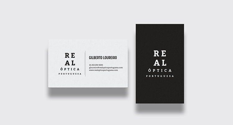
Serious, eyewear business card by HYPdesign
When it comes to creating a design for your brand, the visual impact is important, but don’t underestimate the power of touch. To enhance human satisfaction and intrigue, you can play on a person’s kinesthetic senses – the urge to “feel” and be tactile.
Tactile elements you could experiment with include cut-outs, shapes, pop-ups, embossing, foil stamping, suede, gloss, matte, satin, weight of paper, etc. All of these encourage the user to touch and enhances their senses. This means that they will spend longer with your design and connect with it on a deeper level. In turn, your brand will have a strong staying power in their mind.
04 Don’t be afraid of negative space
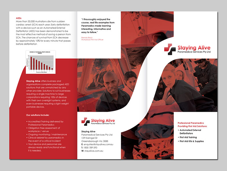
Paramedical service brochure design by Plimsoll Line
When designing a printed brochure, for example, it can prove difficult to position text and image harmoniously so that everything fits neatly onto one page. You may spend hours resizing, cropping and rearranging assets, but you needn’t be so precise. In fact, if you have negative space on a page you will actually enhance its impact and its readability.
For example, if you place a quote or testimonial on a page of its own it will have a lot more power than if it was squeezed into a corner of page that already has 300 words on it.
Embracing negative space will get you out of your design rut and will encourage further creativity and unique ideas.
05 Remember that less is more
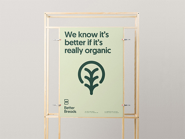
Organic, green poster design by Mr.Mockup
When creativity becomes stagnant and the flow of ideas runs dry, it often helps to step back from the project and look at it with fresh eyes. And actually, the great thing about going back to basics is that it reminds you that less is actually more, and maybe your design should be more simple.
Don’t get bogged down in the details when a design could be more impactful when it says less. Pull out the elements that you must include and treat everything else as unnecessary. Then, with the key components you have, experiment with colour, size, feel, shape, etc. With less to worry about you have more to play with, and the result will exceed your expectations.
Guest Author: Tam Bui, who is a Digital Marketing Manager at Print Logistics, a printing company based in Australia.Tam follows the latest digital marketing trends and sharing marketing tips and expertise with new businesses and marketing aficionados.
Want more?
Flyer Design Ideas – See thousands of print design ideas for your business
20 Design Ideas For Print That You Can Apply Right Now
How To Create A Color Palette For Your Business
Guide to Designing and Printing Your Own Product Labels
How To Produce the Perfect Packaging Designs For Your Products
Written by Jo Sabin on Wednesday, October 10, 2018
Jo Sabin is Head of Designer Community at DesignCrowd. She’s led the company’s public relations and social media programs since 2012. With more than ten years’ experience working with Australian and international tech startups in the creative industries, Jo has been instrumental in meeting DesignCrowd’s objectives in Australia and abroad. Get in touch via Twitter.