Building a brand image is vital for companies, especially small businesses. You have many options when it comes to choosing a brand mark that will symbolize your brand. Today, we are discussing three-letter logos in particular.
You may choose to have a letter logo to shorten your lengthy name or simply because your brand name only consists of three characters.
Either way, you’re in luck. We have a list of captivating brand logo concepts for clothing brands, consulting firms, and a whole lot more.
Letter symbols provide brands a unique way to present themselves to their audience. Using the initials of your brand and a super simple understanding of design basics, your brand can have a compelling visual identity. There’s a lot you can do to make typography work for you.
With these tremendous text-based logos, you can have a stunning design. Famous brands like IBM, Yves Saint-Laurent, NBA, and more have successfully made three-letter brand marks work for them. Start scrolling and get ideas for your brand, too!
Shape logos
Circles, triangles, squares, or what have you, shapes make for a high-impact logo. They act as a natural frame for your text design and gives it visual prominence. It will become much easier for you to apply your logo to different materials without being overshadowed.
Shapes communicate different traits to consumers. Square or cube three-letter logos influence consumers to think of your brand as secure, while circles help them think of your company as harmonious. Putting your three-letter design in triangles will make you look edgy.
AGD Monogram logo design by Enwirto

Blue Sharp A by eightyLOGOS

CCC Monogram logo design by Enwirto
 Commercial Red Letter N by ions

EMS by by ErrAr

GTA logo design by alesha design
 LHM Monogram logo design by Enwirto
 MSS Property Group by MT
 RSH MONOGRAM LOGO by arttemis_design

IBM letter logo design by alesha design

Spiked Letter M by Alexxx
When designing your typography, it is crucial to make sure you are using unique fonts.
Don’t use a font that your competitors are using. This will make your brand look similar to your competition, which is the exact opposite goal of branding. There are tons of different fonts out there. You can check out online font libraries to make your search easier.
Creative logos
There are tons of ways that you can make logos creative. You can use different design elements like illustrations, text, colors, and more to build artistic flair.
Designers add decorative elements like animal illustrations or abstract art to give the letters more life. Coming up with creative designs can help you create a memorable first impression on your audience. Plus, you can also make use of exciting design concepts and make your business logo remarkable. You can go wild with ideas as long as you put your audience first.

RUN Animation – from 66 smart words by What a Story

CBD Logo Design by refolve

CFS / Cable Feeder Systems by One Pen Design

Creative Logo Design (Five) by Munna Ahmed

Dig 306/365 by Ak desain
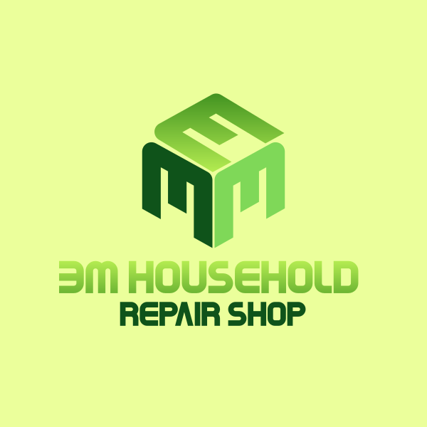 E & M Cube by shad
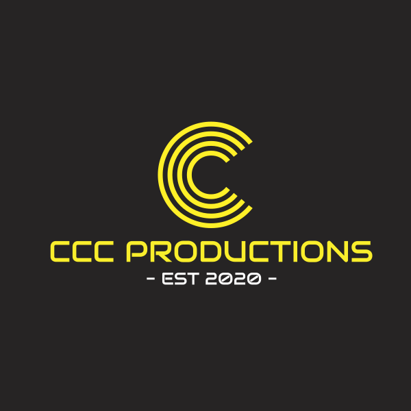
Futuristic Yellow Letter C by BrandCrowd

INK Logo Design by Antonio Calvino
 J,M,A by chinina alam
![]()
King Crown by SimplePixelSL
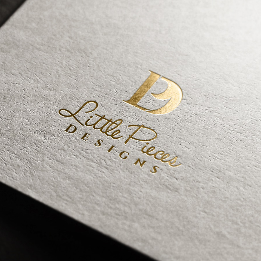
Little Pieces Designs by yoossefMaroc
MSS Property Group by hoaihoai
 Orange Letter X by royallogo

Orange & Purple Letters by eightyLOGOS
 Recent Concept SSG by Md Said
 Truity Financial Group by Oaxaqueña
Tie logo by Stella Wanja

NYC by Nick Slater
Lettermark logos are flexible and work with different designs. Take this NYC logo, for example. It encapsulates the typography with New York related objects like the subway and the big apple. It also uses colors that the city is known for. The design symbolizes the city well.
You can use color psychology to make your design more functional. This way, your symbol can exude more of your personality. For example, red communicates passion, orange represents energy, and so on. The entire spectrum comes with color psychology that will give your brand an edge.
Pro tip: Use text that is easy to understand.
When choosing a font, you should be mindful of sourcing one that is readable and legible. Each letter or glyph shouldn’t be easily confused with another. Your text should also be appropriately spaced. Doing this will help you achieve a scalable design that retains its striking look even in different size dimensions.
Monogram logos
Historically, monograms were used in 350 BC to decorate coins. They have a vintage feel to the design, which gives it a fancy look. Even though monograms have been around for centuries, you can still make them look fresh and relevant.
You can easily make a monogram or initial logo by combining two to three glyphs that are arranged to overlap. This creates an appealing silhouette that can lead the eyes of consumers to your initials.

USA by Kakha Kakhadzen

TMN Monogram Logo by Kanades
 ALB Monogram Logo by Athrá Design

CMV Home Health by tamizhekumaran
 CRO Wordmark by Buffet T.
 Curvy Letter H by eightyLOGOS
 Forthright Motor Company by Rana H
 Future State Brands monogram by Keith Evans
 NED MONOGRAM LOGO by warehouse_logo
 Purple Tech Letter E by eightyLOGOS

RBK Combination by JimjemR
These vintage-inspired logo designs often have bold strokes and curly serifs that make them look alluring. There are excellent choices for brands that want to create one. Fonts like Finagramos, Constanze, Janda Stylish Monogram, and more look great for this type of design. They blend well with each other and create a sharp contrast that can look eye-catching.
To give your design more zest, you can also embellish it with decorating frames like laurel illustrations or stamps.
Pro tip: Aim for timeless.
Today’s logo design trends are tempting to use. However, as thrilling as trends may be, they can make your logo age fast. If you try to use design trends, you must be careful not to overdo it. Try using only one or two. You don’t want to redesign your logo once your logo ends up looking outdated too soon.
Conclusion
This roundup is overloaded with logo design best practices and great concepts for your next logo design.
Your text logo can transform as a monogram, shape, or creative logo. Whatever you may go with, make sure you use it consistently. Putting in an effort to achieve image consistency is beneficial for brands. You can quickly expect to see a 33% increase in your revenue with brand consistency.
Logo design contests are a great way for you to receive more design options. Tie up with online freelance designers to bring your design concept into being. Don’t miss out on working with the designer community in DesignCrowd to give you the best logos.
For brands that prefer to do it themselves, you can get a head start with ready-made business logo designs. You can customize it in seconds using BrandCrowd’s letter logo maker and bring it to the next level. Give it a try today.
Learn more from these articles today:
Written by DesignCrowd on Monday, August 17, 2020
DesignCrowd is an online marketplace providing logo, website, print and graphic design services by providing access to freelance graphic designers and design studios around the world.

