

Print materials are a type of brand collateral with one major advantage over digital: the ability to make an emotional connection through touch. When you can truly reach out and touch something, you’re going to have a more intimate relationship with the brand it represents – whether it’s a business card, a flyer, a catalog, or a personal letter on customized stationery.
But a good print design can only fulfill its purpose if it has a quality design that matches the personality of the company it’s promoting. While part of any designer’s job description, generating new ideas for engaging an audience can be challenging, so here are 20 graphic design ideas to inspire your next print project.
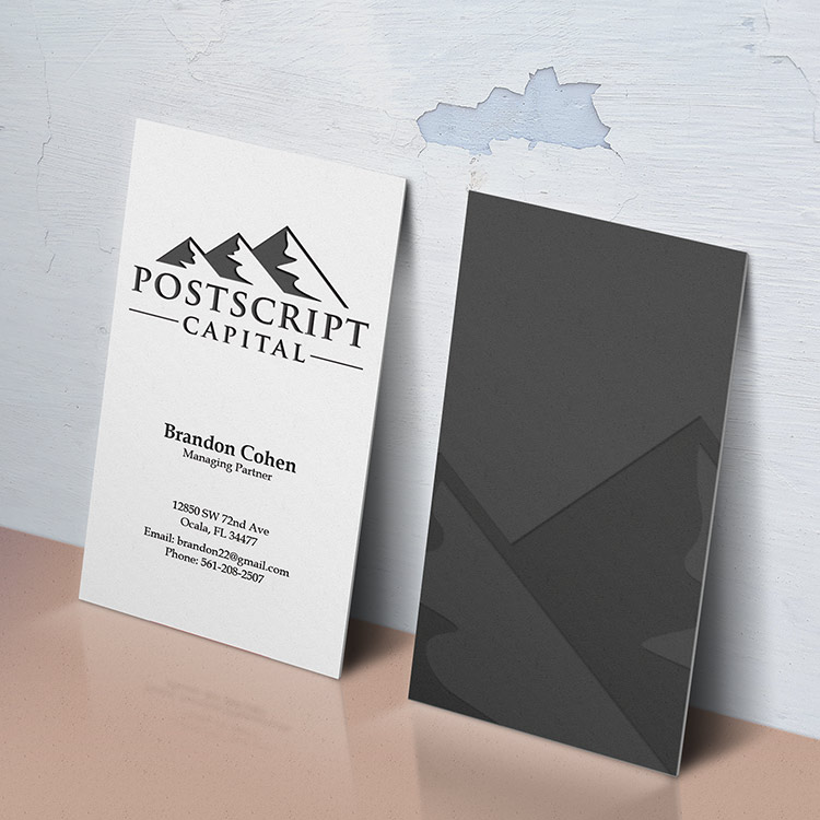
1. Incorporate unique shapes
Playing with shape elements in a business card design by Steve Wolf
Shapes can make or break the design. A unique shape makes the brand memorable. Steve Wolf creates such an iconic shape to make Cleverly (the company) more iconic.
2. Make information easy to navigate

Eye catching brochure targeting CEOS by Mughikrish
When a design brief asks for you to create a design and content is quite heavy, the first step is to read everything. Understand the key components and create a visual hiearchy. Notice how this brochure design by Indonesian graphic designer mughikrish creates a layout with a grid and considers margin, linespacing, scaling and character and paragraph styles.
3. Display products in interesting ways
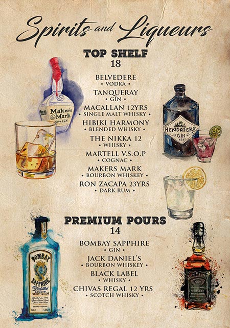
Pretty illustrations for a bar menu by mrmrnj
To keep the brand personality top of mind, sell your product through images or illustrations, similar to this memorable and unique menu design by mrmrnj. 2018 is all about custom illustrations and high resolution images. Again, use these elements to play with scale, colour, texture, etc.
4. Consider your piece’s tactile elements
Cool businesscard design by Sanrell
Play with the physical attributes to add some fun to your design. During the design stage, take into account paper choices, colors, shape, and optional extras such as embossing. Be creative. Sanrell uses embossment, to give a sense of depth in the print card design. Here are some more cool print design examples that play with tactile elements.
5. Accentuate the most important info

Yellow flyer design by Design and Development
It’s all about a designing visual hiearchy. Understand or identify the key elements that need to be prominent in the design. For this menu design, Design And Development, accentuates the product attributes of the juice at the same time as creating movement, adding energy and fun to a standard juice bar menu. The designer extends the yellow splash graphic through the menu design, which emphasizes the company name via the placement of the logo on a white background.
6. Simplicity is key
Simple, embossed business card design by Michal Kubalcyzk
Sometimes a client prefers something simple. But, this doesn’t mean your design should be boring. Exaggerate and play with a few elements such as embossment and scaling of type, similar to Michal Kubalczyk whose design is simply clever. Using black and white, and a lot of white space, his main design breaks layout conventions. One side the elements are in the center, while the back has each element on the corner.
7. Keep it balanced

Playful, illustrative menu design by Matthew Orman
The placement of elements is what we call balance, and can be thought of as each element having a visual weight in which everything needs to be stable with an inherited order. Take for instance Matthew Orman combining the dark, subtle grey tone with the bright and strong yellow hue makes the yellow element naturally feel heavier in the design.
8. Retouch photos sparingly
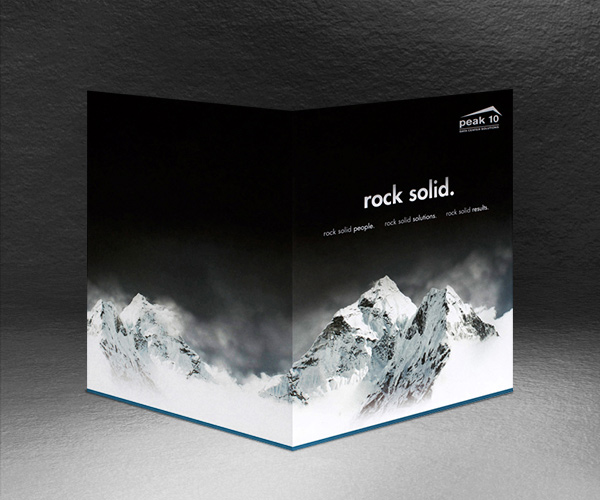
Monochrome presentation folder by Company Folders, Inc.
Photoshop is another useful tool to achieve certain visual effects in print design. Careful not to go overboard. Too much can make your photo look artificial and awkward. This design from Peak 10 on Company Folders, takes a fairly subtle approach, placing a mountain landscape against a solid black background. Here are some free high resolution stock image sites, that will help you create a successful design and avoid the predictable and boring.
9. Less is more
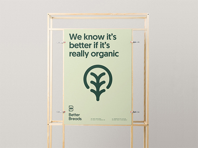
Organic, green poster design by Mr.Mockup
Although 2018 is about being experimental, being minimal is still a style that many clients favor as it has established itself as a classic style.
This design for a bread product gets straight to the point. Notice how the designer has restricted the color palette to two green hues and then played with typography and a tree shape to communicate the company’s product. Less is more and achieving this quality of design takes time.
10. Use vivid photography
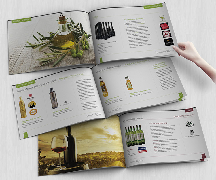
Modern, sleek catalogue design for wine products by Oilegak
It’s true what they say: a picture is worth a thousand words. For this catalog design, Oilegak uses high quality close up images of the company’s products and picturesque scenery that creates a relaxed and immersive atmosphere that engages the reader.
11. Play with negative space
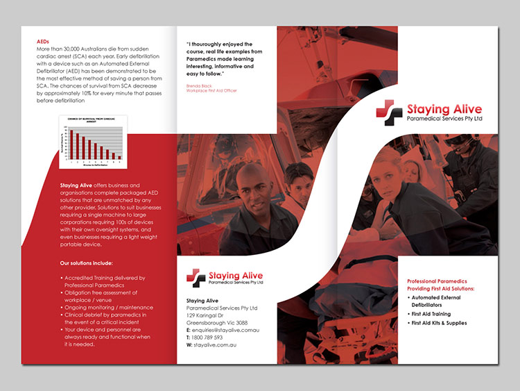
Paramedical service brochure design by Plimsoll Line
Negative space is where the empty part of the design created a second complementary shape. In some print designs, content can be quite heavy. Create negative spaces to separate visual elements. Plimsoll Line use elements from the brand’s logo to create negative space. Thie effect is that your eye flows quite easily from one side to the other.
12. Use angles to create interest
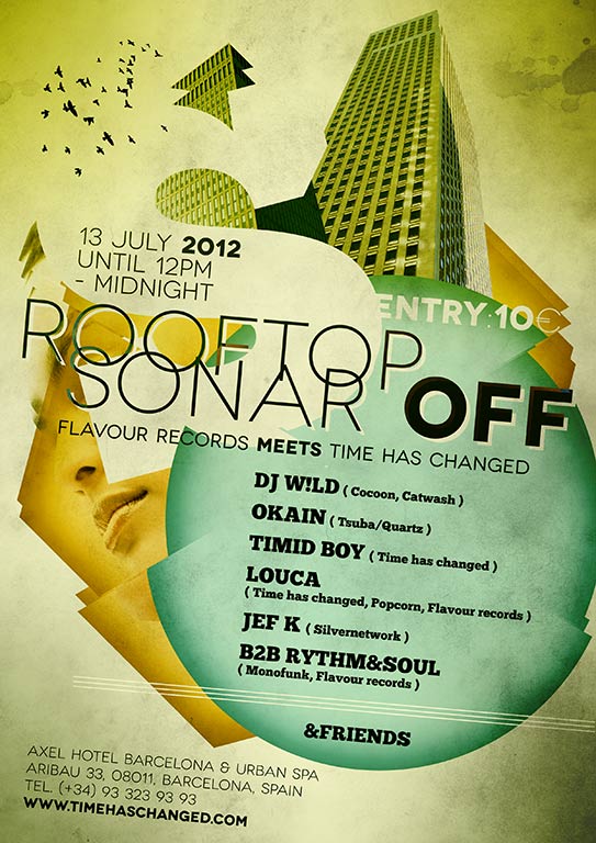
Abstract, party flyer design by Attila
Making use of diagonal lines in your design helps to suggest a feeling of dynamic motion. For this poster, Attila placed several elements (including all of the text) at an angle, creating a quirky and offbeat atmosphere
13. Find creative ways to intrigue your audience

Bright, yellow event poster design by
Culine Naudé
Whenever possible, always take advantage of opportunities to be creative. For the above print Culine Naudé use hyphens and bold shapes, breaking elements, playing with alignments, and line heights, to make this poster design provoking and compelling.
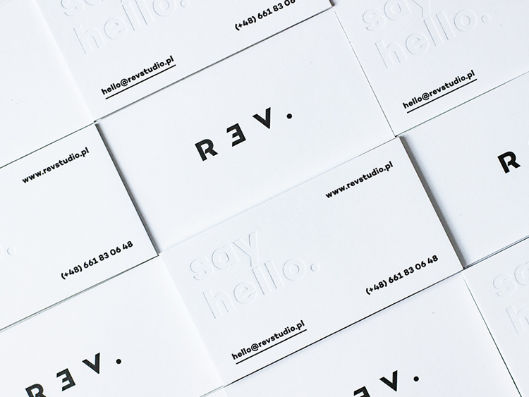
14. Find unique ways to highlight text
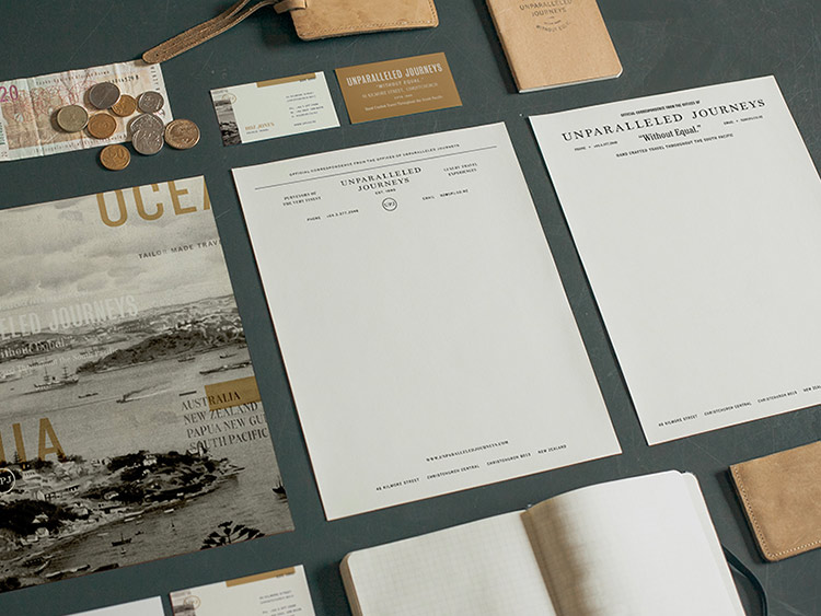
‘Old meets new’ stationery design by Andrew Littman
Andrew Littmann brilliantly designed the above stationery by scaling, cutting, coloring the typeface. He plays with different type elements to bring to life the brand’s value proposition by literally interpreting ‘unparalleled’ into his design. Using this unique approach, he creates beautiful, harmonious stationery.
Typography trends – How and where to use serfif fonts.
15. Consider Layout

Circular, pink tones print design by Charles Patterson
Layout is essential in all designs. You must create a grid, and whether you break it or not, you must have margins and columns to create a visual hierarchy. In Charles Patterson’s design, he creates a harmonious and precise layout throughout. Using margins, columns, spacing he can subtly break the grid, with some type going vertical.
16. Have a sense of humor
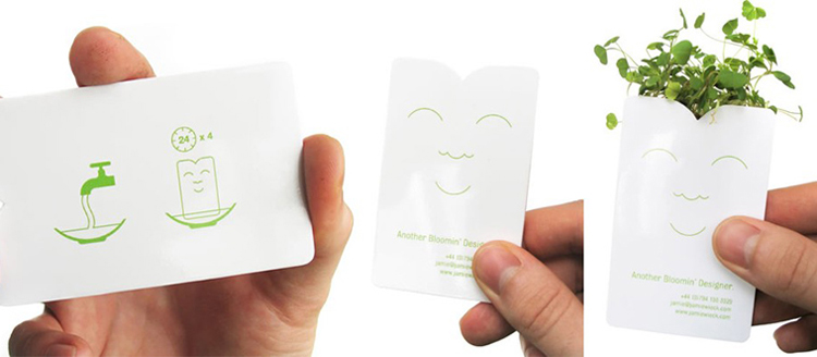
Quirky, plant business card design
Have fun with your design. A client may be open with a brief and have no rules. Enso’s Jamie Wieck offers a sense of humor through his ‘make it grow’ business cards.
17. Use typography as a design element
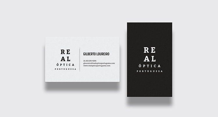
Serious, eyewear business card by HYPdesign
Typography is another visual element to explore. In this design, the typography is the only visual element, with a distinct text hierarchy however looking closely the outline of the typeface cleverly alludes to the eye exam. Need more fonts? Here are 50 fonts to play around with.
18. Repeat elements to maintain consistency

Bright, consistent, detailed stationery design by Jacob Waites
When a company provides a design brief, your design should be as consistent with the brand’s personality. In this example, Jacob Waites’ design uses only six colors and repeats the same elements, reflecting the brand’s values.
19. Repeat elements to maintain consistency
Eye catching, food menu design by Daniel
Make sure your design is harmonious bringing together all the visual elements including typeface, spacing, colour, imagery, shapes, lines and tone. The food menu design is a good example of balance. The text side is minimal and sparse to allow the reader to consume the content. The other side has a high-resolution image showing a variety of colors and shapes, adding contrast and thus balance to the overall menu design.
20. Learn how to make a design look expensive
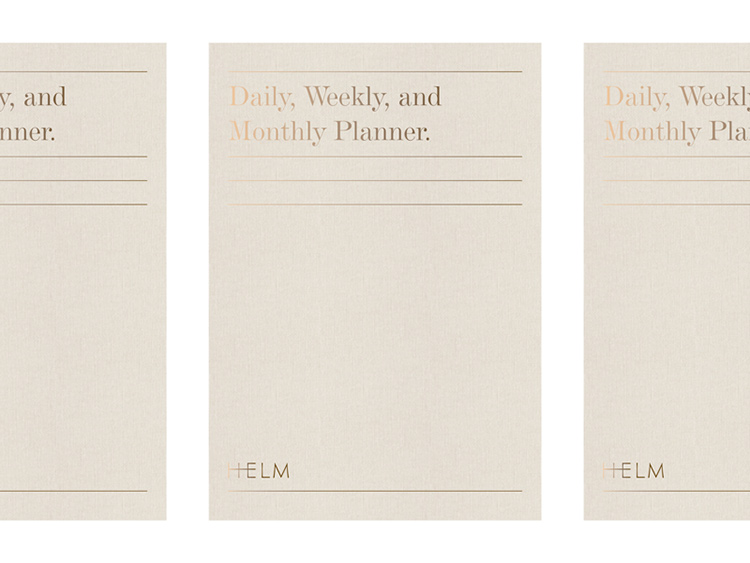
Minimal, gold leafing print design by Amber Assay
To give a print design a hint of luxury add foil stamping to your design. Check your client’s printing budget first before you venture too far down this path. Look at Amber Assay’s design where each element is simple yet elegant through the use of gold foil.
Want more?
How to create a color palette for your business
Four ways graphic design influences shopping decisions
How to produce the perfect packaging for your products
5 big logo design trends influencing graphic design in 2018
… or browse logo design ideas on BrandCrowd!
Written by Jo Sabin on Friday, July 20, 2018
Jo Sabin is Head of Designer Community at DesignCrowd. She’s led the company’s public relations and social media programs since 2012. With more than ten years’ experience working with Australian and international tech startups in the creative industries, Jo has been instrumental in meeting DesignCrowd’s objectives in Australia and abroad. Get in touch via Twitter.