Nashville has grown its reputation over the years as a party town. The music city has rows and rows of bars and clubs that offer good music and drinks. It plays a huge role in the USA’s bar and nightclub $22 billion dollar industry. Businesses stay relevant with a strong brand strategy, making them ideal for sourcing bar logo design inspiration.
This roundup will feature unique music and club logos from standout joints in the party town. Scroll through the list and get inspired.
Let this culturally robust place shower you with branding inspiration.
3rd & Lindsley
The bar is owned by Ron Brice. It is a music hall that has housed concerts for different music icons. The place has a lounge logo that looks like two street signs stacked atop each other featuring the brand name. It is surrounded by a circular stamp-like frame that gives it an urban look.
The Basement
Also referred to as The Beast, the place is home to many Nashville artists. Its logo features a sans serif font with a rounded look to it. The letter B also has a red spiral on its counter that easily grabs the attention of the audience.
Station Inn
The music listening club located in the Gulch highlights bluegrass and classic country acts. The music lounge logo depicts a guitar in the center of typography. Its lettering is done in a signature style adding a touch of authenticity. The entire design is typically surrounded by a white border that makes it pop.
Dee’s Country Cocktail Lounge
Names as one of the best bars in America by Esquire, Dee’s has been around since 2016. You’ll notice its vibrant ‘70s inspired logo that combines different fonts to create a one-of-a-kind brand identity. The design incorporates yellow and red which makes consumers think of joy and food according to color psychology.
The 5 Spot Club
The 5 Spot Club is a place that locals go-to for food and live music since 2003. Its logo consists of handwritten typography which incorporates a personal touch. The design is contrasted by a bright red circle in the center that doubles as a frame to make the number 5 stand out even more.
The Lipstick Lounge

The Lipstick Lounge is located in the Eastern part of Nashville. For its brand identity, it is represented by a red kiss mark that creates a sensual and feminine look for the lip logo. In the right corner, you will find the bar name in a grey sans serif font.
Franklin Cigar
The cigar and drink lounge prides itself on being the man cave that consumers are not allowed to have. Franklin Cigar has a logo design that is straightforward. It features a sans serif font and a black and white color scheme, allowing it to adapt well to different applications.
Wild Horse Saloon
The western music venue and restaurant used to be a warehouse, but it was transformed into what it is today in 1994. Color is one of the first things that you notice when looking at its logo. It also uses an illustration of a horse that looks like it is charging at the audience.
Exit-In
Exit-In is famed for its rock and roll scene with a list of performers that include The Red Hot Chili Peppers and Johnny Cash. The logo of this music forum keeps the design contemporary with a stencil sans serif font for the brand name.
Listening Room Cafe
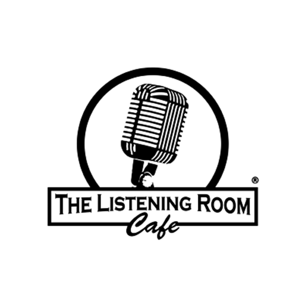
The place was established in 2006 and founded by Chris Blair. A vintage condenser microphone stands as the focal point of this logo design. Although the drawing logo is detailed, it still retains visual prominence with the help of the circular frame that surrounds it.
Bourbon Street Blues and Boogie Bar

This iconic place is a blues bar with a New Orleans theme. It has a vibrant brand identity fronted by a neon logo design. Its design keeps the text in a slight concave arrangement that gives it a domineering look. The typography is paired with a drawing of piano keys underneath it.
Legends Corner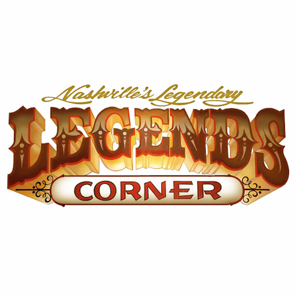
Famed for its country music events, Legends Corner stood as a home to country music stars such as Darius Rucker and Eric Church, among others. The font is a serif font that is inspired by Western design. Gold details in the design also provide the logo with a classic vibe.
The Local
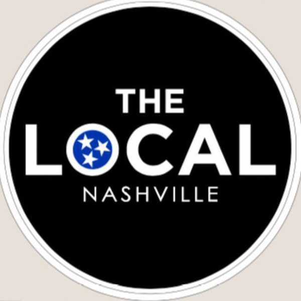
The Local opened in 2017 offering food, music, and alcoholic beverages. It has a circle logo that gives it a harmonious look. Colors black, white, and blue, ornament the design giving it dark and edgy characteristics. For its font, the design has a sans serif font with light lines.
Bootleggers Nashville
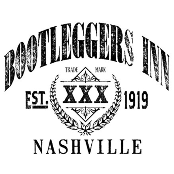
Bootleggers Nashville has been around since 1919. The brand has an old-fashioned logo design with a weathered finish. This adds nostalgia to the establishment. The logo also has a laurel border which symbolizes triumph.
The Original Tin Roof
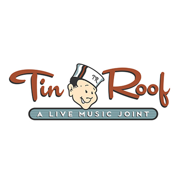
Tin Roof Bar got its start as a music events place in 2002. Today, it is represented by an illustrated mascot logo with cursive lettering. The logo features bright shades of blue and orange as well. The elements of the design make it appear colorful and approachable.
Conclusion
The right bar logo will allow you to create a connection with your audience. Not only will this inform the audience that your place is a bar club, but it will also give them ideas about your specialty whether you are a country music bar, blues bar, and the like.
Find the eye-catching logo you’ve been searching for by running a logo design contest on DesignCrowd. The crowdsourcing platform connects brands with a community of freelance graphic designers who can submit up to 50 design bids for a project. Learn more about it today and find the winning bar logo.
The BrandCrowd logo maker is an option for brands that are looking to generate the perfect design in minutes. You can search through the library of customizable designs for restaurant logos, music logos, cigar logos, and more. Transform them by applying your brand colors, text, and more. Don’t miss out.
Read more articles on design and inspiration:
Written by DesignCrowd on Wednesday, March 24, 2021
DesignCrowd is an online marketplace providing logo, website, print and graphic design services by providing access to freelance graphic designers and design studios around the world.

