

If you’ve been reading along for a while now you’ll know we’re a big fan of style guides. We gave you all the reasons to create one, and told you what to put in it. In case you’re still not convinced, or confused about what you need to do, we went ahead and found ten examples we’re totally in love with, to inspire and inform.
A great style guide can take many shapes, but the best style guides take the information contained within to heart and become emblems of the brand themselves. Some style guides are so beautiful it’s kind of a shame they’re not displayed more openly, like a coffee table book.
The ten we’ve rounded up here are exceptional for several reasons, some of which we listed with their pictures. If you’re struggling with the creation of your own brand guidelines, these might give you the inspiration you need!
What We Love:
- Focusing on a grid layout allows the reader to absorb the guide easily.
- Although there is a lot of information, it’s beautiful to look at, as the use of negative space allows the content to stand out.
- Having navigation with headings and subheadings while allowing the information to be superior gives the guide great proportions.
- It’s a great example of a style guide following its own advice: notice consistent headings, typeface, sub-headings aligned to the left and the logo always placed in the top right corner.

What We Love:
- Simplicity is always best, as it will be more straightforward to understand for readers than a complex, dense style guide.
- Minimal palette with black, white and grey tones.
- The only typeface used is ‘futura’, however playing with font sizes and using it bold in some places creates clear differentiation and structure.
- Incorporating the logo has created the grid and the manual construction of this pattern is a large part of the brand. Tailoring your style guide towards the most important elements of your brand makes the guide strong and impactful.

What We Love:
- Style guides need to be completely clear to every single person looking at them, regardless of their design experience or professional background. That’s why this style guide is so successful – it shows all design elements in their most basic format, explaining everything clearly and concisely.
- It explains kerning, which even most designers don’t remember to pay attention to.
- The more you cover your bases, the stronger the style guide will be, which will allow less chance for mistakes or brand inconsistencies to sneak in.

What We Love:
- Cohesiveness is key, that’s why this guide like most others uses a grid layout and consistent coloring.
- Style guides also address specific collateral, but only if it is important for the brand. For example, this company shows how vehicles should be branded in clear detail, which makes a lot of sense for a taxi company, but maybe not for an IT business.

What We Love:
- Some style guides like to show the history of the brand, including the logo development. This is a great approach, inviting the reader to be more involved and helping them understanding the concept of a logo completely. It shows the brand’s identity in full swing and will make it stronger.

What We Love:
- Skype’s style guide is one of the most pleasant things you’ll ever read – at least as far as style guides go. Most of these documents are pretty dry and heavy, but skype manages to reflect its brand through simple, witty, engaging and friendly copy that’s actually quite fun.

What We Love:
- Printed style guides make sense when the company reflects the need to have a printed manual, but if you’re a company that exists primarily in the digital world like Twitter, a digital guide makes a lot of sense.
- Twitter’s style guide is accessible to all. Why? Because Twitter is used everywhere, and other companies use Twitter icons all the time to promote their own channels. Making the brand’s rules accessible to all gives them the best chance of actually being followed.
- As UI/UX grows this style guide adapts and resembles UI/UX websites. This includes simple yet effective animations and high resolution images

What We Love:
- The subtle animations when scrolling
- Being UI/UX friendly
- Use of grids, white space and brand colors

What We Love:
- Another digital guide, with a more minimalistic approach, even though it holds a lot of content. This guide is different from most others in that it primarily focuses on code rather than design elements. It’s essentially the same thing, but targeted slightly differently.
Android
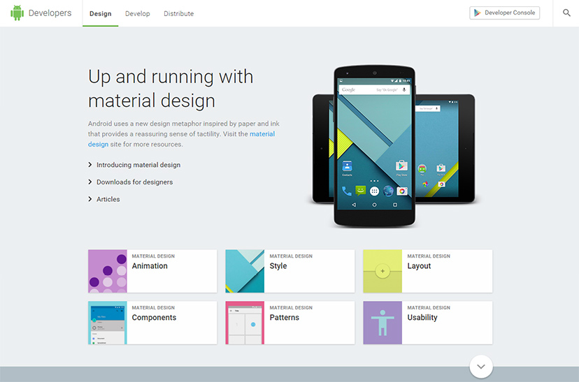
What We Love:
- Android shows us new way of interpreting a style guide, following “responsive” design and Google’s “material design” trend.
- This style guide is strong and powerful, giving a fascinating glimpse at Android’s brand identity. It isn’t just about providing information, it’s about the experience a user will feel reading it. It’s also not heavy on the content, making it clear and easy to use.
- Having it interactive and live to the world, which makes sense for a digital behemoth like Android – anyone, anywhere can use the guide to develop their products.
- Pops of color make this style guide come truly alive, and the navigation and grid layout are strong, simple and clear. This makes the style guide not only great at directing good design, but also showcasing its principles beautifully.
Want More?
A consistent brand is the first step to a successful brand. Learn how to create one:
Does Your Business Need a Style Guide? Four Questions To Ask Yourself
What Are The Key Elements You Should Have In Your Company’s Style Guide?
When Should You Consider A Rebrand For Your Business?

Written by Jane Murray on Monday, April 3, 2017
Jane Murray is a freelance copywriter based in Sydney. Apart from writing up a storm for the DesignCrowd blog on anything from logo design to Michael Jackson’s shoes, she enjoys reading literary science fiction and hanging out with most animals except wasps. Get in touch via LinkedIn.