2020’s first quarter is nowhere near over.
You still have time to breathe new life into your outdated website. This year’s web design trends bring us shifts that are hard to believe, while some bring us no surprise.
Taking notes from these buzzing design movements can help ensure that your website stays and looks up to date. We’ve noticed a whole lot of different trends and projections going on in the industry.
We condensed all that into this TL;DR list of handpicked 10 relevant web design trends that will actually matter:
Give your website a more credible look by staying updated and well-versed in web design goings-on. Besides, 48% of people say that good and timely web design is their top metric when judging a brand. Poorly designed websites get no love from them.
Let’s talk about all the things you can do to add oomph to your website.
Dark mode
Come to the dark side, young one.
Websites are listening to the force. Just look at Twitter. They’re one of the main examples of platforms fanning the flames of interface darkness (not to wax poetic).
Besides, the predominantly dark interface helps your content actually stand out. This helps readers dart their eyes to visual aids such as infographics when scanning your page. The dark mode also helps users with visual impairments to have an easier time reading content.
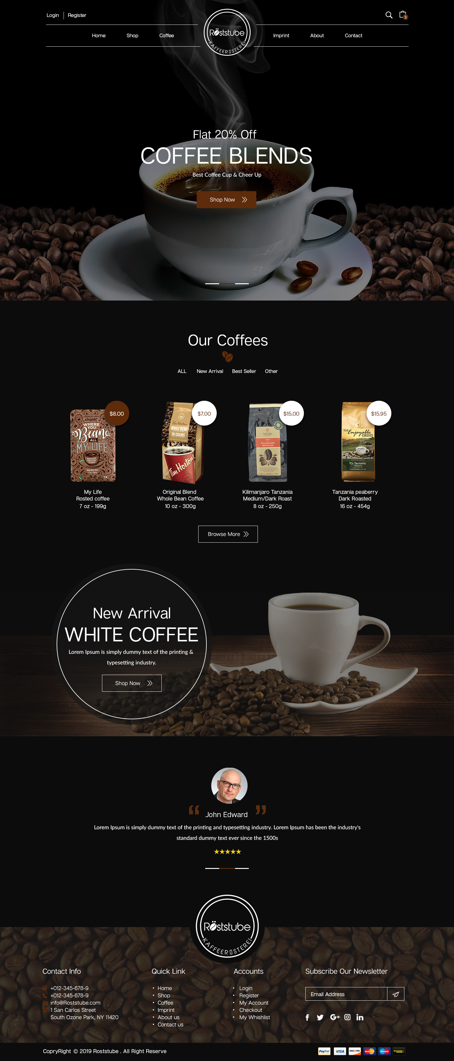
Kaffeerösterei benötigt, bdesigner9
Chaotic type
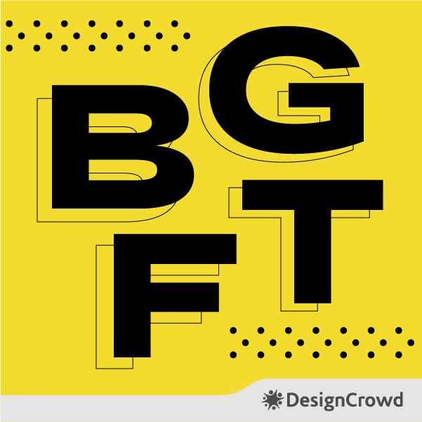
Disruption has always been there, but its visual power has long been overlooked by brands in the 2000s.
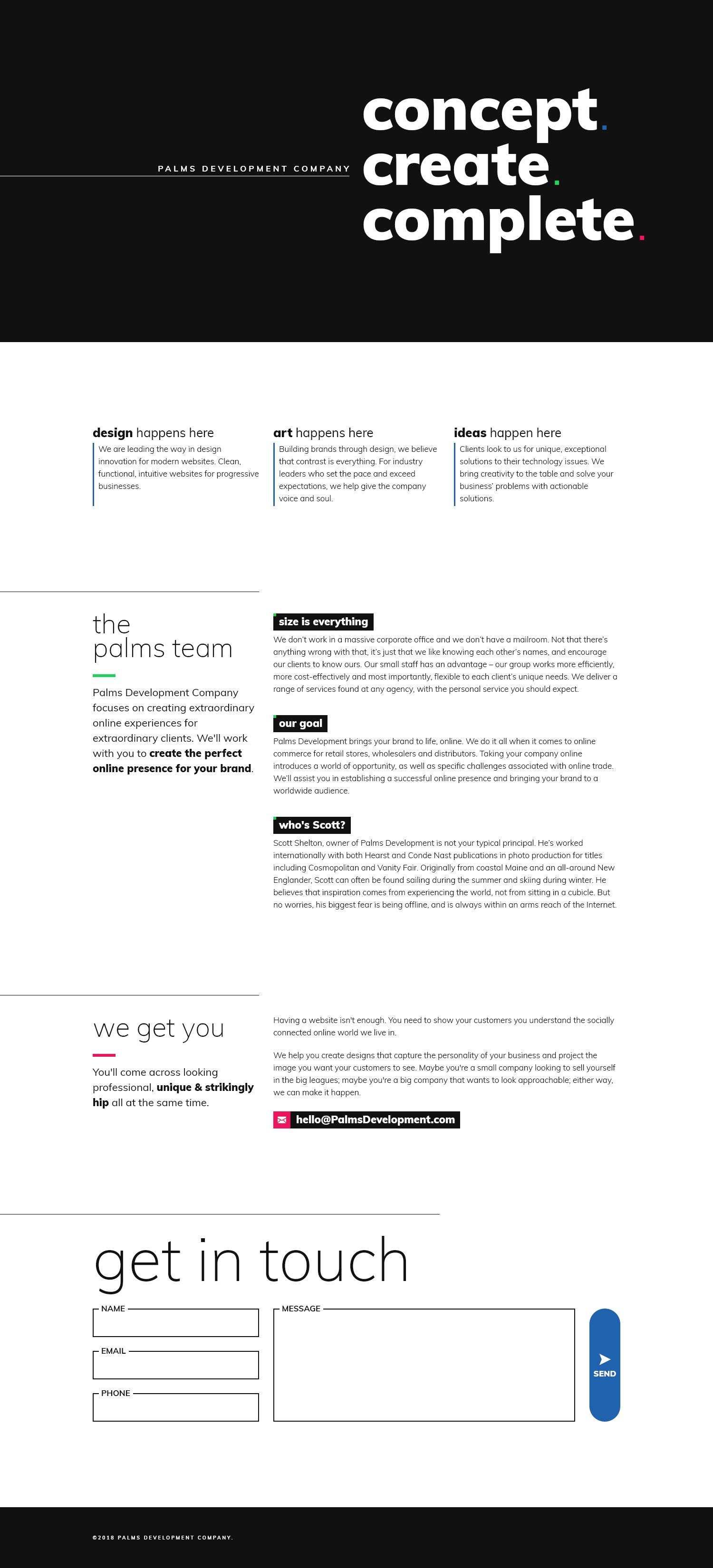
By shifting one letter a little more to the left, this grunge movement adds so much to your branding. This is perfect for companies who have the knack for rebellion.
Over polished design is great, but it just can’t add as much drama and intrigue as chaotic typography. Disheveled type dares your audience to decode what you’re putting up on your page. Be mindful of how you use this concept, though. Maintain the difference of a good visual challenge from illegibility.
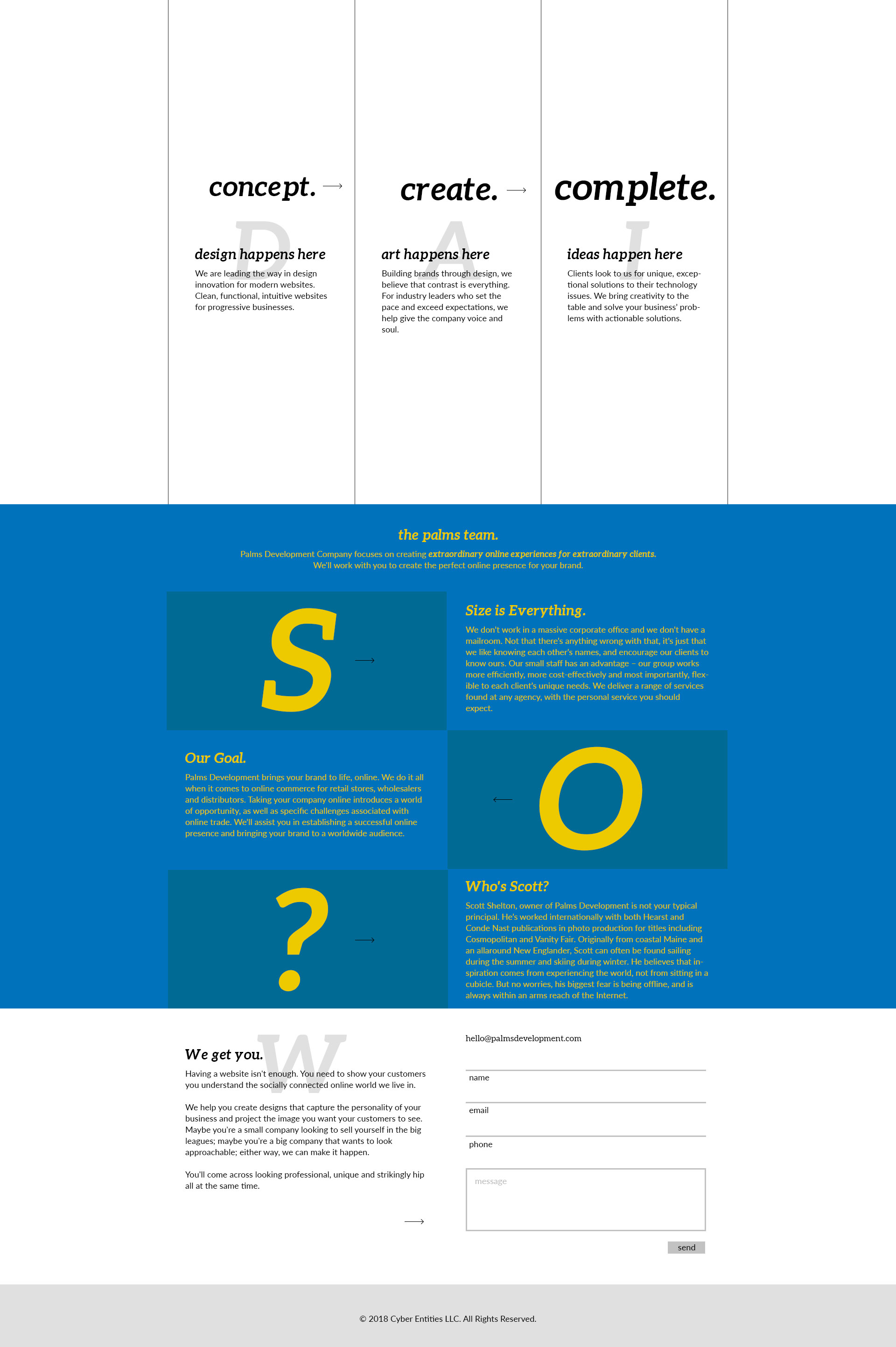
US Company, grabson
Big fonts
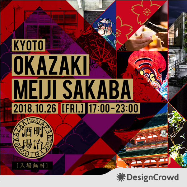
And we mean really bold ones.
Designers like chunky fonts because they do help break out texts make them more manageable to read.
It does so much for visual hierarchy by highlighting essential content. Your design will see an increase in readability once you start incorporating bold typography.
This is a popular choice for both desktop and mobile web designers.
US Company, MIND
Shapes
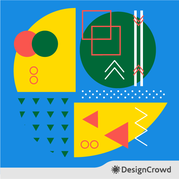
Geometric figures commonly function as call to action buttons.
However, they do so much more. They can add visual cues to aid users when navigating your website. Shapes can also add emphasis to your web content when used as a frame. Different figures can add varying effects and moods.
This works especially well for minimalist websites that need something simple yet remarkable.
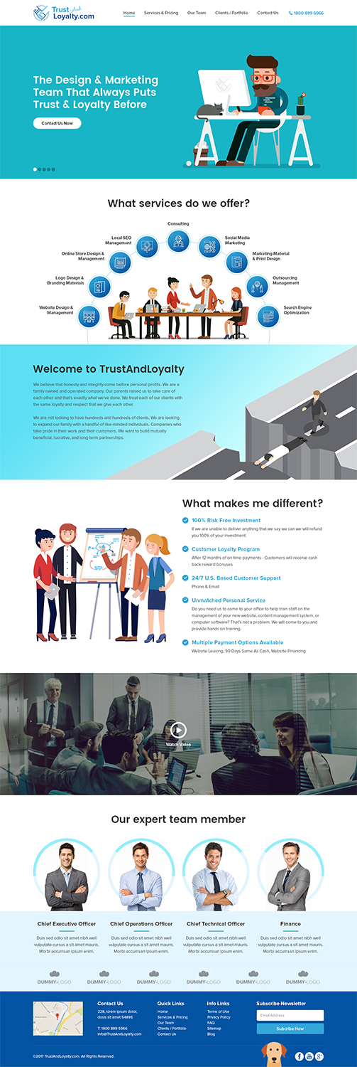
Marketing Company, RupalTechno
Motion
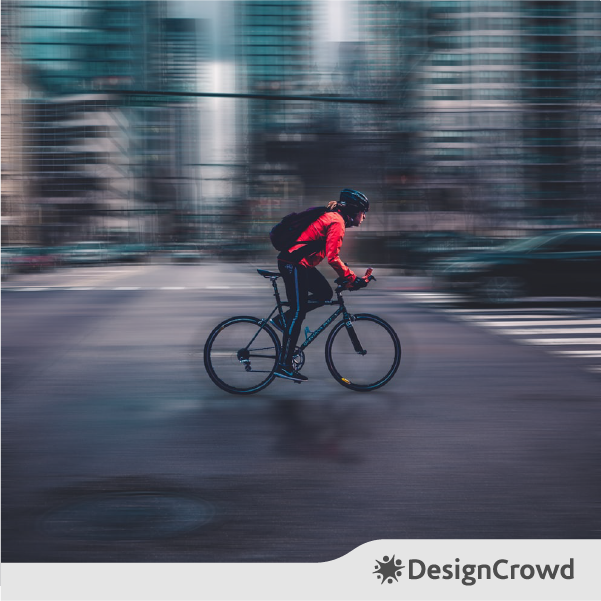
Animation in your web design will give you an increased session duration. Motion keeps your audience entertained as they wait for your page to load. Users have now set their expectations sky-high when it comes to website load times. 47% of them said that ideally, a website should only take 2 seconds to load.
Related: Taking Your Graphic Design Further, Expanding into Animation and Motion Design
You can break free from lifeless pages with even the littlest tweaks with motion.
A good web page motion idea would be making your logos move to give it more attention from your audience. This is a double win for your brand’s website and logo recognition.
White space
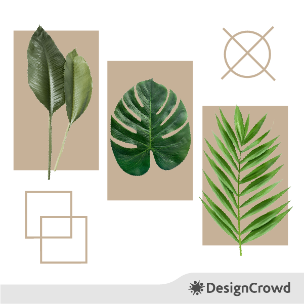
It’s about time we all send white space a friend request on Facebook.
Ellen Lupton, designer and author of Thinking With Type once said of the craft, “Design is as much an act of spacing as an act of marking.” And we felt that.
More white space = more ease of use.
Designers often forget the huge value that space can bring to their work. We’re past the point of saturated web design that over stimulates the audience with clutter from end to end.

Africa”sTalking Ltd, Kingdom Vision
Gradient
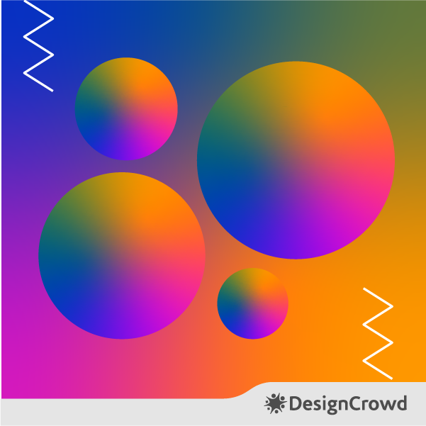
Webpages with gradients are rebels of the flat design shift.
Using the gradual blending of different colors onto one another creates depth and brings more realism to your design. This is also a smart hack to use to communicate more meanings through more colors.
Gradients can really save you from tough spots when choosing what brand color you should decorate your website in.
It’s modern. It brings high-impact. Most of all, it makes your text easier to read.
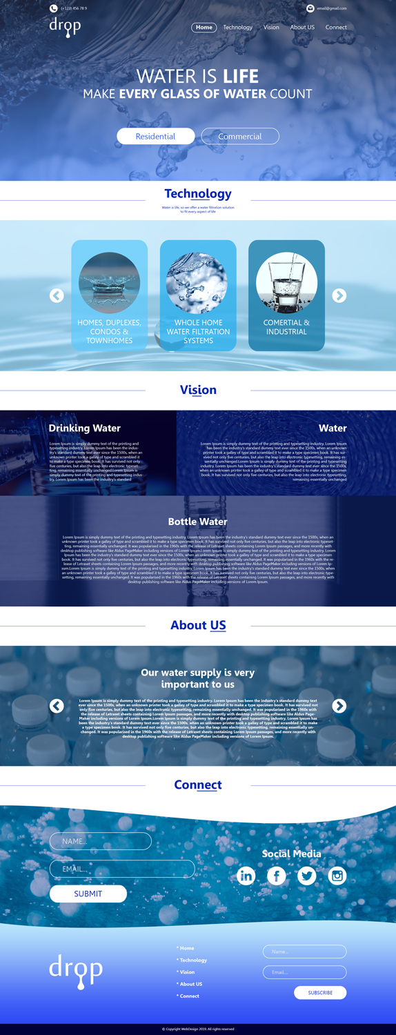
DROP, 3N54R07
Minimalism (yet again)
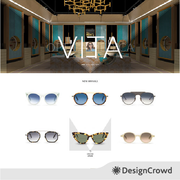
Not all of us are over the KonMari craze.
Minimalist web design concepts are famous for a variety of reasons. But the main has got to be how this design principle allows for much simpler website navigation. Your users will have a much better time using your website when they’re not busy scratching their heads trying to figure out how to access the information they want.
This is also a good time to flaunt your amazing logo, headlines, and other essential content.
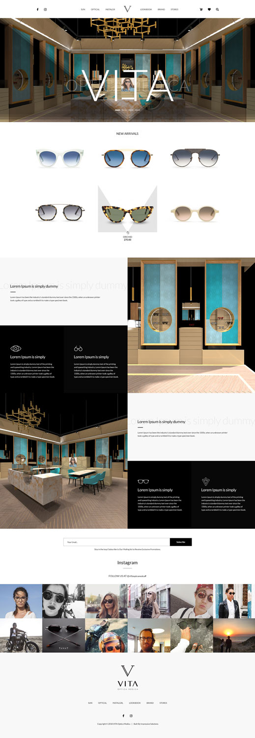
VITA, Black Stallions Impressive Solutions
Illustrations
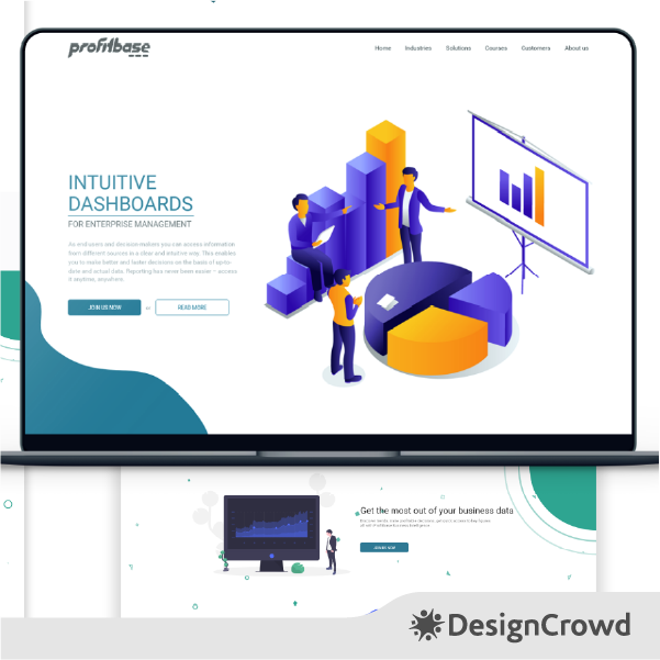
By adding illustrations to your website, you’re hitting a flock of birds with one stone. They facilitate the following things:
- Better segmentation of content
- Add personality
- Communicate information better
- Gives your webpage a playful touch
The kicker of illustration is its capacity to seize the little moment you have to prove your value.
Users take a fraction of a second to form an opinion on your website. When taking measures to guarantee a good first impression, consider graphic elements that symbolize your message promptly.
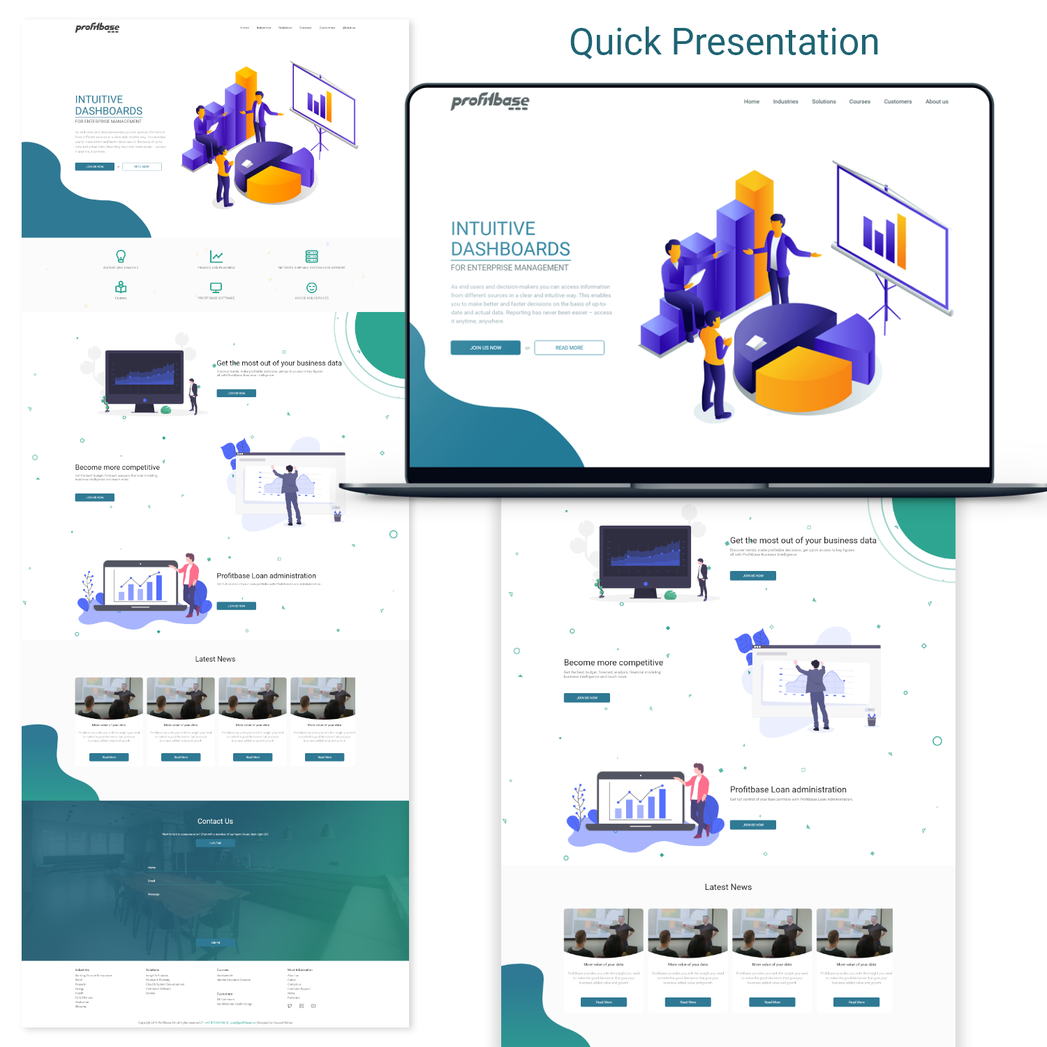
Profitbase, YR95
Accessibility
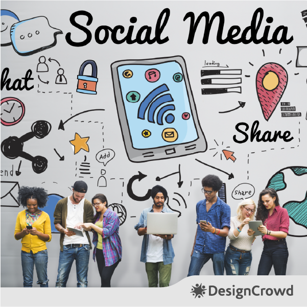
Alt texts are great, but they aren’t and shouldn’t be the end all be all of your website’s effort to be more accessible.
Besides that, you can up your accessibility through other things.
You can clean your script to give users with poor internet connection an improved loading experience. For color deficient folks, you can tweak your contrast and spacing for better readability. These also benefit the people in your audience with learning disabilities.
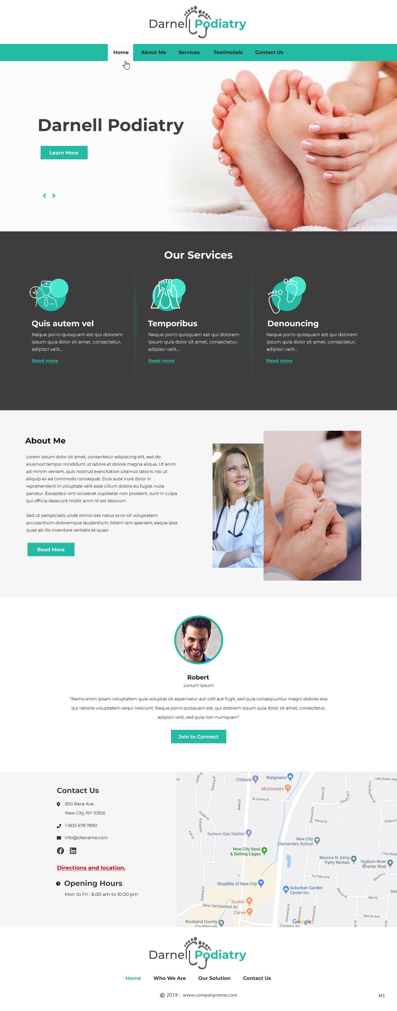
Podiatry Company, pb
Conclusion
You might be wondering why should you even spend time working trends into your website if they change every year?
Well, for starters, it’s because trends are based on user preferences that pervade the industry. It’s another form of looking at the needs and wants of your audience. People use it to predict what users like and what they will like next.
When applied correctly and meaningfully, trends can draw people in.
2 out of 3 consumers prefer reading well-designed content. Their standards incorporate celebrated design principles seen most often.
Mindlessly piling design concepts on top of each other without careful consideration will end you up with a mess. This isn’t just the truth for web design, but for other branches of art as well.
Small businesses spend around $2,000 to $9,000 for a website on average. Don’t let good investments go to waste by not optimizing.
When working with a design service provider—whether it be agencies or freelance graphic designers—make sure to consider their ability to give you professional consultation and output your business needs.
More articles you’ll like:
Written by DesignCrowd on Thursday, March 19, 2020
DesignCrowd is an online marketplace providing logo, website, print and graphic design services by providing access to freelance graphic designers and design studios around the world.

